9 Customer Sentiment Examples: From App Reviews to Socials

Table of Content:
- Customer sentiment examples at a glance
- Key insights
- Customer Sentiment Analysis Examples by Channel
- App Store reviews sentiment analysis examples
- Social Media customer sentiment analysis examples
- Support ticket sentiment analysis example
- Customer service sentiment analysis examples
- How to understand customer emotions
- How to classify customer messages into satisfied, neutral, dissatisfied, and mixed
- How app teams run the sentiment workflow in AppFollow
- FAQs
Customer sentiment looks clean in a dashboard. Real feedback is messier.
A user gives you 5 stars and writes, “Love the app, but the latest update broke exports.” The rating says happy. The text says something broke. Another user writes, “Thanks for finally fixing it,” after three angry support tickets. The last message sounds positive, but the history still shows risk.
This is where teams misread sentiment.
Useful customer sentiment analysis does not stop at positive, negative, and neutral. It answers four operational questions:
- What does the customer feel right now?
- What caused that feeling?
- Who owns the fix?
- How will we know the next wave of feedback improved?
In this guide, Lucija Knezic, our Senior CSM, and I walk through customer sentiment examples from app reviews, support tickets, social posts, Reddit threads, NPS-style feedback, and customer transcripts. You’ll see how to label the emotion, split mixed messages, spot the real topic, and turn feedback into a workflow your Product, Support, Marketing, and ASO teams can actually use.
If you only scan one thing:
- Positive: the job is done and the customer is confident. “Fixed fast, works again.”
- Negative: the job failed or effort increased. “Still can’t log in after three tickets.”
- Neutral: the customer needs information, no frustration yet. “Is dark mode on Android?”
- Mixed: praise and friction in one message. Split the tags, don’t average them.
- Then add intent, owner, and action. A label without a next step is just a dashboard color.
Customer sentiment examples at a glance
Use this table as the fast triage layer before you get into the detailed examples.
Customer message | Sentiment | Topic | Owner | Next action |
“Love the app, but exports stopped working after the update.” | Mixed | Bug after release | Product + Support | Tag app version, reply with workaround, group with similar crash/export reports. |
“I can’t log in and support keeps sending the same answer.” | Negative, urgent | Login + support quality | Support lead | Escalate, review macro quality, check repeat contact count. |
“Is this feature still included in Pro?” | Neutral, at risk | Pricing clarity | Support + Marketing | Answer fast, then check if paywall or FAQ copy causes repeated confusion. |
“Finally fixed. Thanks.” | Resolved, history-sensitive | Closed-loop support | Support | Mark resolved, but do not count as purely positive unless earlier tickets are closed. |
“Great app. Please add Urdu-to-English lessons.” | Positive with request | Localization demand | Product / Growth | Cluster by language and market. Add to backlog if volume repeats. |
“Interesting update…” | Ambiguous | Possible sarcasm | Community / CX | Read the thread before labeling. Look for replies, emojis, and prior sentiment. |
“Too many ads now. I used to recommend this.” | Negative, churn risk | Monetization friction | Product + Monetization | Compare against ad/session metrics, rating trend, and subscription complaints. |
The label is only the first pass. The useful insight is the combination: sentiment + topic + owner + next action. That is what turns “negative feedback” into a fixable product signal.
Key insights
- Tag sentiment and intent together. A five-star review with a blocker is still a churn risk. A one-star rant is noise until it repeats. Bug, pricing friction, onboarding confusion, feature request, trust issue: that’s how you stop arguing and start prioritizing.
- Context changes the read. App Store reviews are structured and permanent, so star/text mismatches matter. Social is fast and visible. Support tickets are about the emotional arc. Reddit and forums are slow-burn, and the truth lives in the thread, not the first post.
- Group analysis beats hero work. Three loud messages are anecdotes. A cluster of 100 is a trend, like “Doesn’t Work” jumping to 20% of conversation after a release, or refund requests dragging sentiment while pricing comments look fine.
- Emotion labels must trigger action. “Confused” routes to onboarding or help content. “Anxious” goes to trust, security messaging, and clearer policies. “Angry + urgent” is an SLA and escalation issue, not a copy issue.
- Close the loop with receipts. Ship the fix, then check whether the tag share drops and sentiment climbs. If nothing moves, the fix didn’t land, wasn’t discoverable, or solved half the problem.
Customer Sentiment Analysis Examples by Channel
Every channel your customers use to talk about you requires a different lens for sentiment analysis. Not because the emotions are different, but because the context, structure, and intent behind each message type shifts dramatically.
- App stores reviews come with built-in sentiment signals. A star rating gives you the headline before you read a word. Someone drops a 1-star review saying "Love this app, just wish it had dark mode"? The rating tells you they're frustrated enough to punish you publicly, even if the words sound mild. You're analyzing sentiment against expectation here.
The gap between what they said and what they rated reveals the intensity. App store sentiment also lives forever and influences download decisions, which means a negative review from 2023 still damages you in 2026 if you never responded. (More on that in our breakdown of how ratings and reviews affect ASO.) - Social media sentiment hides in threads, replies, quote tweets, and comment sections where the original post might say one thing but the real story unfolds six comments deep. Social moves fast, sentiment shifts within hours, and you're often analyzing incomplete conversations because people DM the resolution.
- Customer support tickets give you the richest sentiment data because you see the entire emotional journey in one place. The opening message usually carries peak frustration: "This is the third time I'm reaching out about this." By message four, they might write "Thanks for staying with me on this," which reads positive but you need to tag the overall ticket sentiment based on resolution, not just the final reply.
- Forums and communities operate like ongoing focus groups where sentiment about a feature might span a 50-comment thread across three weeks. Someone posts "The new dashboard is confusing" and gets 23 upvotes, then another user replies with a workaround that gets 15 upvotes and a "This should be built-in" response. You're not analyzing one person's sentiment anymore. The collective agreement signals product gaps louder than individual complaints.
Here's how the analysis approach differs across channels:
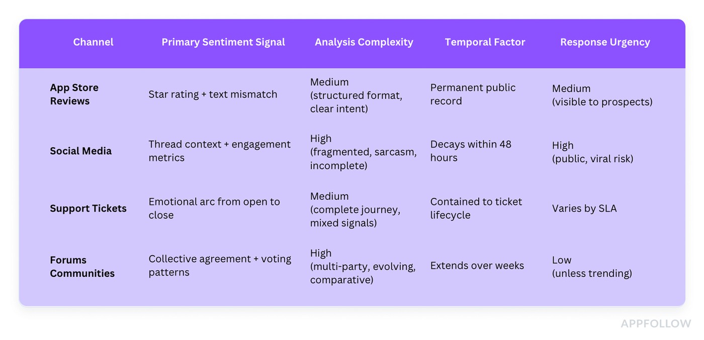
Pick the right lens before you label: each channel carries different signals, context, and risk.
The biggest mistake teams make with customer service sentiment analysis examples is applying the same tagging logic everywhere. A "thanks" in a support ticket after you resolved their issue? Positive. That same "thanks" as a sarcastic reply to your Twitter apology about a 6-hour outage? Negative, and you better recognize it as such before you add it to your positive sentiment dashboard and embarrass yourself in the next QBR.
Each channel below gets real examples showing exactly what positive, negative, neutral, and mixed sentiment looks like ⬇
App Store reviews sentiment analysis examples
App Store reviews are the fastest place to practice sentiment labeling because users tell you the verdict up front, then they drop the “why” in one or two lines. Still, it gets tricky. A 5-star review can hide a real bug. A 2-star rant can include a perfect feature request you should route straight to Product.
The snippets below are real-world patterns pulled from AppFollow clients, rewritten only to remove identifying details. Treat them like plug-and-play customer sentiment examples: what “positive,” “neutral,” and “negative” looks like when it’s wrapped in sarcasm, mixed feelings, or urgency. Use the labels to drive action, not vibes. Tag the emotion, tag the topic, assign an owner, and you’ve got a workflow instead of a pile of stars.
Example 1: Feature Request Detection
Sentiment label | Positive with request (often 4–5 stars) |
Topic | Feature request: localization, AI features, beginner UX |
Owner | Product / Growth |
Next action | Size the tag, split sub-themes, segment by country and language, then check if request volume drops after shipping |
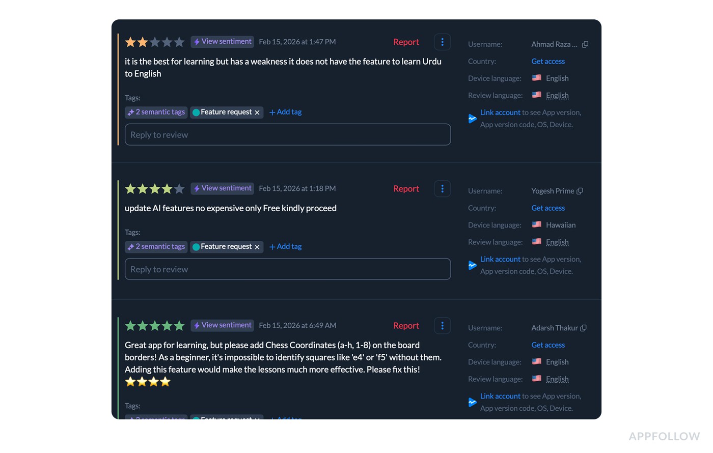
Group requests under one tag so you can treat them as one signal stream, not separate opinions.
Feature requests are where sentiment gets weird in the best way. People can be genuinely happy and still tell you what’s missing, and they can also be annoyed, but the request itself is clear. So instead of treating reviews like three separate opinions, teams tag them as Feature request and analyze the cluster as one signal stream.
Here’s a tight sample of real-world, cleaned-up reviews that sit under that tag:
- “This app is great for learning, but it doesn’t have an option to learn Urdu to English. Please add Urdu-to-English support.”
- “Please update the AI features and keep them free. The paid options are too expensive.”
- “Great app for learning, but please add chess coordinates (a–h, 1–8) on the board edges. As a beginner, it’s hard to identify squares like ‘e4’ or ‘f5’ without them.”
Now the dashboard part, because that’s where this becomes analysis and not storytelling.
Teams open the Feature request tag inside the sentiment dashboard and look at it like a mini dataset.
- First question is volume. How big is this tag compared to everything else.
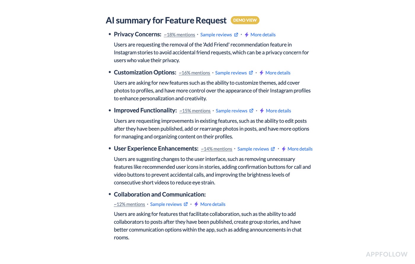
- In the tag summary view, you get sub-themes and their share of mentions, so you’re not guessing what’s inside the bucket. Privacy concerns can take ~18% of mentions, customization ~16%, improved functionality ~15%, UX enhancements ~14%. That breakdown tells you what “Feature request” means for your app right now, in weighted categories, not vibes.
- Then they read the sentiment shape of the tag. Feature requests often show up in high-star reviews because loyal users are asking for improvements, not rage-posting. That’s an important nuance for CX and Product. A five-star review with a missing feature request is still a retention risk if the same theme repeats week after week.
On the flip side, if the tag is dominated by low-star reviews, the missing feature is probably blocking a core workflow and dragging rating perception. - Next comes trend analysis. They track how sentiment and volume move over time for the Feature request tag specifically. If it spikes right after a release, that’s usually friction introduced by change. If it steadily climbs, the product is maturing and users are bumping into “advanced needs” like export, integrations, or language coverage.
- Segmentation is where you stop arguing internally. Teams slice the Feature request tag by language and country to see whether a request is global or market-specific. Urdu-to-English support, for example, is not “a random request.” It’s a clear localization demand you can quantify by region. Pricing-related requests tend to cluster by market, too, and that gives Marketing and Product a shared view of where monetization messaging or tiering is creating friction.
What do they do with these insights?
- Product turns the top sub-themes into backlog items with receipts: frequency, trendline, and the exact phrasing users repeat.
- Support aligns response macros by theme, so replies are consistent, and expectations don’t get overpromised.
- Marketing uses the same tag view after shipping changes to validate impact. If the request volume drops and sentiment stabilizes, the update solved something real. If nothing moves, the feature might exist, but users can’t find it, or it only fixes part of the job.
That’s the point of doing customer sentiment analysis on feature requests - to measure which missing capabilities are shaping user emotion, ratings, and retention, then close the loop with proof.
Example 2: Bug Impact Analysis
Sentiment label | Negative, urgent |
Topic | Release bug: “Doesn’t Work”, payment issues, UI issues |
Owner | Product / Engineering, with Support collecting repro details |
Next action | Build an incident brief, ship the hotfix, then watch tag share shrink and sentiment climb |
Here’s how AppFollow users run bug impact analysis when the App Store turns into a live incident channel.
A release goes out. Reviews jump to 176 in the window shown, up 28%. Sentiment tanks to 20% (up 54% only because the baseline was even worse), and the average rating sits at 2.88. That’s not “customers are grumpy.” That’s a measurable hit to acquisition and retention.
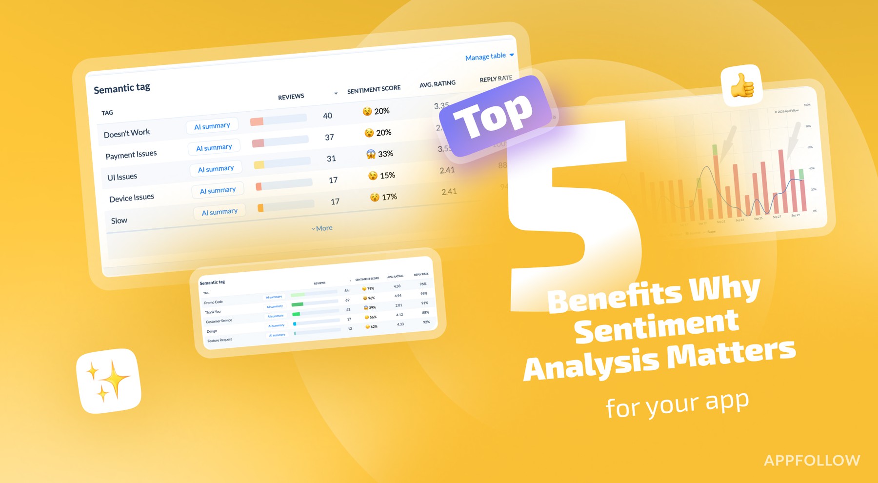
So the team opens the semantic tag table and asks one question: what’s driving the drop right now? The answer is visible fast.
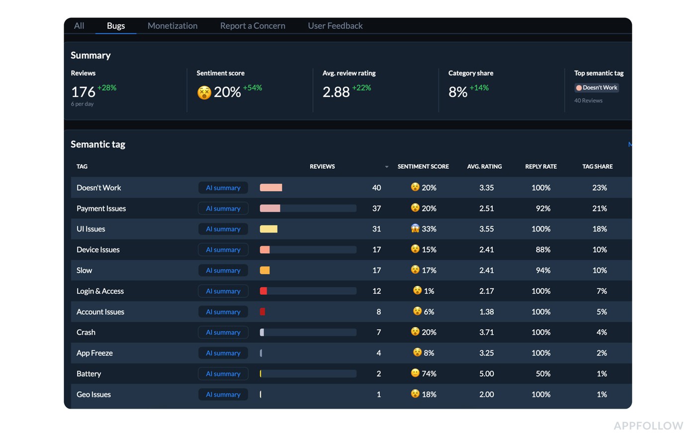
Find the tag driving the rating drop: volume, tag share, and sentiment side by side.
The top tag is Doesn’t Work with 40 reviews, and it’s a big chunk of the conversation at 23% tag share. Inside that tag, the metrics stay ugly: 20% sentiment score, 3.35 average rating, 100% reply rate. Next to it, Payment Issues is also heavy at 37 reviews and 21% tag share, while UI Issues trails with 31 reviews and 18% tag share.
That comparison matters because it tells you whether you’re dealing with one dominant failure mode or three separate fires.
Then they open the “Doesn’t Work” summary and scan it for the issues with the highest % of mentions.
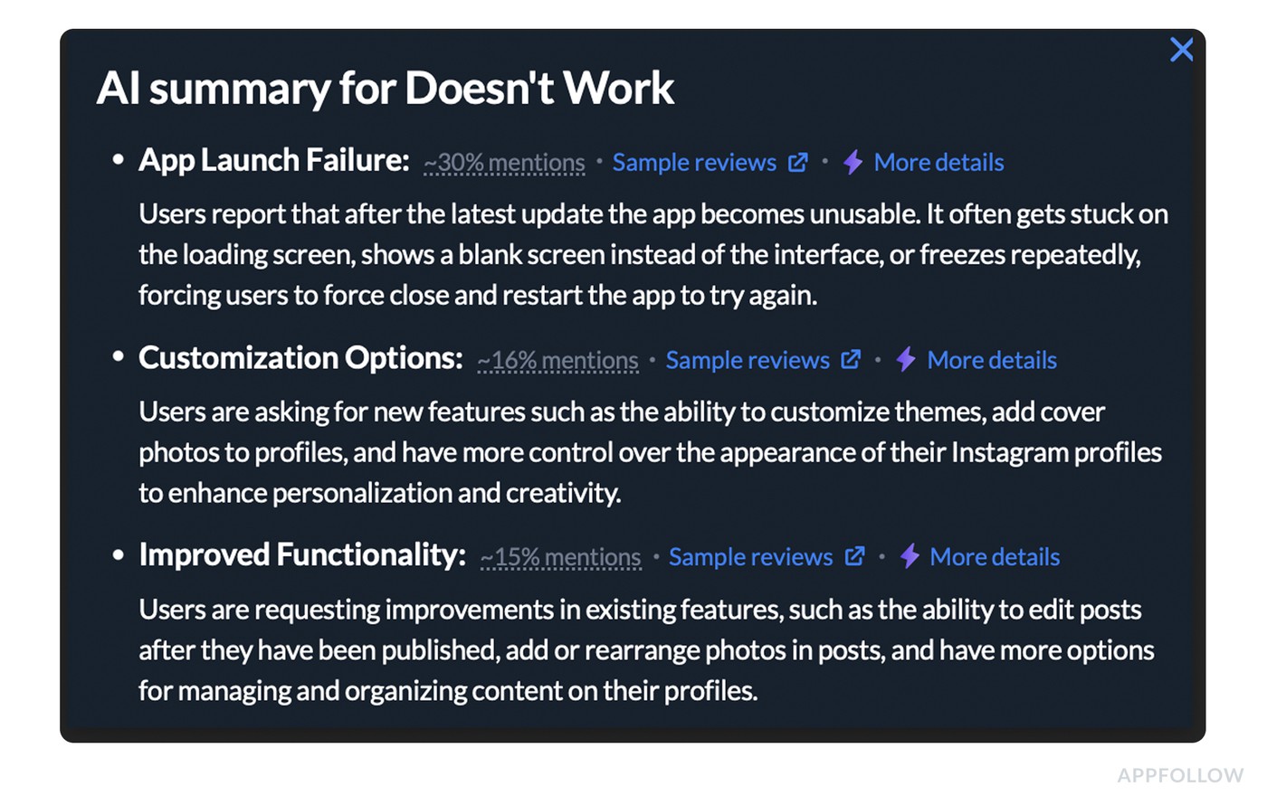
Open the tag summary to see which failure mode users mention most.
Now the move that makes this useful for CX, Product, and Marketing at the same time: a tight incident brief built from the dashboard.
What goes into that brief:
- Blast radius: 40 reviews tied to “Doesn’t Work,” plus its 23% share of all tagged issues in this period.
- Business impact: average rating 2.88 with sentiment at 20%, which is a conversion killer in the store.
- Priority context: “Doesn’t Work” outranks every other tag by volume, so this is the first fix that will move the needle.
Support gets a parallel play. Reply rate is already high, so they standardize the response to do two things: acknowledge the break, and collect the missing repro details that matter for triage (OS, device, app version). That keeps replies consistent and turns review responses into structured debugging input instead of apologies.
After the hotfix ships, the team goes back to the same dashboard view. They expect two changes on the sentiment graph: the overall sentiment trendline starts climbing, and the Doesn’t Work tag share starts shrinking as fewer new reviews get pulled into that cluster.
If the line doesn’t move, they don’t argue about feelings. They assume the fix didn’t reach everyone, the bug isn’t fully resolved, or a second failure mode is still active. That’s the loop.
This is why CX leads like it, why PMs trust it, and why marketing stops guessing what to say in release notes. The dashboard tells you what broke, how widespread it is, and whether your fix changed the story customers are telling.
cta_get_started_purple
Example 3: Pricing Sentiment
Sentiment label | Mixed: pricing mostly neutral-to-positive, refunds and ads strongly negative |
Topic | Monetization: pricing transparency, refund requests, ads |
Owner | Product + Monetization, Support for billing replies |
Next action | Compare monetization tags side by side, segment by market, standardize refund and pricing replies |
Pricing feedback is usually trust, fairness, and surprise rolled into one. In this case, AppFollow users pulled a pricing cluster that was big enough to matter and messy enough to lie if you read it manually.
They started in the Monetization view and saw the headline numbers for the selected window: 120 reviews (about 4/day, +46%), sentiment score 53% (+8%), avg rating 3.91 (+14%), and category share 5% (+25%).
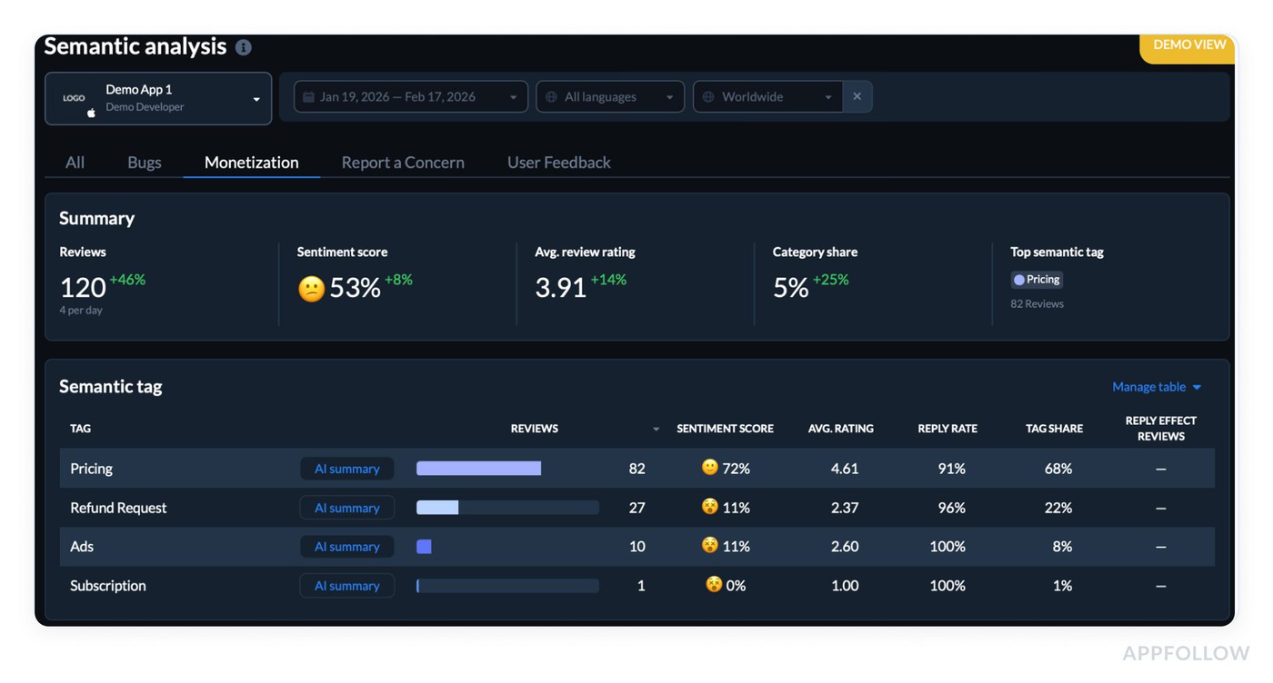
Check whether monetization feedback is growing before you decide what to fix. Test it live.
The top semantic tag was Pricing with 82 reviews. About 40% of them were in other languages, which is exactly where tagging helps because the theme stays consistent even when wording changes.
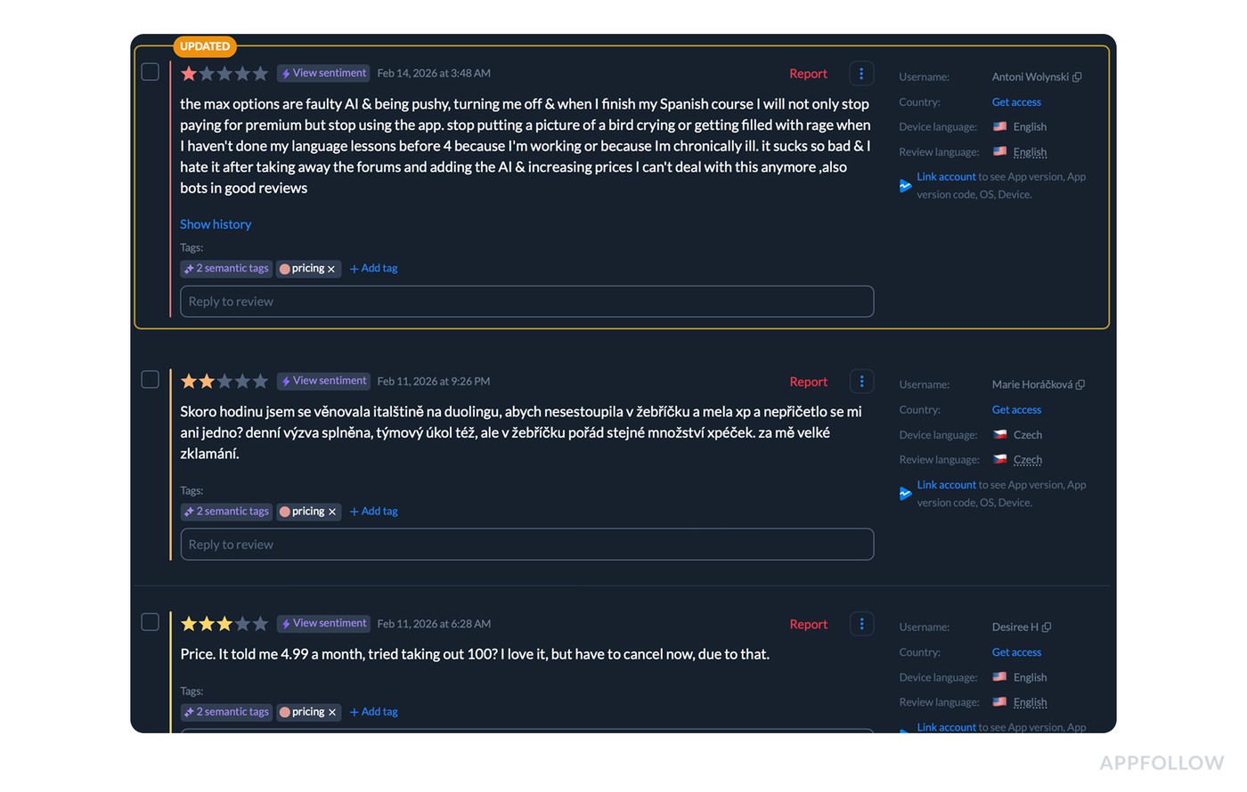
A few real review lines from the cluster (cleaned, anonymized):
- “You’re actively hiding your prices online and in the app. That’s scummy and scammy.”
- “Money-hungry. You can’t finish lessons with the standard energy. Gems are overpriced.”
- “Prices increased, AI feels pushy, and it’s turning me off.”
Here’s the part people miss. The dashboard shows Pricing is not automatically “negative.” In this dataset it sits at 72% sentiment with a 4.61 avg rating and 91% reply rate, plus it accounts for 68% of Monetization-tagged feedback.
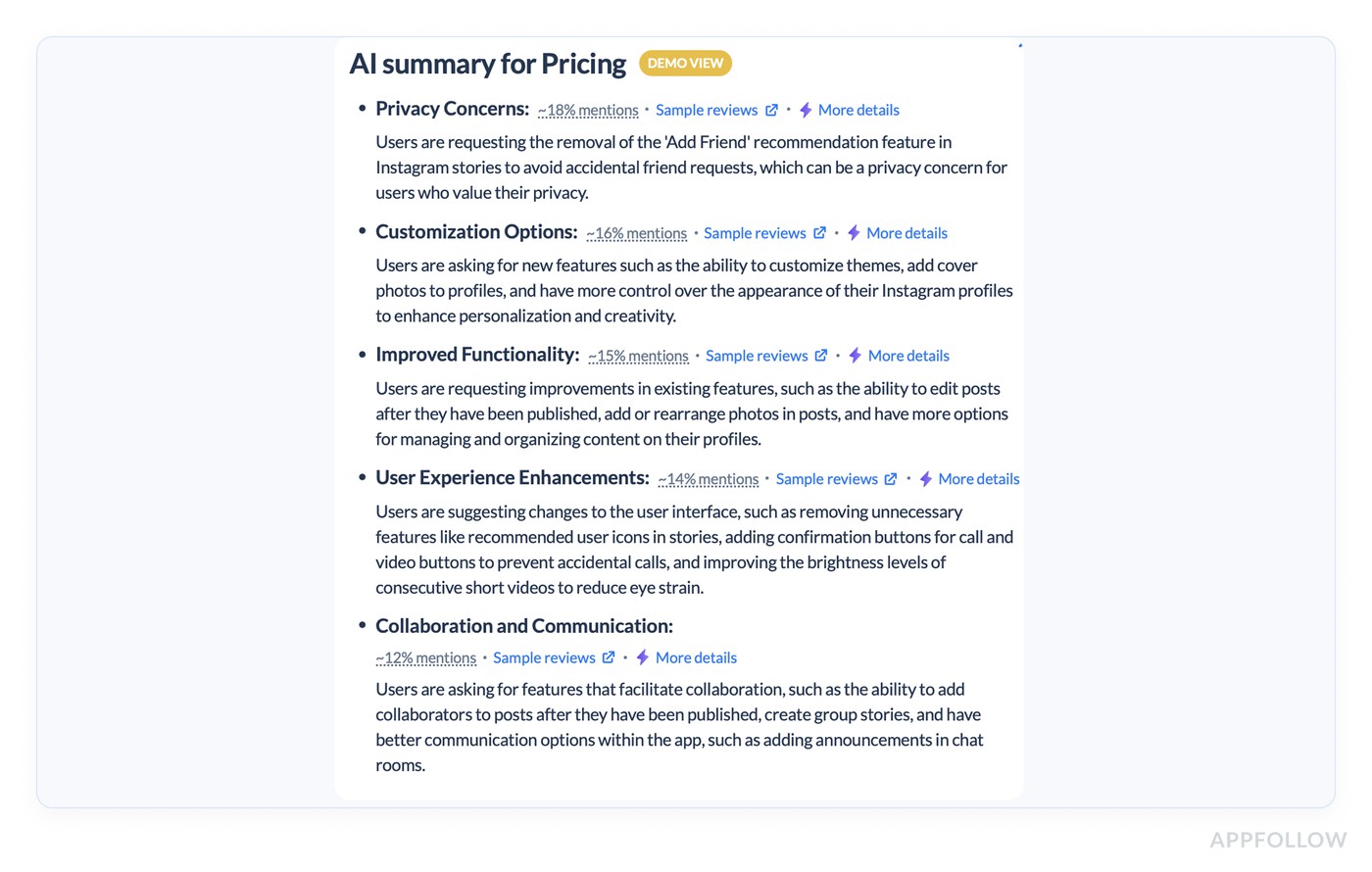
Separate the tag people talk about most from the tags that actually drag sentiment down.
Meanwhile, the real pain is concentrated in adjacent tags: Refund Request has 27 reviews with 11% sentiment and 2.37 avg rating (reply rate 96%), and Ads has 10 reviews with 11% sentiment and 2.60 avg rating (reply rate 100%).
That contrast is the insight. Pricing mentions include plenty of neutral or even positive “worth it” talk, while refunds and ads are the emotional sinkholes.
Process looked like this:
- They filtered to Monetization, then compared tags side by side to isolate what’s damaging sentiment.
- Next, they segmented the Pricing cluster by language and market to see whether “hidden prices” was global while “energy paywall” spiked in specific regions.
- Only after that did they standardize responses. Refund-related reviews got a tight billing flow and next-step instructions. Pricing transparency complaints got a single clear explanation of where pricing lives and why. Product got a ranked list of recurring friction themes, phrased in user language, with the tag volumes as receipts.
That’s a customer sentiment analysis example that leads to action. The win condition is visible in the trendline: after changes ship, teams watch whether Refund Request share shrinks, Pricing stays stable or improves, and the overall sentiment score keeps climbing instead of snapping back.
Example 4: Onboarding Experience in different countries
Sentiment label | Negative, varies by market |
Topic | Onboarding: payment issues, “Doesn’t Work”, UI issues |
Owner | Product, Support for triage details, Marketing for market-specific copy |
Next action | Take the top country + top tag combo, confirm the failure mode, fix, then check that sentiment lifts in that market |
When onboarding breaks, it doesn’t always break evenly. One market screams “can’t pay.” Another says “won’t open.” If you average it all together, you’ll miss the point and ship the wrong fix.
So AppFollow users start by filtering reviews to the Onboarding category, then open the Worldwide summary → By country view to see where the first-time experience is failing hardest.
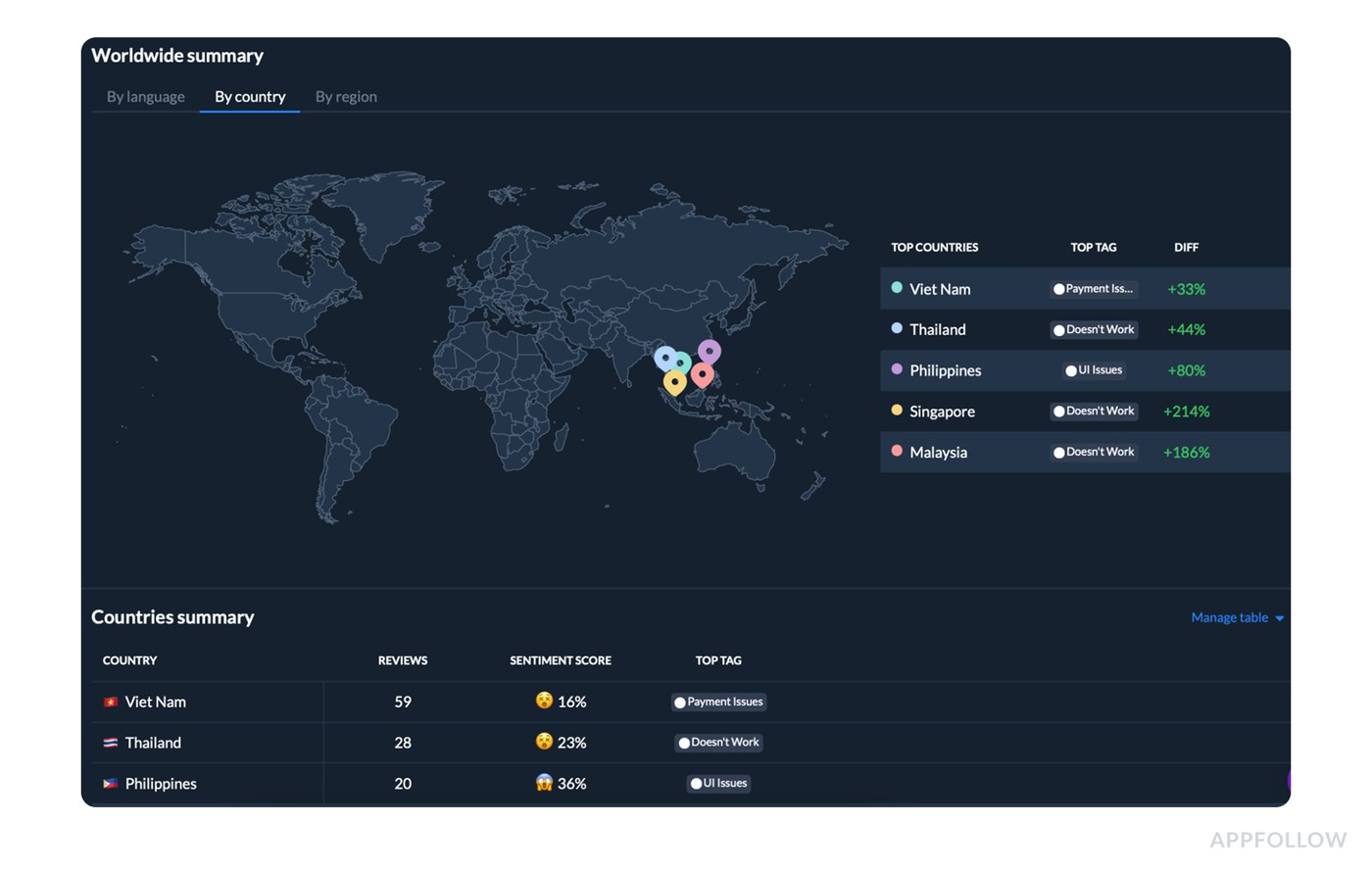
Spot which market’s onboarding is failing and why, before you ship one global fix. Test it live.
- Viet Nam leads with 59 reviews and a 16% sentiment score, with Payment Issues as the top tag.
- Thailand follows with 28 reviews, 23% sentiment, and Doesn’t Work as the top tag.
- The Philippines shows 20 reviews, 36% sentiment, and UI Issues on top.
On the “what changed” side, the spikes are loud:
- Singapore has Doesn’t Work +214%,
- Malaysia +186%,
- Philippines UI Issues +80%,
- Thailand Doesn’t Work +44%,
- Viet Nam Payment Issues +33%.
That’s the dashboard version of a summary: users are failing to get started, but the “why” differs by country. In Viet Nam it looks like payment friction during setup. In Thailand, Singapore, and Malaysia it looks like app stability or load failures early in the flow. In the Philippines, onboarding pain reads like interface confusion and control issues.
Here’s a customer sentiment analysis example that teams use: they don’t pull 100 reviews into a spreadsheet. They take the top country + top tag combo, click into the cluster, and confirm the repeating failure mode in minutes.
Then the process turns into execution:
- Product gets a country-tagged incident brief, not a vague “onboarding is bad.”
- Support updates reply macros by tag to collect the missing triage details (payment provider, device, OS, version) and to stop sending generic apologies.
- Marketing rewrites the store listing or paywall copy only in the markets where payment confusion is driving the sentiment.
After shipping fixes, they come back to the same view and look for two signals: sentiment lifts in the affected countries, and the top onboarding tag stops spiking. If Singapore’s “Doesn’t Work” doesn’t drop after the hotfix, the release didn’t land, or the root cause is still active. To keep watching those country and version shifts over time, monitor app performance and sentiment trends in one place.
cta_free_trial_purple
Social Media customer sentiment analysis examples
Social media is where sentiment gets loud, fast, and quite useful. People don’t write polite bug reports on X or TikTok comments. They post a screen recording with “why is this happening” energy, or they drop a one-liner that sounds positive until you catch the sarcasm. That’s why the analysis matters more than the quote.
In this section, we’re pulling the brightest real-world customer sentiment analysis examples from social mentions and breaking down how teams read them at scale. You’ll see how to separate hype from true product love, how to spot churn risk hiding inside “lol,” and how to tag emotion in a way that leads to action.
Not “negative.” More like frustration plus urgency, or delight plus a feature request.
The goal is simple. Turn social noise into a clean workflow: cluster by theme, track shifts over time, route the right issues to Support vs. Product, then measure whether the next release changes what people say.
Post | Sentiment | Owner | Action |
X: “me running to the door when the order arrives” | Positive | Social / Marketing | Engage or amplify. No ticket needed. |
X: wrong item delivered, dietary restriction, delivery partners tagged | Negative, urgent, trust risk | Support | Reply publicly fast, move to DMs, fix, post a resolution update. |
X: “Great job on the outage, thanks ????” | Negative (sarcasm) | Support + Comms | Never count as positive. Link to the incident topic and track the thread. |
Reddit: “Ryanair defeated me” plus workaround comments | Negative, resignation | CX + Ops + Marketing | Log as policy friction, update help copy, set expectations up front. |
App community: “The new dashboard is confusing” (23 upvotes) | Negative, collective | Product | Treat upvotes as volume. Check if the top workaround should be built in. |
Example 5: Customer service on X
On X, brand mentions look like a random feed until you run them through a listening tool. Then it becomes a queue with patterns.
For example, here is the variety of feedback you see on X about Dominos Pizza:
- One post is pure love: “me running to the door when Dominos arrives.”
- Another is a loyalty flex: “They’ll never make me hate u.”
- Then you get the sharp stuff. A serious complaint about an order mix-up, plus dietary restrictions and multiple tags to escalate.
- Sprinkle in jokes about hiring agents, a vague “Dominos are falling,” and a pineapple meme reply.
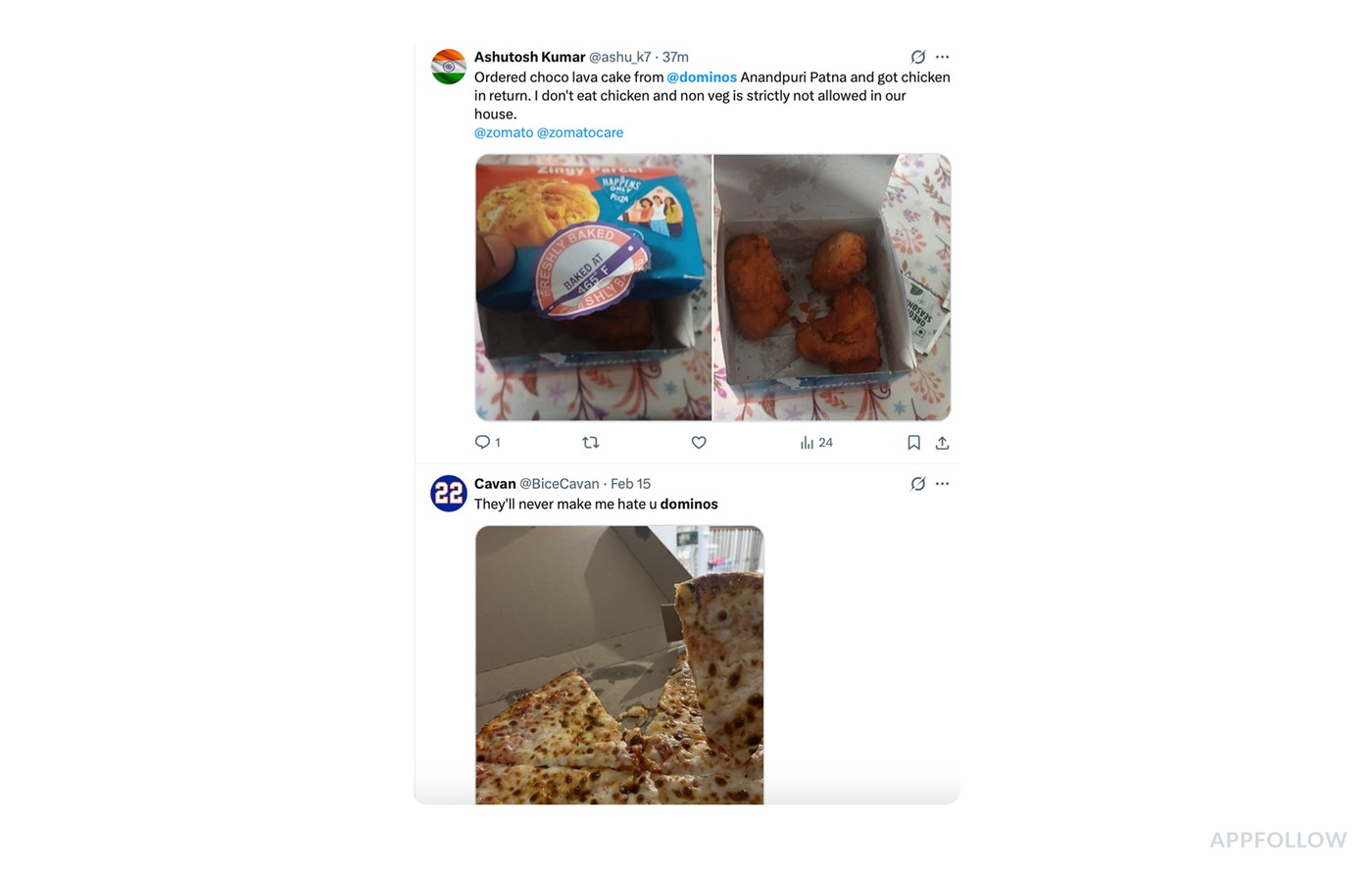
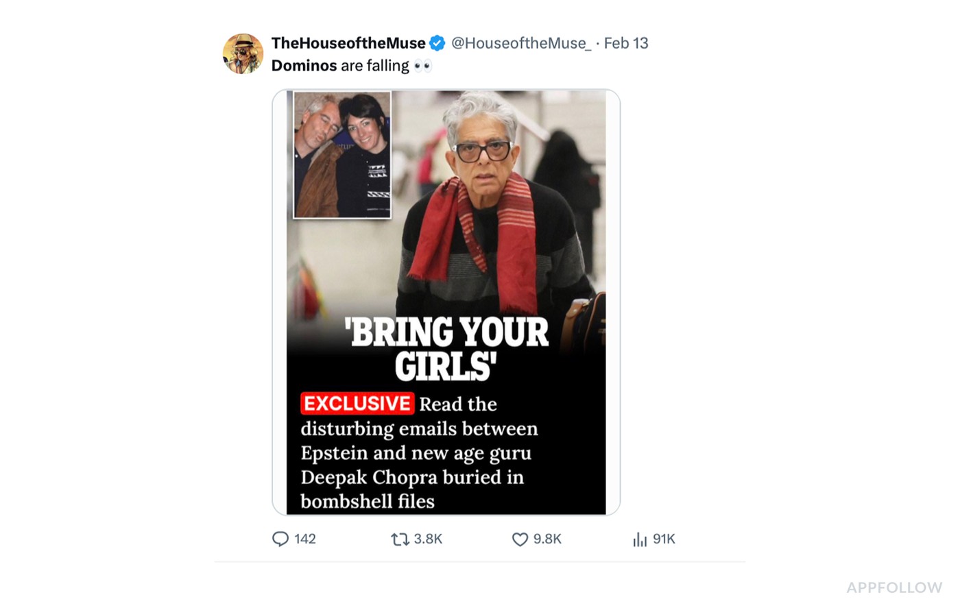
One feed, five intents: praise, loyalty, complaint, joke, and noise. Sort them before you reply.
If you try to handle this manually, you’ll spend your day reacting to the loudest tweet and miss what’s trending.
So support teams use social listening + CX tooling to do this at scale. The system does three jobs that humans can’t do fast enough:
- It collects every mention in one stream, across accounts and keywords.
- It classifies posts by intent and sentiment, usually with rules plus NLP: complaint vs praise vs question vs joke.
- It tracks trends over time, so you see spikes by topic, not just individual posts.
That’s where the analysis starts. The team filters to the “complaint” cluster and spots the high-risk thread: wrong item delivered, non-veg in a household that forbids it, public escalation by tagging delivery partners.
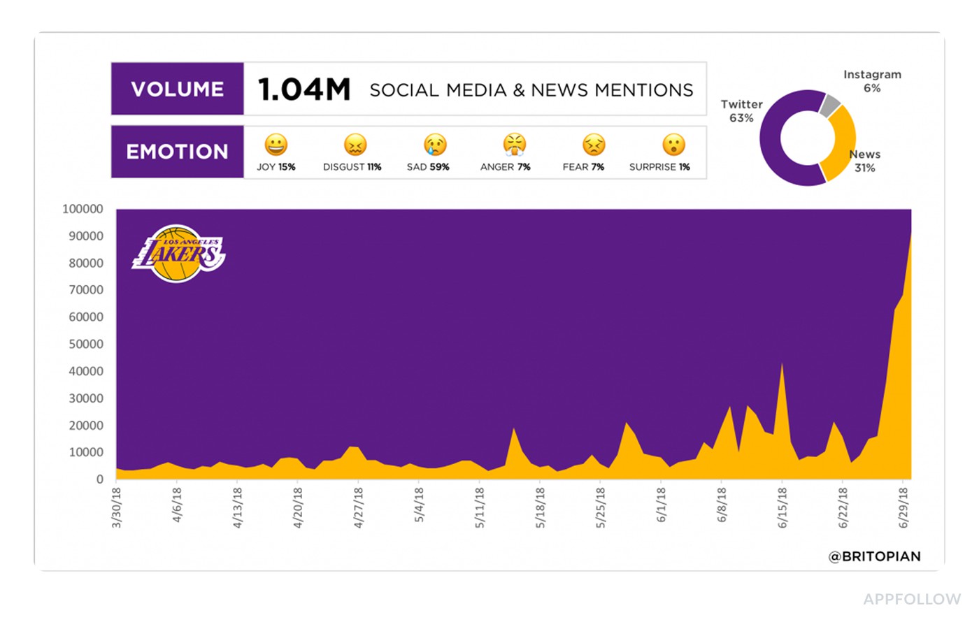
Example of the Brandwatch dashboard: catch negative spikes before they turn into a pile-on. Image source.
The tool surfaces it because negative sentiment is spiking and the post includes keywords tied to safety and trust. It gets routed to a human fast, often as a ticket with priority rules.
Then the workflow becomes measurable. Support replies publicly within the tool, moves to DMs for order details, fixes it, and posts a resolution update. The platform keeps monitoring the thread and the wider “order issue” topic. You literally see the curve change: right after the response, the conversation shifts from angry pile-on potential to neutral or resolved. That’s your before/after, not a nice story someone tells in a retro.
Example 6: Reddit community feedback
Reddit is where sentiment stops being a one-liner and turns into a whole story. Take this thread.
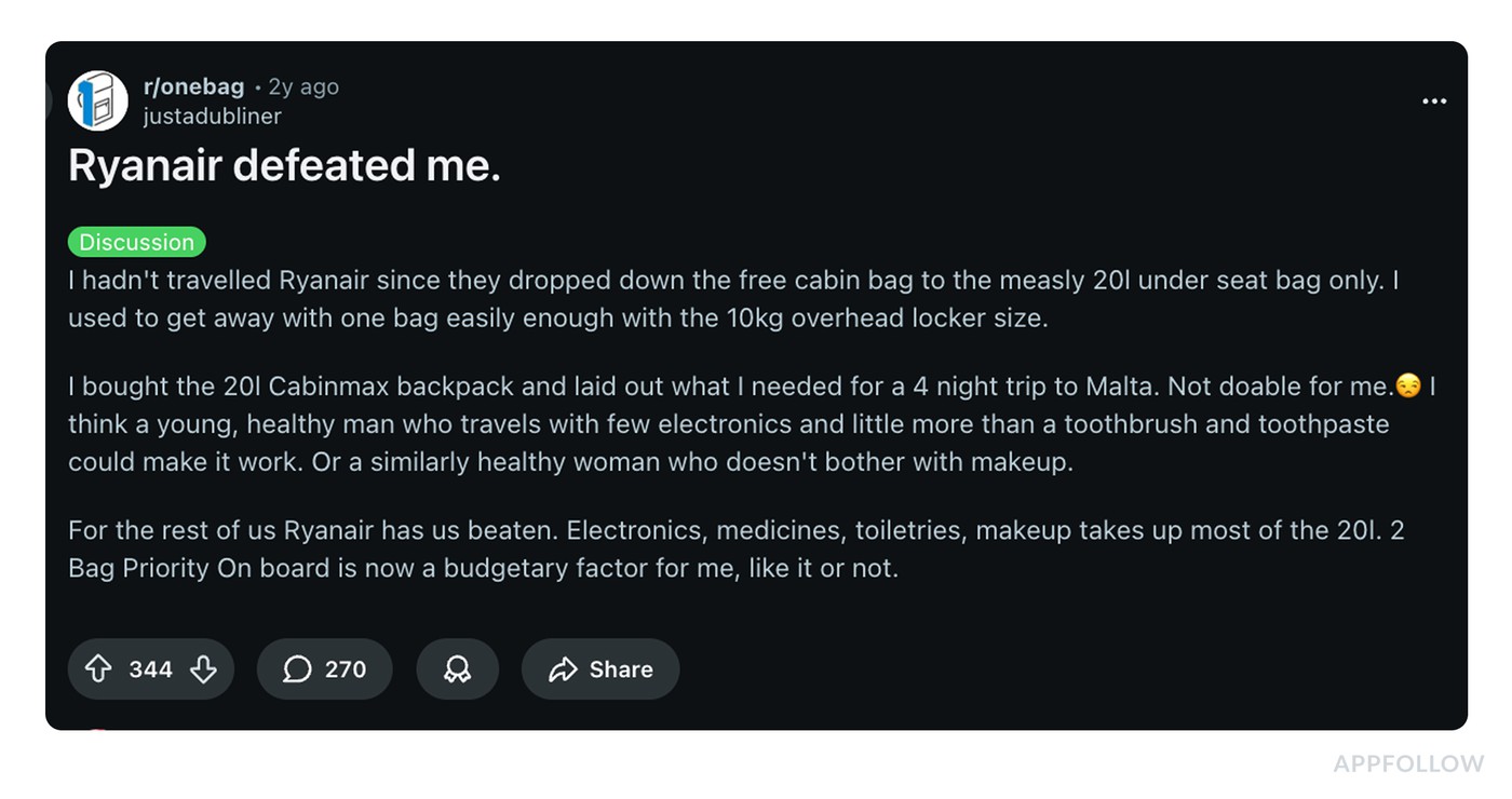
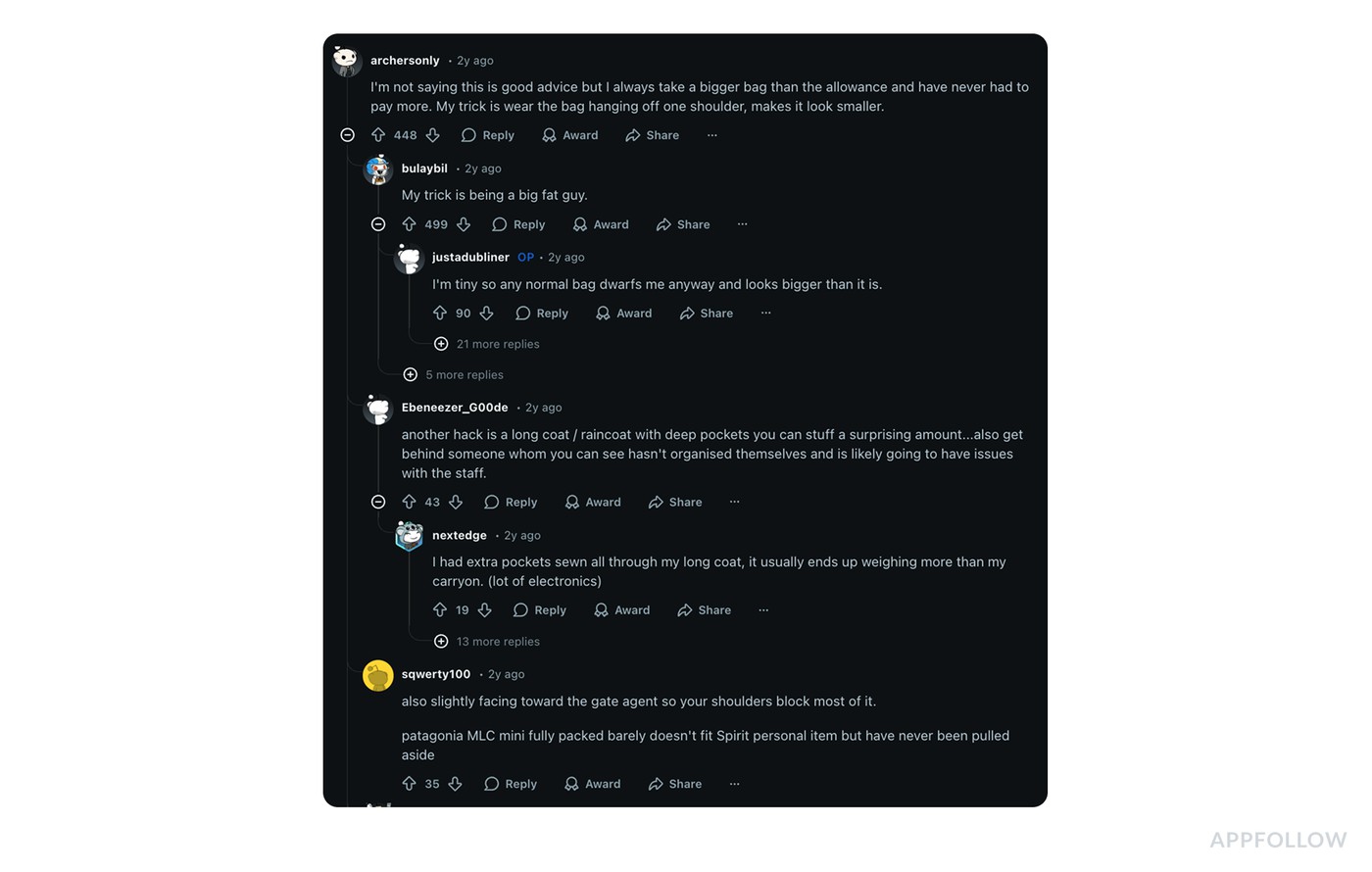
Read the whole thread, not just the post: the comments show how customers work around the policy. Image source.
The headline “Ryanair defeated me” is really a long-form narrative about a policy change, an attempted workaround, and the final emotional outcome: resignation. Then the comments pile in with “here’s how I beat the system” hacks, jokes, and extra context.
This is a customer sentiment analysis example brands can’t handle by skimming. Support teams usually pull Reddit into a listening workflow using tools like Brandwatch, Talkwalker, Sprinklr, Meltwater, Sprout Social, plus native Reddit search and saved queries for brand + policy keywords (baggage size, “one bag,” “priority,” “overhead,” “fees”).
The goal is to read the thread as a cluster and measure what’s spreading.
What they extract from this kind of discussion:
- Theme: “I used to get value, now I feel forced into paying for priority.” That’s fairness sentiment, not a feature request.
- Emotion arc: frustration → bargaining (trying the 20L bag) → defeat/acceptance. That arc matters because it predicts behavior. People don’t rage-quit. They quietly pay the fee or quietly avoid you.
- Workarounds: commenters share hacks like “wear the bag differently,” “use a coat with deep pockets,” “hide behind disorganized passengers.” That’s not noise. It tells you customers are actively problem-solving around your constraints, which usually means the policy is painful but demand is still there.
- Who’s affected: the OP explicitly calls out that the rule is easier for “young, healthy” minimalists, harder for everyone carrying meds, toiletries, electronics. That’s segmentation insight you can use in messaging.
Then the action loop kicks in: CX logs this as a recurring “policy friction” topic, support updates macros and help-center copy with the exact confusion points people keep repeating, and product or Ops gets the signal; if the top workaround is “how to sneak a bigger bag,” your rule is generating adversarial behavior, which usually increases gate conflict and hurts staff experience too. Marketing adjusts expectations up front, because surprise is what turns “I paid” into “you defeated me.”
cta_free_trial_yellow
Support ticket sentiment analysis example
Someone’s locked out, charged twice, panicking about data, or trying to cancel while they’re half-asleep on their phone.
That’s why a simple positive or negative label can be misleading.
- A ticket can start angry and end delighted in ten minutes.
- A chat can sound polite while the customer is clearly stuck.
- A call transcript can look neutral until you catch the same phrase repeated three times, which is usually frustration with a customer-service voice.
The job of customer support sentiment analysis is to track that emotional journey at scale and tie it to something actionable. Which issues create anxiety. Which workflows trigger rage. Which agents consistently de-escalate. Where a “resolved” ticket still leaves the customer annoyed, so churn risk stays high.
Example 7: Support ticket categorization
Sentiment label | Negative, urgent |
Topic | Billing, login, cancellation, bugs |
Owner | Support lead / Support Ops, Product for recurring clusters |
Next action | Batch-categorize tickets weekly, flag urgent + negative, adjust routing and SLAs per topic |
Support ticket sentiment isn’t about reading every message like a therapist. Brands don’t have time for that. The way it works is batch analysis. Pick a period, pull the tickets, let the system cluster what happened, then use the patterns to tighten your workflow.
Here’s a clean customer sentiment analysis example of what “urgent negative sentiment flagging” looks like in a real queue:
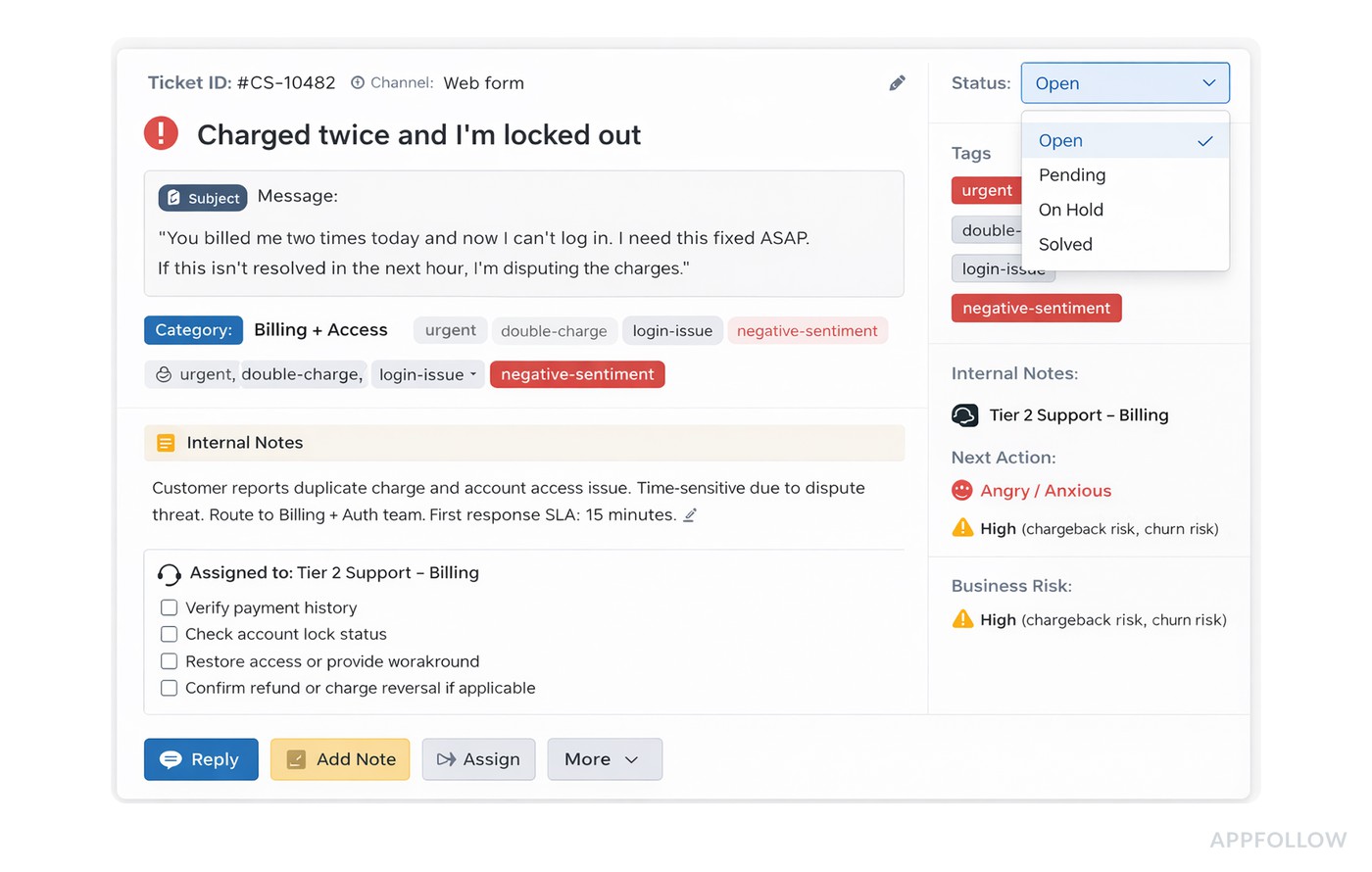
Flag urgent + negative tickets first: they are the ones that turn into refunds, churn, and public complaints.
One ticket like that is annoying. Fifty in a week is a trend with revenue risk.
So support teams run categorization in tools they already live in, usually Zendesk, Intercom, Freshdesk, Salesforce Service Cloud, Help Scout, sometimes with analytics layers like Gong (for calls), Chorus, or a BI setup pulling ticket exports into a dashboard. The sentiment layer can come from built-in AI features, add-ons, or an NLP pipeline that scores text and tags it by intent.
The analysis flow is simple and fast:
- They pull a batch for the last 7 or 30 days, then categorize tickets by topic (billing, login, cancellation, bugs) and emotion (angry, anxious, frustrated, neutral).
- Next, they filter for “urgent + negative,” usually defined by language signals like ASAP, dispute, chargeback, cancel, lawsuit, scam, never again plus a low sentiment score.
That’s how they find the tickets that can turn into churn, refunds, and public complaints.
The insights are what you’d expect, but sharper because they’re quantified. Maybe 60% of urgent-negative tickets are billing-related and spike right after a pricing change. Maybe login issues have lower volume but higher urgency because they block access.
Sometimes you discover the biggest driver is lag. The sentiment tanks when the first response time crosses a threshold.
How do they use this knowledge?
- Billing gets a dedicated route and faster SLA. Login issues get a stricter escalation path and a “known issue” banner if it’s widespread.
- Agents get macros that de-escalate without sounding robotic.
- Product receives a weekly summary with the top negative clusters and example language customers keep repeating.
The point of doing it in batches is momentum. You’re not trying to psychoanalyze every ticket.
Customer service sentiment analysis examples
Support sentiment can flip inside the same conversation.
I would not classify a ticket from the final line alone. That is how teams mark “Thanks” as positive and miss the fact that the customer waited three days, repeated the same screenshot twice, and still does not trust the fix.
Use the whole support path.
Ticket pattern | Sentiment label | What it really means | Owner | What to check |
“This is the third time I’m asking. Nothing works.” | Negative, urgent | The customer is not only blocked. They are tired of the process. | Support lead | Repeat contacts, SLA breach, macro quality, open bug link. |
“Thanks, that helped. But why did it happen?” | Mixed, unresolved | The task is fixed, but confidence is still low. | Support + Product | Root cause explanation, release notes, help center coverage. |
“Can you explain the new price before I renew?” | Neutral, anxious | No anger yet. Bad wording can create it. | Support + Marketing | Pricing page, paywall copy, plan-change emails. |
“The agent was great, but the app keeps crashing.” | Positive service, negative product | Support performed well. Product still owns the pain. | Product | Crash reports, app version, device, country, recent release. |
“I already sent logs. Why are you asking again?” | Negative, process failure | The customer sees your workflow, not your internal tools. | Support Ops | Handoff notes, CRM fields, escalation process. |
For app teams, the best view is not “ticket sentiment” alone. It is sentiment by topic, app version, country, language, rating, and resolution status.
That view changes the conversation. Support may be doing a good job while app sentiment drops because one release keeps creating new tickets. Product may ship the fix, but sentiment stays negative because users never saw the workaround. Marketing may think pricing is clear, while support sees the same subscription question every day.
That is the point of customer service sentiment analysis: not to grade feelings, but to find where the experience keeps breaking.
How to understand customer emotions
Before you label anything, decide what “emotion” means in your world. Keep it practical. An emotion wheel is great, but you don’t need 48 nuanced feelings to run a weekly feedback loop. Most teams do fine with a short set like: frustrated, delighted, confused, anxious, satisfied, angry, neutral.
Now map those to real signals across channels. Quick customer emotions examples you’ll recognize instantly:
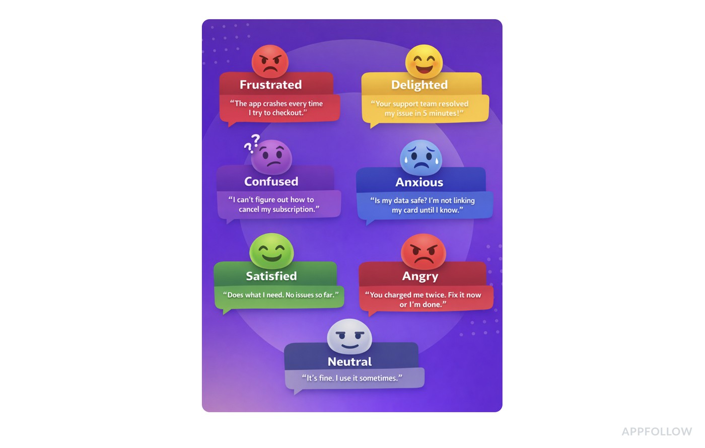
One shared emotion set across channels makes trends comparable and routing predictable.
When everyone uses the same labels, trends become real and routing becomes easy.
Determine emotions manual reading vs. system-assisted tagging
Most brands start by doing it the human way: read samples, agree on definitions, calibrate as a team. That’s still valuable because you catch context. Sarcasm. Cultural phrasing. The “I love it but…” reviews look positive until you see the blocker.
Then the scale problem hits. Hundreds of reviews, 40% in other languages, and suddenly your “weekly sentiment check” becomes a half-day meeting.
This is where systems help. Review management tools like AppFollow can surface emotion at a glance by showing it as an emoji plus a percentage score, so you can scan clusters without reading every line, then click into samples only where it’s worth it. If you’re still choosing a stack, compare customer sentiment analysis tools first.
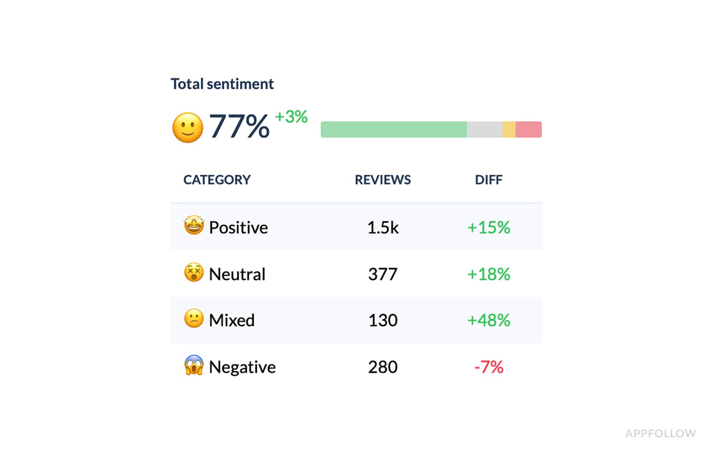
Scan emotion by cluster, then read samples only where the score tells you to look.
You still keep a human in the loop. You just stop doing the boring parts by hand.
How to classify customer messages into satisfied, neutral, dissatisfied, and mixed
Do not start with the emotional word. Start with the customer’s job.
A message is satisfied when the user completed the job and shows confidence. “The refund arrived, thanks for fixing this” is satisfied. No blocker. No extra effort. Done.
A message is neutral when the user needs information but has not shown frustration yet. “Is dark mode available on Android?” is neutral. The opportunity is still open. A clear answer keeps it that way.
A message is dissatisfied when the job failed, effort increased, or trust dropped. “I still can’t log in after reinstalling” is not just a login complaint. It signals repeated effort and a possible churn moment.
Mixed sentiment is where teams usually lose the useful signal. “Great app, but the new ads make it hard to finish a lesson” should not be averaged into neutral. Split it into two tags: positive product value and negative monetization friction.
Here is the rule I’d use:
- If the goal is done and confidence is high, mark satisfied.
- If the user needs information, mark neutral and route the answer.
- If the job failed or effort increased, mark dissatisfied.
- If praise and friction sit in the same message, mark mixed and split the themes.
- If the message mentions safety, payment, login, data loss, or repeated support contact, add urgency.
The last step matters. Mixed sentiment often hides the best roadmap signals because loyal users explain exactly what would make them stay.
How app teams run the sentiment workflow in AppFollow
Every example above follows the same loop. Here is what it looks like when your feedback is App Store and Google Play reviews:
- Detect. Watch the sentiment score, rating, and review volume for a sudden shift after a release, a pricing change, or a new market launch.
- Cluster. Open the semantic tags and find the one driving the change by volume and tag share, not by the loudest review.
- Check context. Slice the tag by app version, country, language, and rating to see whether the issue is global or local.
- Assign an owner. Bugs go to Product, billing to Support and Monetization, confusing copy to Marketing or ASO.
- Reply. Use one consistent response per tag that acknowledges the issue and collects the triage details you still need.
- Measure. After the fix ships, check that the tag share drops and sentiment climbs. If it doesn’t, the fix didn’t land.
If you want that loop built into your review triage, see how the app review sentiment analysis workflow works in AppFollow, or start a free trial and run your next triage on actual trends, not gut feel.
cta_free_trial_purple
FAQs
What is an example of customer sentiment?
A customer sentiment example is a message that shows how a customer feels about a specific experience, such as “Love the app, but the latest update broke exports.” The useful label is mixed: positive about the product, negative about the bug.
What is a positive sentiment example?
“The support team fixed my issue fast, and the app works again” is positive sentiment because the goal was completed and the customer expresses relief or satisfaction.
What is a negative sentiment example?
“I still can’t log in after three tickets” is negative sentiment because the customer’s job failed and the effort repeated.
What is a neutral sentiment example?
“Is dark mode available on Android?” is neutral sentiment. The customer needs information, but there is no clear frustration yet.
What is mixed sentiment?
Mixed sentiment appears when one message contains both praise and friction, such as “Great app, but the ads make lessons hard to finish.” Split the tags instead of averaging them.
What is an example of a sentiment analysis?
A solid customer sentiment analysis example is when you take 500 app reviews from the last 30 days, tag them by theme (pricing, crashes, onboarding), then measure how sentiment and star rating shift per tag. If “Doesn’t Work” is 23% of mentions and tracks the lowest sentiment, you’ve found the real driver behind the rating drop.
How do you use customer sentiment analysis in app reviews?
Group app reviews by topic, rating, sentiment, country, language, and app version. Then route each cluster to the team that can act on it and measure whether the tag share drops after the fix.
Can ChatGPT do sentiment analysis?
Yes, ChatGPT can help draft, classify, and summarize sentiment from text, but it’s best used as an assistant, not your single source of truth. For customer service sentiment analysis examples, it can label tickets as frustrated vs. anxious, flag urgency language, and cluster themes. In production, teams usually combine that with your support data, tagging rules, and QA checks to keep results consistent.
What is a real life example of sentiment analysis?
A real-world use case is social listening during a product change. You track posts and comments, then map emotions like frustrated, confused, or delighted to what people are reacting to. Those customer emotions examples become actionable when you can say, “Confusion spiked after the pricing update,” and then fix the messaging or flow.