ASO Screenshots in 2026: Best Practices, Specs & App Store Optimization Images That Convert

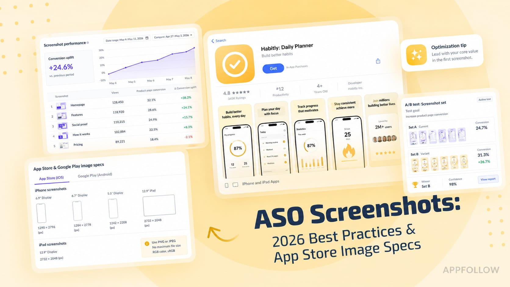
Table of Content:
- Key insights: what high-converting screenshots have in common
- What ASO screenshots are and why they decide your install
- Native platform requirements
- ASO screenshots best practices, step by step
- App store optimization screenshots by app vertical
- 3 ASO screenshot mistakes killing your conversion
- A measurement framework: from impression to install
- How AppFollow helps you ship better ASO screenshots
- Conclusion
About half of users decide whether to keep scrolling or install based on the first three frames they see in a store listing. That makes your ASO screenshots less of a design exercise and more of a conversion system. The problem is that most teams still treat app store optimization screenshots as static assets rather than as testing surfaces tied to user intent, category behavior, and localization.
I’ve watched strong apps lose installs because the visuals looked polished but failed to answer the user’s first question fast enough. At AppFollow, we analyze creative performance across thousands of apps every month, and the same patterns keep winning. The best-performing app store optimization images usually communicate value in under two seconds.
This playbook breaks down the ASO screenshots best practices shaping iOS and Google Play in 2026. If you want the broader picture beyond creative assets, AppFollow’s ASO resources cover the full app store optimization workflow.
Key insights: what high-converting screenshots have in common
The strongest screenshot sets tend to follow the same behavioral patterns, even across completely different categories. Users scan fast, decide emotionally, then justify logically afterward. That changes how effective creatives are built.
After reviewing more than 1,200 top-grossing app listings on iOS in the past year, the pattern is brutally consistent: the first three frames carry roughly 70% of the conversion weight. If your first screenshot doesn't communicate the core promise of the app in under one second, the rest of the listing is just polish on a leaking funnel.
— Yaroslav Rudnitskiy, Senior Professional Services Manager - ASO guru
AppFollow's review of 1,200 top-grossing apps shows a few patterns repeating consistently across high-performing ASO screenshots:
- Frame one drives attention. Frames two and three explain value or reduce doubt. Later frames support retention inside the listing.
- Users scan app store optimization images in an F-pattern. Short captions, strong contrast ratio, and clear reading order outperform crowded layouts. The squint test remains one of the fastest ways to spot weak hierarchy and unreadable messaging.
- Portrait layouts usually win for utility and finance apps because they mirror real usage. Landscape performs better in gaming and streaming where immersion matters more.
- Lifestyle creative works best when emotion drives the install. UI-only screenshots convert better when clarity and trust matter first.
- The best ASO screenshots come from disciplined testing, not visual trends alone.
What ASO screenshots are and why they decide your install
ASO screenshots are the visual proof behind your app’s promise. They sit between discovery and install, shaping the moment a user decides whether your product feels worth tapping. In the App Store and Google Play, screenshots act like a compressed landing page. Every caption, crop, and sequence influences perception fast.
ASO screenshots vs. app preview videos
Many teams still treat video as the main creative asset. In practice, screenshots usually carry more weight because they load instantly and stay visible longer.
I’ve seen store listings where the conversion rate improved only after the screenshot order changed, even though the preview video stayed untouched. Users often decide directly from the search results card or product page without pressing play.
On Google Play, the hero frame from the video often becomes a static thumbnail anyway. If that frame is weak, performance drops before motion even starts.
The simplest way I think about it is this: screenshots sell the promise, while videos explain the experience.
ASO screenshots | App preview videos | |
Primary job | Communicate value | Show product flow |
User behavior | Scanned | Watched |
Visibility | Always visible | Often requires a tap |
Strength | Fast message delivery | Richer product context |
Biggest risk | Weak first frames | Weak hero frame |
How screenshots influence CR and Search Ads CTR
Strong screenshot sets usually improve tap-through rate before they improve installs. The first frame earns the click. The rest of the sequence closes the install.
Search Ads make this obvious because creatives appear beside direct competitors. A screenshot saying “AI budget planner” tends to outperform “Track expenses” because specificity grabs attention faster. Clarity beats polish more often than most teams expect. In one public Google Play experiment, adding stronger framing and clearer value communication to screenshots increased store performance over plain interface captures.
Conversion rate also improves when screenshot messaging matches search intent. Someone searching for an ADHD habit tracker responds differently than someone casually browsing productivity apps.
The first three frames: what users see without scrolling
Most users never reach screenshot four.
That changes how I approach ASO screenshots during audits. The first three frames need to work like a narrative, not a gallery. Frame one communicates the core promise. Frame two shapes expectation around the experience. Frame three reinforces value through proof, utility, or differentiation.
Weak listings waste those slots on generic dashboards and vague slogans. Strong ones show consequence instead; save money faster! Finish workouts consistently! The best-performing sequences communicate a before-and-after state before the user even scrolls.
Native platform requirements
App store optimization screenshots fail surprisingly often because of technical details. A cropped headline or wrong export ratio can hurt conversion before the user even reads the message. Platform requirements shape how creatives appear in-store.
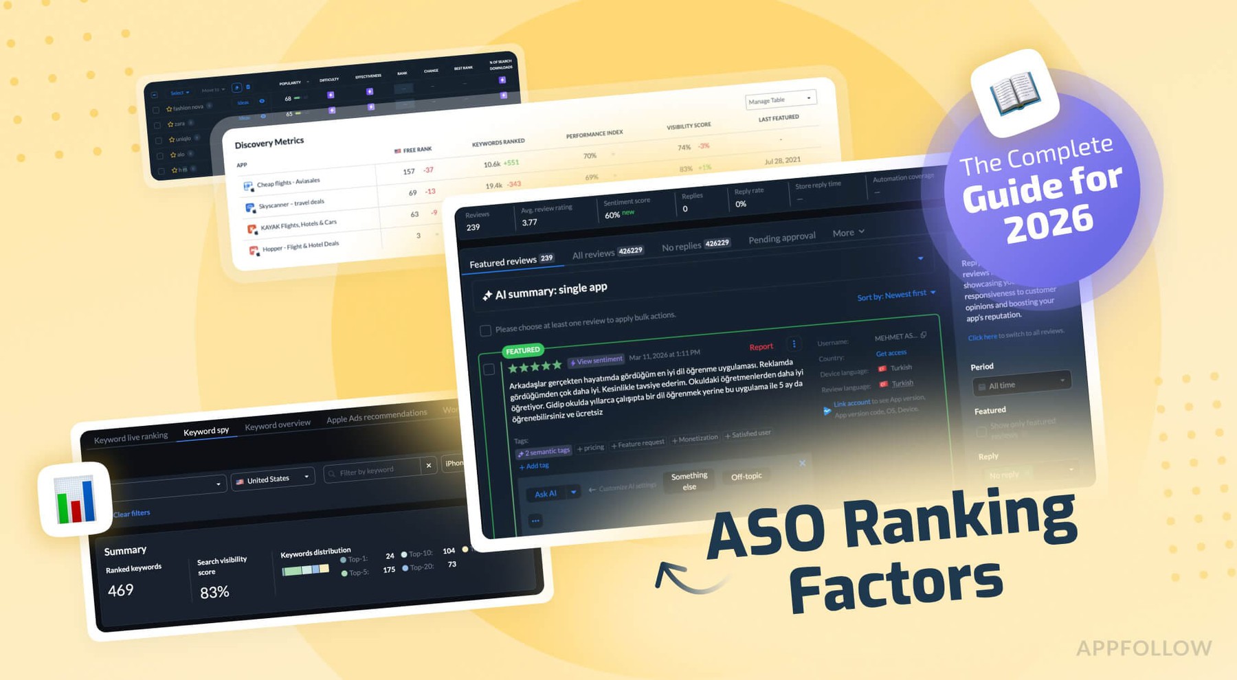
Screenshots are one part of a larger optimization system. App metadata, ratings, localization, and keyword strategy also influence discoverability. AppFollow’s guide to ASO ranking factors breaks down what influences visibility beyond creative assets.
Apple App Store specs
For iPhone listings, current App Store specs include 1320×2868 px for 6.9" displays and 1290×2796 px for 6.7". Apple also maintains separate screenshot requirements across device families, which means iPad assets should not be treated as stretched phone versions. See Apple’s full screenshot specifications for the complete device matrix.
I usually design the first frame for small-screen readability first. Tiny text breaks quickly inside App Store previews. Oversized UI crops create another problem because the value proposition disappears. Screens that looked balanced in Figma can feel cramped once they reach production.
Google Play specs
Google Play allows more layout flexibility, but device fragmentation makes testing harder. Phone screenshots still drive most traffic, though Google maintains separate screenshot assets for phones, 7" tablets, and 10" tablets because those storefront experiences can appear across different Android surfaces and device contexts. Check Play Console previews carefully because layouts and cropping can vary across placements.
Localization, Custom Product Pages and Custom Store Listings
Localized creatives outperform translated creatives in most categories because user motivation changes by market. The same headline rarely works everywhere.
Notice the differences in imagery, tone, and value framing. The goal is to match local expectations and motivations.
Custom Product Pages on iOS and Custom Store Listings on Google Play make testing easier now. I’ve seen ASO screenshots built for paid campaigns outperform default listings simply because the message matched ad intent more closely. Someone clicking a budgeting app ad in Brazil may respond to savings language, while German users react more strongly to structure and planning.
ASO screenshots best practices, step by step
Most teams lose installs because the sequence lacks strategy. Strong ASO screenshots guide attention frame by frame. Weak ones throw features at the user and hope something sticks.
Step 1: Map screenshots to user intent and search keywords
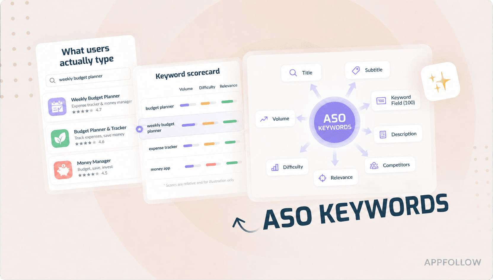
I start with the search itself. Someone searching “meal planner for families” expects a different visual story than someone searching “macro tracker.” The screenshot sequence should reflect that intent immediately. If you need a deeper breakdown of keyword research and search behavior, check out AppFollow’s guide to ASO keywords.
High-performing app store optimization images usually align one core keyword cluster with one user outcome. That does not mean stuffing keywords into captions. It means matching visual emphasis to the reason the user searched in the first place. If the traffic comes from productivity terms, show saved time first. If it comes from finance queries, show clarity and control before features.
Step 2: Storyboard a 5-frame narrative
The best ASO screenshots work like a tight landing page. Every frame answers a specific question.
Frame one communicates the core promise. Frames two and three reinforce value through use cases or outcomes. Later screenshots expand utility, reduce friction, and add proof or trust signals.
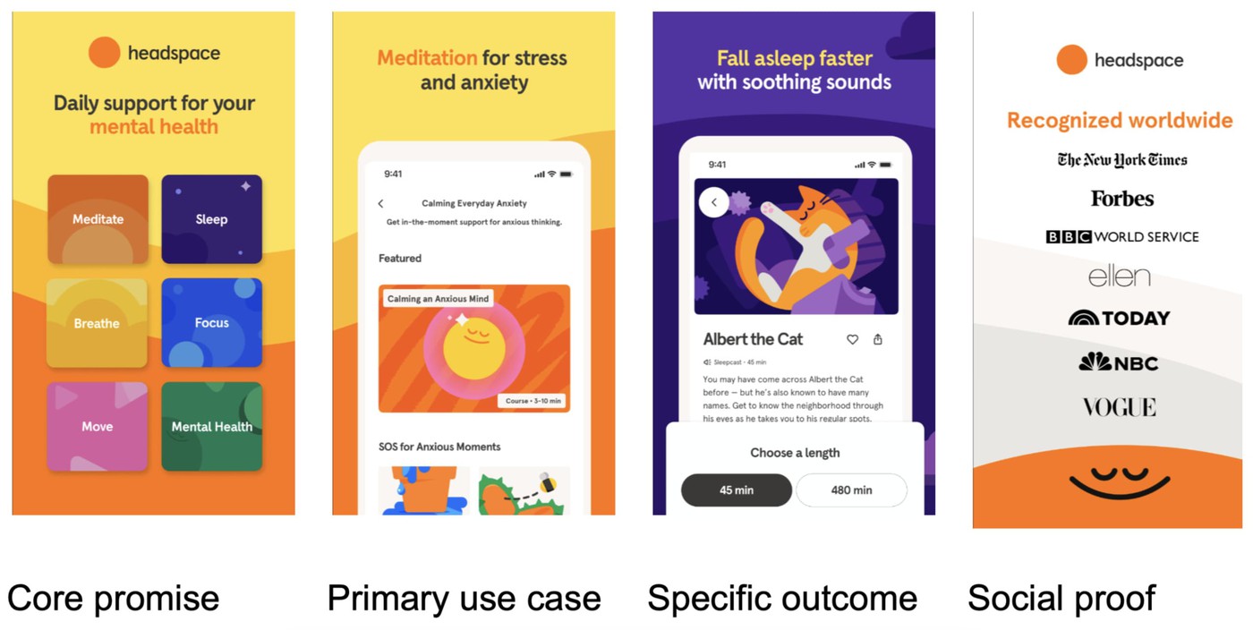
Headspace moves from a broad value proposition to specific use cases, feature depth, and social proof as users continue scrolling.
I usually sketch the sequence in plain text before opening design tools. One message per frame keeps teams focused. The moment a screenshot tries to explain three ideas at once, the narrative breaks, and scanning behavior takes over.
Step 3: Captions that pass the squint test
Most users never read small screenshot text. They scan shape, contrast, and a few large words.
That is why concise captions outperform detailed explanations so often. Keep text under five words when possible. Design for roughly 60pt or larger on export. Then do the squint test.
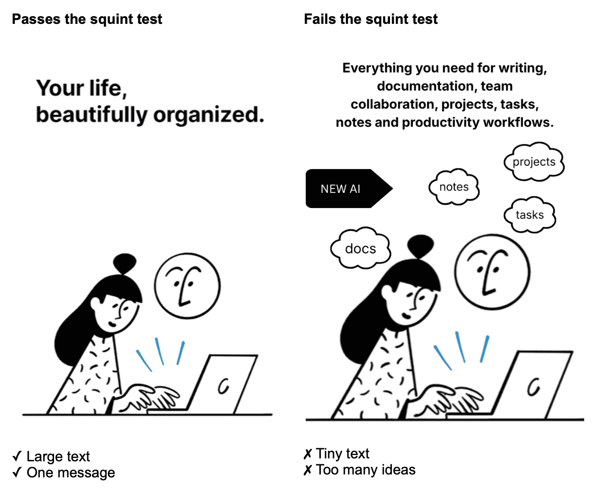
If the message disappears when you zoom out, it will disappear in the store too.
Generic phrases like “Everything in one app” rarely convert well because they communicate nothing concrete. Strong captions survive at thumbnail size and tell users exactly what changes after install.
Step 4 — A/B test creatives with statistical rigor
A surprising number of store listing experiments fail before the test even starts. Too many variants, no clear hypothesis, and tiny sample sizes.
The mistake we see most often is the bad testing hygiene. Teams launch four-variant tests with 5,000 sessions per arm and call a 3% lift a winner. With ASO screenshots, you need a clear hypothesis per frame, a single primary metric (conversion to install), and enough volume to detect a 5–8% lift. AppFollow's testing dashboard is built around exactly that discipline.
Yaroslav Rudnitskiy, Senior Professional Services Manager - ASO guru
I pay close attention to the minimum detectable effect before launching tests. A small uplift often means noise, not learning. Native tools like Product Page Optimization on iOS and Store Listing Experiments in Google Play help teams validate changes before rolling them out broadly.
AppFollow helps connect those creative decisions with broader ASO signals. Instead of evaluating screenshot changes in isolation, teams can monitor competitor updates, track keyword movement, and review creative performance trends in the context of visibility and conversion.
cta_get_started_yellow
Step 5 — Localize visuals
Translation alone rarely improves conversion. User expectations shift by market, category, and visual culture.
Original (US) | Translation only | Localized creative |
Hero image: smiling young professional using phone in a café. Warm lifestyle photo + app UI | Same image and layout | Different imagery and emotional framing |
Caption: Take control of your money | Controle seu dinheiro | Save more every month |
Supporting line: Budgeting that fits your life | Direct translation | Build smarter savings habits |
Visual tone: lifestyle-first | Same visual | Savings graph, stronger financial proof, localized currency |
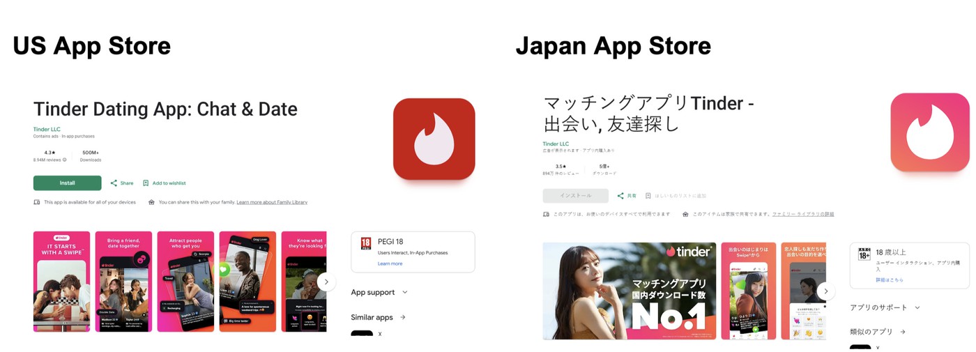
Translating caption text is the bare minimum. A screenshot that lands in the US with a confident lifestyle photo can read as awkward in Japan, where minimal UI screenshots tend to outperform. Localization is a creative decision, not a translation task, and it pays back fastest in markets you don't yet rank in.
— Veronika Bocharova, Customer Success Manager at Appfollow
I think of localization as the hreflang of visuals. Different markets respond to different proof points, colors, and emotional framing. The strongest localized ASO screenshots adapt the message itself, not just the language around it.
App store optimization screenshots by app vertical
Strong app store optimization screenshots depend heavily on category behavior. Users expect different proof from a puzzle game than from a budgeting app. The visuals need to match the emotional reason behind the install.
Games
Gaming creatives work best when they explain the gameplay loop immediately. Puzzle and casual games usually convert through clarity and momentum, so the first frame should show interaction fast. Hiding in-app gameplay until later screenshots often hurts conversion.
Look at Candy Crush. The first screenshots reveal the core mechanic almost instantly. Match pieces. Trigger combos. Progress. There is very little mystery because players decide quickly whether the loop feels satisfying.
RPGs behave differently. Games like Genshin Impact lean into world-building, character reveals, and progression systems because users want to imagine themselves inside the experience before they care about interface details.
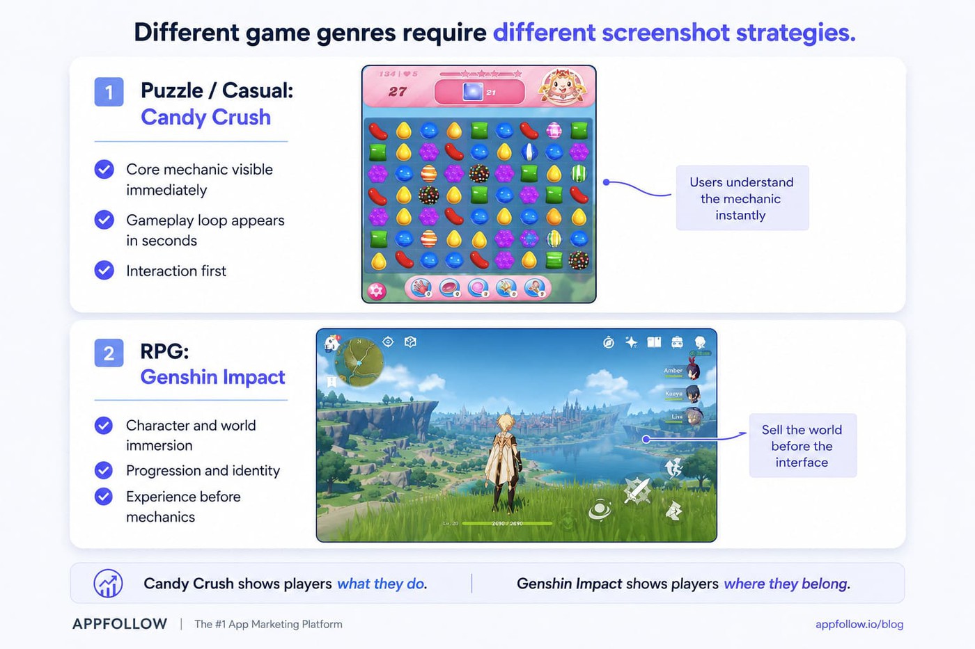
I also watch how screenshots align with the app icon. When visual styles feel disconnected, trust drops faster than teams expect.
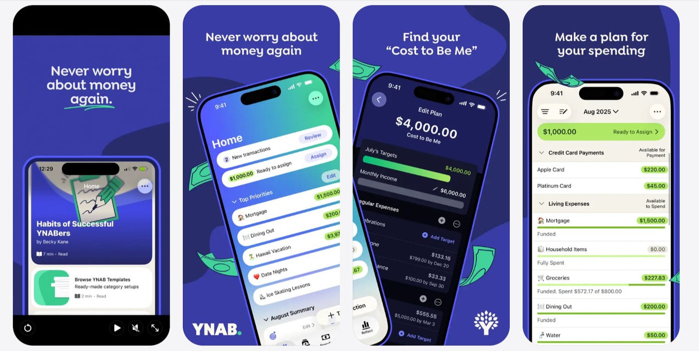
Fintech & subscription apps
Finance apps convert through confidence. Users scan for stability, simplicity, and control before they care about features.
Apps like YNAB or Revolut rarely lead with feature inventories. The screenshots usually focus on outcomes first. Understand spending. Save money. Stay in control. Trust badges and recognizable proof points matter because users evaluate risk before functionality.
Subscription products face another challenge. People expect friction. Fitness apps like Headspace often reduce that tension by showing ease of use first, then personalization, then social proof or ratings.
Social, dating & on-demand apps
Social and dating apps sell emotional outcomes more than functionality. Tinder rarely leads with filters or settings. The screenshots focus on interaction and connection because users picture the outcome before they evaluate mechanics.
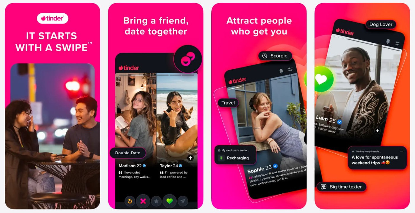
Average rating matters more here, too, because people interpret it as social validation.
On-demand apps follow another pattern. Uber Eats and DoorDash usually prioritize speed and convenience in the opening frames.
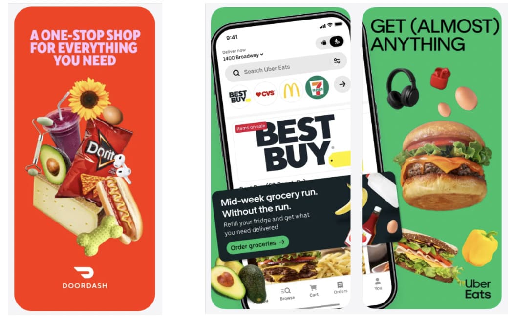
If users cannot understand the value immediately, the install often disappears with the scroll.
3 ASO screenshot mistakes killing your conversion
Most screenshot problems are not dramatic. They look small in review meetings. Then conversion drops quietly for months because nobody connects the visuals to the installs.
Weak ASO screenshots usually fail through accumulation, not one catastrophic mistake.
Cluttered frames and 9-pt copy
The fastest way to lose attention is to try to explain everything at once. I still see screenshots packed with tiny labels, feature lists, arrows, badges, and floating UI callouts competing for focus.
For example:
Users do not study store listings. They scan. The moment a frame asks users to process labels, arrows, badges, and multiple messages at once, attention shifts from understanding to effort. If the value cannot be understood in a second or two, the frame stops working.
Small text creates another problem. Accessibility matters more now because users browse across larger devices and different display settings. Poor color contrast WCAG compliance also hurts readability faster than most teams expect. Strong app store optimization images simplify aggressively. One idea. One action. One visual priority.
Stale screenshots after a UI redesign
A redesigned onboarding flow, paired with outdated screenshots, damages trust immediately because the product feels inconsistent before install. I’ve watched polished apps lose credibility simply because the screenshots still showed an interface retired three updates ago.
Brand consistency matters here more than people think. Colors, typography, and interaction patterns should match the live product closely enough that users feel continuity after opening the app for the first time.
Ignoring dark mode and device frames
Dark mode is no longer optional behavior. Large parts of mobile traffic now experience apps primarily through darker interfaces, especially at night.
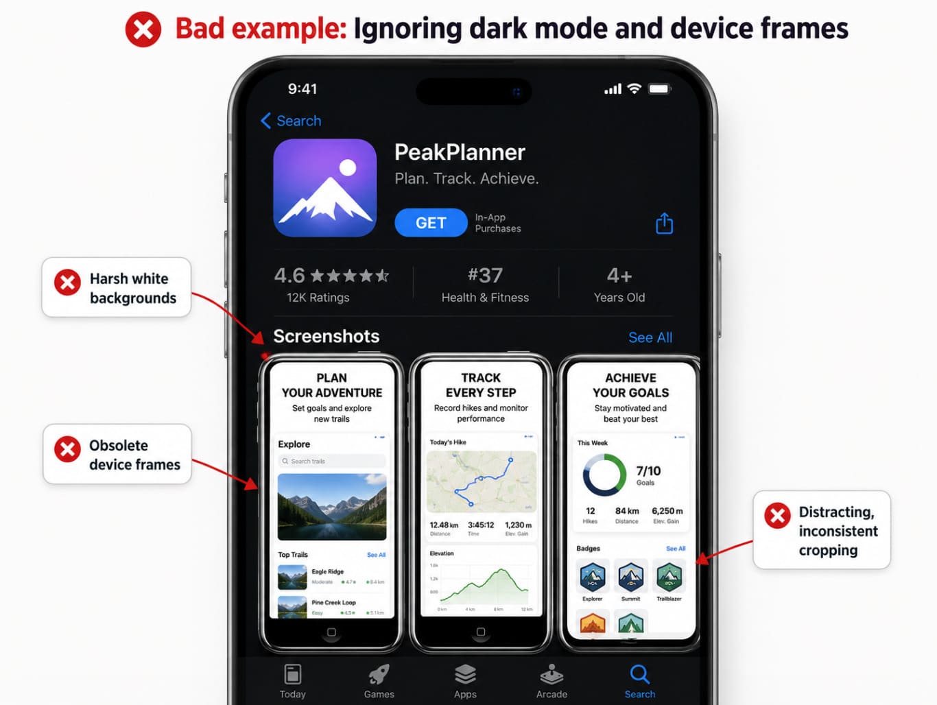
Bright screenshots with harsh white backgrounds can feel visually outdated inside modern storefronts. Device frames create similar problems when they look obsolete or distract from the product itself.
I usually test screenshots directly on multiple devices before launch because framing, contrast, and cropping behave differently in production than inside design files.
A measurement framework: from impression to install
A lot of ASO teams track installs without knowing where the drop actually happens. Good measurement separates visibility issues from conversion issues. Otherwise, teams redesign creatives when the real problem started earlier in the funnel.
Impression → Tap-Through Rate (TTR) → Install Rate (CR)
I look at screenshot performance as a chain. Impressions measure visibility. TTR shows whether users care enough to open the listing. Conversion rate measures whether the page closes the install.
That distinction matters because ASO screenshots affect different stages differently. A stronger first frame may improve tap-through rate without changing installs much. A better narrative sequence may leave TTR flat but improve conversion after the click.
Incrementality matters too. Rising installs do not automatically prove the creative caused the lift. Ranking shifts, paid traffic changes, or seasonality can distort results. That is why holdout thinking and statistical significance matter in ASO testing.
Apple Ads CPP variations vs. organic listing
Apple Ads traffic behaves differently because intent arrives more focused. Someone searching “budget planner for couples” already knows the problem they want solved.
CPP-based ad variations work best when they match that intent directly instead of recycling the default listing. I’ve seen paid campaigns convert better with narrower messaging that would underperform organically because the acquisition context changed the expectation.
What changes | Apple Ads CPP variations | Organic App Store listing |
Traffic intent | More specific. The user often comes from a searched phrase like “budget planner for couples.” | Broader. The listing has to work for mixed traffic from search, browse, brand, and category discovery. |
Screenshot job | Confirm one exact promise fast. Show the outcome the ad keyword implied. | Explain the app’s core value across several use cases, not just one search intent. |
Messaging angle | Narrow and aggressive. Example: “Plan money together without awkward spreadsheets.” | Wider and more balanced. Example: “Budgeting, expense tracking, and shared money planning in one app.” |
Best creative focus | One audience, one pain point, one conversion hook. | Main positioning, strongest features, trust signals, and overall product story. |
Risk if reused blindly | Default screenshots may feel too generic for paid traffic. | Over-narrow screenshots may exclude users who arrived with different needs. |
What to test | Keyword-matched screenshots, benefit-first first frame, audience-specific proof. | Broad first impression, feature order, screenshot captions, ratings/review cues. |
Organic listings need broader positioning. Apple Ads creatives can target one outcome aggressively.
Re-test cadence and seasonal refreshes
Creative fatigue happens faster than most teams expect, especially in crowded categories. Users stop noticing visuals they have already seen repeatedly.
I usually tie refresh cadence to product launches, acquisition pushes, or seasonal behavior instead of arbitrary monthly redesigns. New Year fitness messaging or holiday finance positioning often creates measurable seasonal lift when timed correctly.
Re-testing also protects against slow conversion decay that teams rarely notice week to week.
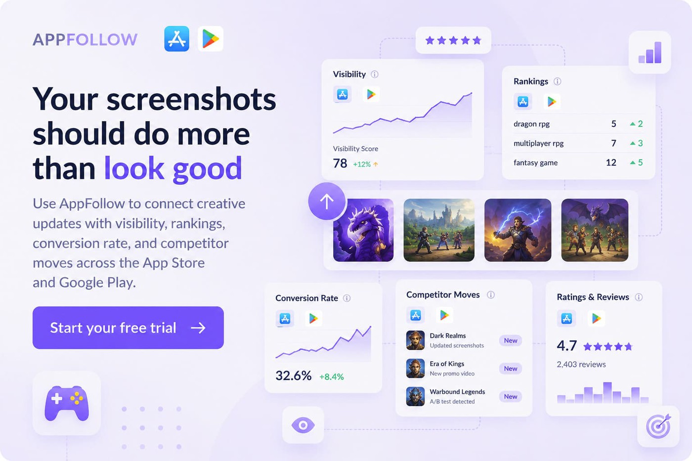
How AppFollow helps you ship better ASO screenshots
A good screenshot set should not live in a Figma folder and hope for the best.
It should be tied to the rest of your ASO data: which keywords bring users in, where conversion drops, what competitors changed, which markets respond differently, and whether the new creative actually helped installs.
That is where AppFollow’s ASO tools help. Mobile marketers, ASO teams, app publishers, product managers, and agencies use AppFollow to monitor app store performance, track competitors, understand keyword movement, and connect listing changes to real growth signals.
So when you update screenshots, you are not asking, “Do these look better?”
You are asking the grown-up ASO question: did this change improve visibility, tap-through, conversion, or install quality in the markets that matter?
AppFollow features:
- App Page — check app metadata, screenshots, videos, devices, countries, and language versions in one place. Useful when you need to audit how your listing appears across locales and devices.
- App Update Timeline — track screenshot, video, icon, metadata, version, category, and in-app event changes for your app and competitors. This helps you spot when a rival refreshes creatives before their rankings or conversion start moving.
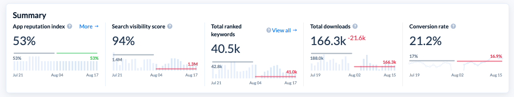
- Organic Dashboard — monitor visibility, downloads, conversion rate, total ranked keywords, and reputation signals across countries. Handy when you need to understand whether a screenshot update helped conversion or if the real issue sits earlier in the funnel.
- Channel Analytics — see impressions, page views, downloads, calculated conversion rates, and historical changes from App Store and Google Play data. This is where screenshot work becomes measurable instead of opinion-based.
- Conversion Benchmark — compare your app’s conversion rate with category and country averages. If your traffic is healthy but CR sits below benchmark, your screenshots, icon, ratings, or page message may need attention.
- Downloads by Keywords — connect search keywords to downloads, branded vs. non-branded traffic, rank, and search conversion rate. Use it to see whether screenshot messaging matches the keywords already bringing users to the page.
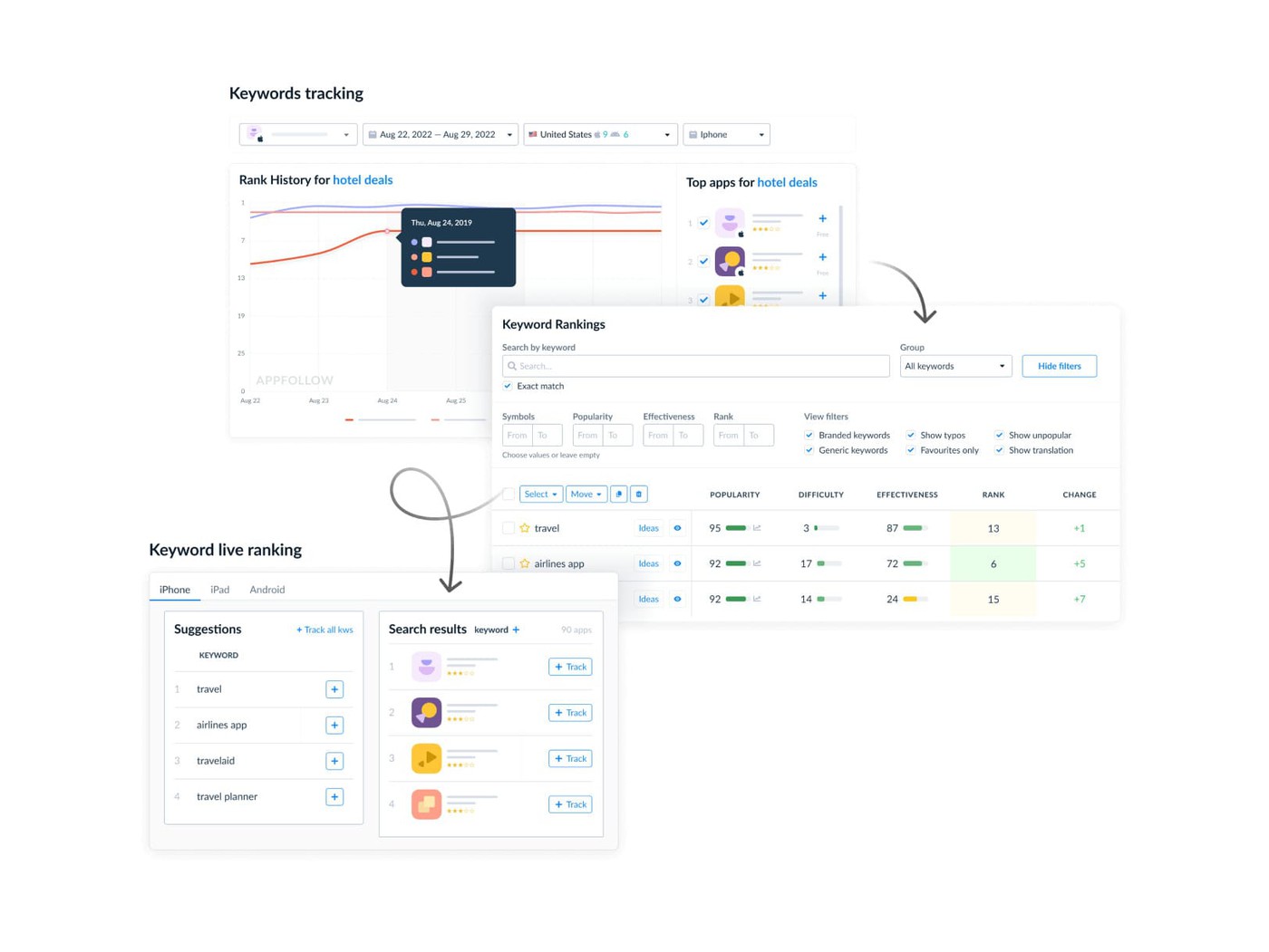
- Keyword Live Ranking — check real-time keyword positions by country, device, and competitor. Helpful after metadata or creative tests when you need to see whether visibility shifted around the terms your screenshots target.
- Competitor Apps — add competitor apps to your workspace and monitor their ASO strategy, performance, and public store changes. Useful when screenshot trends start changing inside your category before your own numbers react.
If screenshots are one of your highest-impact conversion surfaces, they deserve more than a “looks good” approval.
Use AppFollow to track the listing, the market, and the numbers around every creative change. Then sign up and make your next screenshot refresh a testable ASO move, not another design debate.
cta_get_started_purple
Conclusion
High-performing ASO screenshots are measurable conversion surfaces tied directly to search intent, tap-through rate, and install behavior. The strongest listings communicate value within the first three frames, stay readable at a glance, and evolve through disciplined testing instead of creative instinct alone.
I’ve seen small screenshot changes outperform expensive acquisition pushes simply because the messaging became clearer. That is why app store optimization images deserve the same rigor teams already apply to landing pages and paid ads.