[Webinar recap] What fintech apps get wrong (and right) in the app stores

![[Webinar recap] What fintech apps get wrong (and right) in the app stores](https://cdn.appfollow.io/blog/static/appfollow_126bb420-cee0-4ea0-9a8c-6c1d9871175f.jpg)
Table of Content:
We ran the first session of our live audit series on June 10th, with fintech as the topic. This session had Kai Singhvi-Hanns, Senior New Business Manager at Yodel Mobile, and Shivani Chhabra, Senior ASO Manager at AutoScout24, moderated by Olivia Doboaca, Growth Marketing Manager at AppFollow.
What follows pulls the thinking out of that session and lays it out on its own. Three apps came up as case studies: Copilot Money, Western Union, and Verivox, and the lessons from each apply well beyond those names.
After all, finance apps have a tricky job in the stores. They have to get their value across fast while building trust before anyone installs. With all the phishing messages, fake investment apps, and suspicious bank alerts floating around, people are cautious about what they tap install on.
You can watch the full recording here:
People download for the feeling
People download a finance app out of necessity, more than for the dashboards, graphs, or data.
- They want to be less anxious about their money.
- They want more control over spending and saving.
- They want to be better informed, with things simplified into something they can read quickly.
- They want to be reassured that their data and money are safe.
Finance is personal, so that last one carries a lot of weight.
Copilot Money is a good case for this. It's an AI personal finance and budgeting app that pulls all your accounts into one dashboard, and the brand already feels premium and trusted. So the next gain lies in how reassured and in control people feel from the very first impression.
Sentiment analysis is a big piece of that now. It's how people perceive the app and how they feel when they leave a review. On Android, Gemini has started summarizing overall user sentiment, which means the broad feeling across your reviews matters more than ever (one glowing review or one angry one doesn't shift things the way the aggregate does).
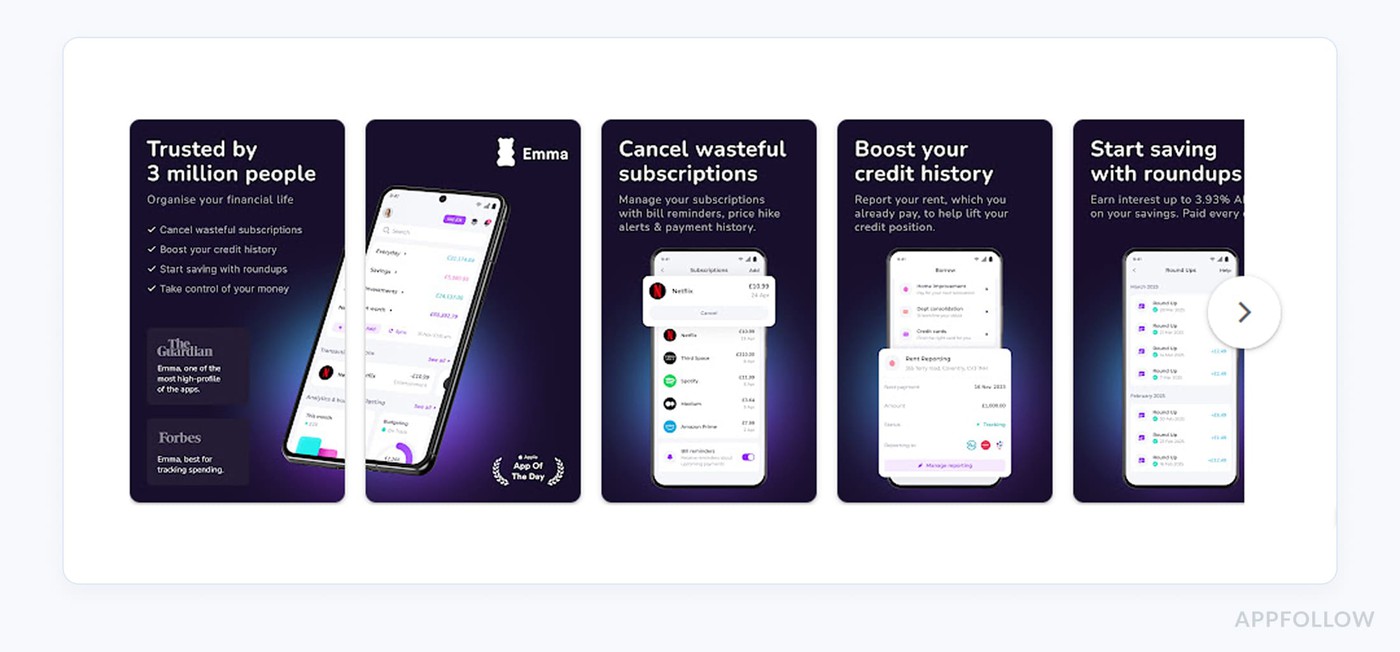
For Copilot Money, sentiment around branding was strong. The gaps showed up in three places: how accurate the AI tooling is at organizing finances, how reliable the app is across web and mobile, and whether people trust the AI logic enough to lean on it. Competitors like Emma, Snoop, and Cashew lean harder into those areas, with more personal and approachable language.
Don't make people work to understand you
The screenshots for Copilot Money have a cognitive overload problem.
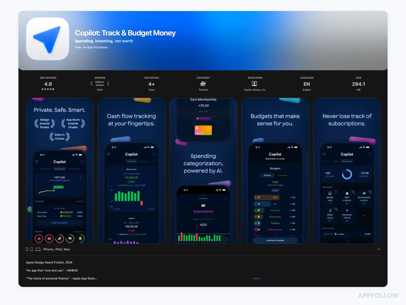
Charts, transactions, budgets, categories, all of it shown at once. That proves the product is capable, sure, but when someone spends five to seven seconds before deciding, that's a lot to take in. The emotional positioning felt weaker than the competition too.
Emma tends to show the outcome, then the benefit, then the proof, and that order converts well.
There was a positioning issue as well. The screenshots read like an investing product, close to something like Trading 212, which can muddy things for an app that's meant to be about budgeting. Lighter, brighter colors, the kind that are more common on the budgeting side, would help, along with pulling back a bit on the graphs and charts.
This is the recurring theme in fintech.
Outcome matters more here than in most categories. People know they can invest or save or send money. What they care about is what the outcome will be, whether they earn more, whether it's easier, whether it's cheaper. A listing that communicates that outcome in five to ten seconds, on screenshots one, two, and three, will do more than one that piles on features.
Keywords drift, so keep an eye on them
Behind the scenes, Copilot Money's keyword picture has slipped. Ranked keywords dropped by 64 over six months, and almost half of those were in positions one to ten, which is where people spend their attention. Visibility was down around 25% across 2026.
Part of that is a naming problem.
The top keywords are mostly brand and AI terms, and those don't pull much search volume. There's also the clash with Microsoft's Copilot, so the app can rank high for "copilot" searches without converting, because those people were never looking for a budgeting app in the first place. The move is to diversify toward generic terms that match real intent, things like best budgeting app or best AI budgeting app.
A note on testing: it's tempting to change a lot at once. Copilot Money had A/B tests with layout, social proof, in-app UI, and a user quote all shifting in the same test, and when everything moves you can't tell what drove the result. Isolate a single variable, get a clean read, then iterate from there.
Trust shows up in the creative
Western Union is the more mature example. It has near brand dominance worldwide and a real ASO program behind it: regular metadata updates, constant testing, a lot of localization work. A setup that comes from treating ASO as a growth channel.
The interesting part is how closely their conversion strategy lines up with what users say.
They reply to reviews, they're active on the Western Union subreddit, and the creative reinforces the themes people care about, like trust, security, and reliability. The screenshots lean on human imagery, family scenarios, real moments, and Trustpilot ratings. None of that is decoration. It comes straight from reading what creates positive brand moments and then putting it where people will see it.
On testing, they isolate conversion drivers instead of changing everything at once. Five pillars came up:
- Social proof
- Human imagery
- Value propositions
- Pricing
- Trust.
That kind of discipline is what lets you learn something real from a test.
Even the big players leave intent on the floor
The metadata for Western Union told a more mixed story. On Android, visibility was solid through 2026 and very tied to brand equity, but the last 30 days brought volatility, with just over 160 keywords lost, a lot of them in higher positions. That volatility has been growing month to month (January through April), which is the sort of thing worth getting ahead of before it becomes a bigger problem.
iOS was the bigger surprise. Usually iOS performs better in these audits, but here there was a notable drop in visibility, fewer top-ten rankings, and a much smaller share of generic discovery traffic than six months back. Brand terms still hold up. The losses sit in high-intent generic searches like send money abroad or country-to-country transfers, which is real demand going unanswered.
So even with strong branding, the opportunity is to expand past brand-led discovery.
Our advice here: optimize keywords toward country-specific intent (send money to India, Nigeria, Philippines) and outcome-led messaging like fast transfers, cheaper transfers, track your transfers. The phrases people search when they have a need right now.
Localization, country by country
Western Union is also a lesson in how intent shifts by country. In the UK the common searches are send money to India or Pakistan. In Germany it leans toward Turkey or Arab countries. You can see it in the screenshots. The UK listing prominently features the US, India, and Pakistan flags and shows a GBP to INR conversion, which hints at close work with the product team on where UK users send money most. The German listing shows euro to Turkish currency instead.
Add as many localized listings as you can. On the App Store especially, your job isn't done at English US or English GB. English UK, US, Canada, Australia, all of them help you resonate properly. Custom product pages are worth it for fintech too, because the way someone in the UK interacts with money is different from someone in Germany or India. CPPs let you segment by market, and they help with compliance, since FCA rules in the UK don't mean much to someone in India. Show what's relevant per region, drop what isn't.
Make the benefit impossible to miss
Verivox, a German personal finance and contract management app, has the trust side handled. Trustpilot and TÜV badges give people a sense of safety before they download. Where it gets thinner is the value proposition and the emotional side.
You have under three seconds to land the value. Right now the listing explains functions more than it explains what the user gets. The benefit, in plain terms, is saving time and money by tracking and comparing and switching providers in one place. The emotional part is feeling confident you're not overpaying, and feeling in charge of your own contracts without being overly dependent on an app.
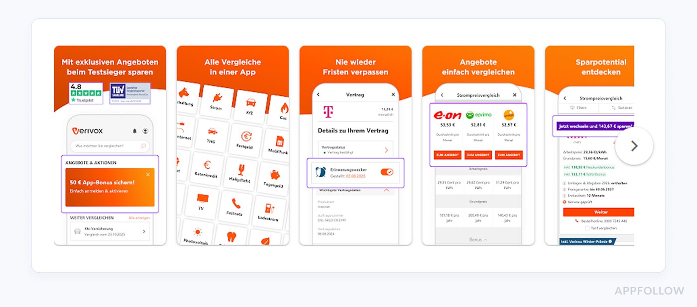
One screenshot listed a lot of services at once. A better move is to work with the product team to find the high-intent categories (electricity, internet, maybe insurance) and pop those out, then test different styles of highlighting. Lead with the benefit, something like save time and money, then the functional line about tracking and switching. Be sure you're not paying more than necessary. Stay in control. Keep the trust factor, and add the benefit and the emotional connect on top.
A few things to do this week
If you want one small change, look at your title, subtitle or short description, and your first screenshot. Does that first screenshot sell the outcome in under five seconds? If a big rewrite feels risky, A/B test it.
Treat reviews as a focus group you never had to recruit. Read them for the language people use, the trust concerns, the things that break trust, and feed that back into your messaging. Repurpose the positive sentiment into screenshots and long descriptions, and watch those Gemini review summaries, since they surface the broad feeling fast.
Next up in the series is gaming in July, then streaming and entertainment in September. Worth a look even if you're a finance team, since there's usually something to borrow from another category. Stay tuned!
cta_get_started_purple
FAQ
What is ASO for a fintech app?
App store optimization is the work of improving how an app shows up and converts in the App Store and Google Play. For fintech it covers two jobs at once. Metadata and keywords so people can find you, and screenshots, ratings, and trust signals so they feel safe enough to install. Finance is a sensitive category, so trust does a lot of the heavy lifting here alongside the usual keyword and creative work. Get the discovery side right and you still lose people at the listing if the trust side is thin.
How do you build trust on a finance app's store listing?
Lean on proof. Claims on their own don't carry much weight when someone's deciding whether to hand over their bank details. Trustpilot scores, security badges (TÜV is a common one in Germany), real human imagery, family scenarios, and short review quotes all help people feel reassured before they install. Your reviews will tell you where trust is shaky, so read them, find the worries that keep coming up, and answer those directly in your messaging and screenshots. Replying to reviews and showing up where people talk about you, like a subreddit, reinforces the same thing.
Should a fintech app target branded or generic keywords?
Both, though a lot of apps over-index on brand. Branded terms convert well for people who already know you, but the volume is usually small, and you can get drowned out by name clashes (Copilot Money sharing a name with Microsoft Copilot is a clear example of how that goes wrong). Generic high-intent terms like best budgeting app or send money abroad reach people who have a need but no brand in mind yet, and that's often where the growth is hiding. A healthy keyword strategy diversifies away from leaning only on your own name.