Customer Sentiment Score: How to Calculate, Track & Use It

Table of Content:
You’re scanning reviews after a bad update, trying to decide if it’s “just noise” or the start of a ratings slide. Meanwhile, support is firefighting, product is asking for proof, and you still don’t have a single number that tells you how users feel. That’s the gap a customer sentiment score is meant to close.
I didn’t want a vague definition, so I talked to Yaroslav Rudnitskiy, Senior Professional Services Manager and ASO guru who’s spent years working with app teams.
In this article, we’ll unpack the parts that matter:
- How is sentiment calculated from review language and star ratings?
- What’s considered a good sentiment score in real life, not in theory?
- When does a “small dip” deserve an escalation?
- Where should this metric sit in your release process, support workflow, and ASO routine so it changes decisions, not just reporting?
TL;DR
- A customer sentiment score is the fastest way to turn “we’ve got a lot of reviews” into “we know what’s hurting users right now.” It’s a single number built from review language, not gut feel, so you can track mood shifts before your star rating catches up.
- Most teams calculate it by classifying each review as positive, neutral, negative (sometimes mixed), then rolling those counts into a ratio. A common formula is net sentiment: (Positive − Negative) ÷ (All reviews) × 100. The exact math can vary by tool, but the job stays the same: quantify direction.
- The business value is boring and powerful. You stop chasing anecdotes. You catch post-release issues in the first 24–72 hours. You prioritize fixes based on volume + severity, not the loudest complaint.
- “Good” is not a universal number. Benchmark against your own baseline, then compare by country, version, and topic. One market can be melting down while the global average looks fine.
- Implementation is where teams win. In AppFollow, you start at the summary, zoom into topics, then use semantic tags to see which clusters drive negativity. Click AI Overview to get the “why” behind a tag in seconds. Route the top issues to owners, ship the fix, then confirm recovery on the sentiment timeline.
- If you want this metric to change user experience, give it a ritual: weekly review plus a post-release check. Treat it like a release signal, not a dashboard decoration.
What is sentiment score?
A customer sentiment score is a metric that turns app store review emotion into a number you can trend and operationalize. It blends what users say (“can’t log in,” “love the redesign,” “refund?”) with context like rating, recency, and volume, so you can answer one question fast: are users getting happier or angrier, and about what.
Here’s the sentiment score meaning in plain terms: it’s not “how many 5-stars you got.” It’s a quantified read on customer mood, pulled from the language inside reviews, then summarized into something your team can react to before the store algorithm reacts for you.
There isn’t one universal sentiment score range, so don’t get stuck comparing numbers across tools without checking the scale. Common formats:
- 0–100 index: exec-friendly. Easy thresholds (e.g., alert if < 60).
- -1 to +1: analytical, great for correlations and modeling.
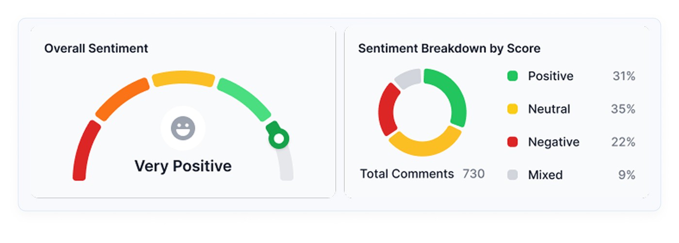
- % positive / neutral / negative: the most operational view because composition changes show up even when averages hide it.
- Net sentiment (pos% minus neg%): perfect for alerting and weekly scorecards.
- Topic-level sentiment: the best for process change because it tells you what to fix, not just how you’re doing.
More examples of how it may look like:
Here is an example of how it is presented in AppFollow:
If you want one recommendation: use a composition chart plus a topic breakdown. Leaders get a trend, teams get a worklist.
How does customer sentiment scoring work?
1. Manual sentiment scoring
This is what teams do when they’re early-stage or when a crisis hits, and everyone is in “war room” mode. You export reviews → read them → tag them “positive/neutral/negative” → group by themes → calculate a quick score.
What you gain: context. Nuance. The ability to spot sarcasm and weird edge cases.
What it costs you: time and consistency. Because once you’re getting hundreds or thousands of reviews a week, manual scoring turns into:
- sampling bias (you read the loudest stuff, not the full dataset)
- drift (two people label the same review differently)
- delayed signals (you find out about a crash trend after the rating already dips)
Manual is still valuable, by the way. It’s your “ground truth” check. It just can’t be your main engine.
So what replaces it when volume hits?
2. Automated sentiment scoring
Modern platforms run this pipeline daily or near real-time:
- Collect reviews from App Store + Google Play across locales.
- Normalize text (language detection, handling slang, short reviews, emojis).
- Classify sentiment using NLP models that look at phrasing, not just stars.
- Attach meaning via topics/themes (login, crashes, pricing, ads, UI).
- Roll it up into dashboards, alerts, and queues, so the right team sees it.
Automation can be wrong sometimes. The trick is designing it so mistakes don’t break your process. You’re using sentiment to decide what gets escalated, what gets fixed, and what gets communicated. But there are many more benefits it brings you.
Why sentiment score is a must for your customer review analysis
When you’re staring at 2,000 new reviews after a release, “read them all” is not a strategy. It’s a stress response. A customer sentiment score is what turns that chaos into an early-warning system you can run every week.
Store performance is a conversion game. The average US store page conversion is around 25% on the App Store and 27.3% on Google Play in H1 2024, plus an average App Store install rate around 3.8% (source). That means tiny perception shifts can quietly cost you a lot of installs.
Sentiment gives you three process wins that teams feel immediately:
- You stop treating reviews like anecdotes. A few dramatic 1-stars can hijack priorities. A score forces you to look at direction and volume. If negative sentiment jumps right after v8.2, you’re not debating feelings in Slack. You’re validating a pattern, then reacting like adults.
- Triage becomes faster, and less political. Sentiment lets you route work based on impact. “Negative + login + latest version” becomes a priority queue. “Neutral + feature request” becomes backlog input. Suddenly, your review inbox behaves like a system, not a pile.
- You can tie action to outcomes. Speed matters when users are still emotionally “in it.” For example, Gameloft cut response time from 30 days to 3 days, and 62% of users updated their rating higher after receiving a response. That’s not vibes. That’s measurable damage control.
AppFollow also points to Google Play guidance that responding to a negative review can lift that rating by +0.7 stars on average. Even if your mileage varies, the direction is the point. And don’t underestimate the human behavior piece. 99.9% of consumers say they read reviews at least sometimes when shopping online.
So if you want sentiment to change your process, not just decorate a dashboard, treat it like a release metric. Track it by version. Review it in the first 24–72 hours post-launch. Use it to trigger escalations and ASO copy updates when specific themes go negative.
Cool, but what’s inside the number? Let’s break down how it is calculated.
Read also: 5 Benefits Why Sentiment Analysis Matters For Your App
How is sentiment score calculated?
Most sentiment scores start the same way: you classify each review’s text as positive, neutral, or negative using NLP (the same family of tech that helps machines interpret human language). Then you roll those labels up into one number you can trend.
There are two “standard” formulas in the wild. Two that work well for app reviews:
Option A: Net Sentiment (balanced, includes neutrals)
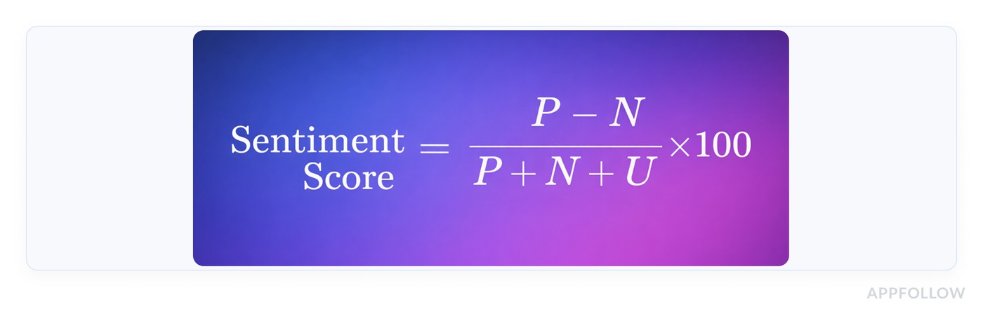
- P = # positive reviews
- N = # negative reviews
- U = # neutral reviews
Option B: Positive Share

This ignores neutrals and focuses on the “tug of war” between love and frustration.
Mini example: 420 positive, 120 negative, 60 neutral
- Net Sentiment = (420−120)/(420+120+60)×100 = 300/600×100 = 50
- Positive Share = 420/(420+120)×100 = 420/540×100 = 77.8%
Both numbers are “true.” They answer different questions. Net Sentiment tells you how hard negativity is pulling down the whole pool. Positive Share tells you if positives outnumber negatives in the reviews that carry emotion.
In AppFollow, Sentiment Score is described as a percentage calculated based on the correlation between positive and negative reviews. The score rises when positive reviews outweigh negative ones, and drops fast when negatives start winning.
For example: If you shipped v8.2 and, over 48 hours, semantic analysis labels 320 reviews as positive and 180 as negative, your “correlation” is leaning positive (roughly 64% positive share).
If the next 48 hours flip to 210 positive / 290 negative, your sentiment score will drop, even if your average star rating hasn’t caught up yet. That’s exactly why teams use sentiment as an early warning system.
Read also: 10 customer sentiment analysis tools to decode app reviews
Now you’ve got a number. The next problem is the one nobody answers honestly: what’s “good” for your app?
What is a good sentiment score?
“Good” depends on the scale your tool uses, so start there. Many sentiment systems run on a -100 to +100 style index, where higher = more positive. On that kind of scale, one practical benchmark is:
- 21 to 60 = Positive
- 61 to 100 = Very Positive
So if your score sits at 55, you’re doing fine. If it’s 70+, you’re in that “users are actively happy” zone. If you’re hovering near neutral, treat it like a warning light, not a comfort blanket.
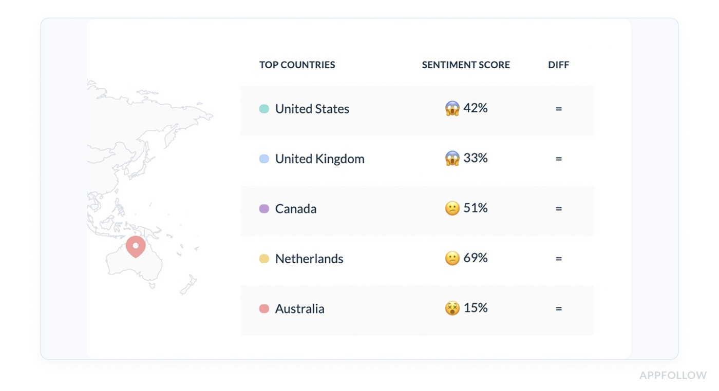
Now the nuance. A single average sentiment score can hide a release fire. The overall number stays steady while one country, one device type, or one version quietly turns negative.
Why you need your benchmarks
Benchmarks aren’t about flexing a number. They’re about knowing what’s normal for your app so you can spot “something changed” fast.
A meditation app might live in “very positive” most weeks, then drop hard if a subscription flow breaks. A fintech app might run closer to “positive” because users complain loudly about fees and verification, even when the product is solid.
That’s why you benchmark against:
- Your own last stable period (before a big release, pricing change, outage)
- Your competitors in the same category and market
- Your own segments (version, locale, theme)
Your score is only half the story
A 70 can be great… or a red flag. Context decides.
Use AppFollow to see your sentiment trend with volume, themes, and release context, so you can benchmark properly instead of eyeballing a single number.
cta_free_trial_purple
How to benchmark sentiment score for your business with AppFollow
AppFollow makes benchmarking usable because it pairs the score with context and drill-down.
- Pick a clean baseline window. Start with the last 30–60 days of “normal operations.” No major launch, no store listing overhaul, no known incidents. You’re setting a reference point you can trust.
- Compare against competitors with Benchmark Report. Use AppFollow’s Benchmark Report to line up your app with a competitor set and see metrics like Sentiment Score side by side. AppFollow defines the Sentiment Score as a % calculated from the correlation between positive and negative reviews, so higher means users are feeling more positive overall.
- Slice the benchmark so it tells you what to do next. This is where teams usually level up:
- By country/language: one market can be dragging the whole score down.
- By theme: “login” can go negative while “UI” stays positive, which changes what you fix first.
Semantic Analysis is built for this kind of “helicopter view,” so you can detect issues behind dissatisfaction and rating drops earlier than stars alone.
- Turn the benchmark into a routine. Weekly works for most teams. After every release, check again within 24–72 hours. You’re looking for trend breaks, not perfection.
- Keep a “why” trail. When the score shifts, jump from the benchmark view into the review clusters driving it. Phrase-level and tag-level analysis helps you connect “score dropped” to “people are saying ‘crash’ and ‘won’t open’ after update.”
How to use a sentiment score to improve your users' experience?
Everything starts with a sentiment score dashboard. AppFollow basically hands you a UX improvement workflow in the order the page is laid out. Your job is to turn each block into a decision, then into an action users can feel.
Step 1: Summary
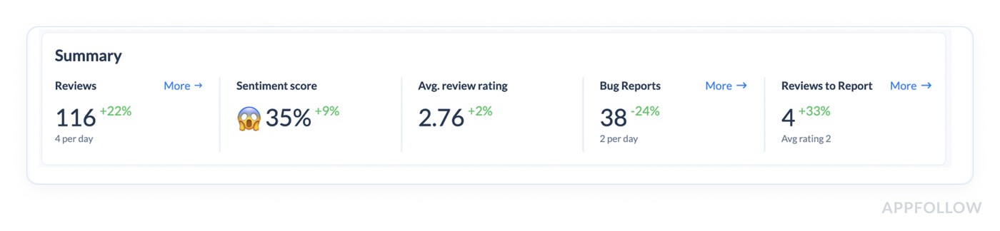
This top summary is your health check: Reviews, Sentiment score, Avg review rating, plus the top semantic tag. How this improves experience:
- Sentiment down + rating flat = users are unhappy before the stars catch up. You can catch the issue while it’s still fixable with a patch + good comms.
- Top semantic tag is a failure-mode (Doesn’t Work, Login & Access, App Freeze) = prioritize stability. Users don’t need a new feature. They need the app to work.
- Review volume spikes = something changed in the experience. Treat it like a release regression until proven otherwise.
As a result, you can declare the week’s UX priority (stability vs friction vs pricing confusion) and stop trying to “fix everything.”
Step 2: Now you’re choosing where to spend your effort: Bugs, Monetization, Report a Concern, User Feedback, Custom Tags.
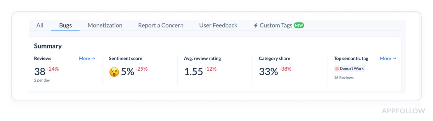
How to use it in real life:
- If Bugs sentiment is tanking, your “UX improvement” is a hotfix plan and a workaround playbook.
- If Monetization is negative, you’re improving the paywall flow, pricing clarity, trial messaging, and cancellation path.
- If User Feedback is negative, it often means the app “works,” but feels annoying or confusing. That’s UX polish and onboarding.
Based on this info, you can pick one topic as the focus for the next sprint. Your sentiment score improves when you concentrate.
Step 3: Semantic tags → turn sentiment into a punch list with owners
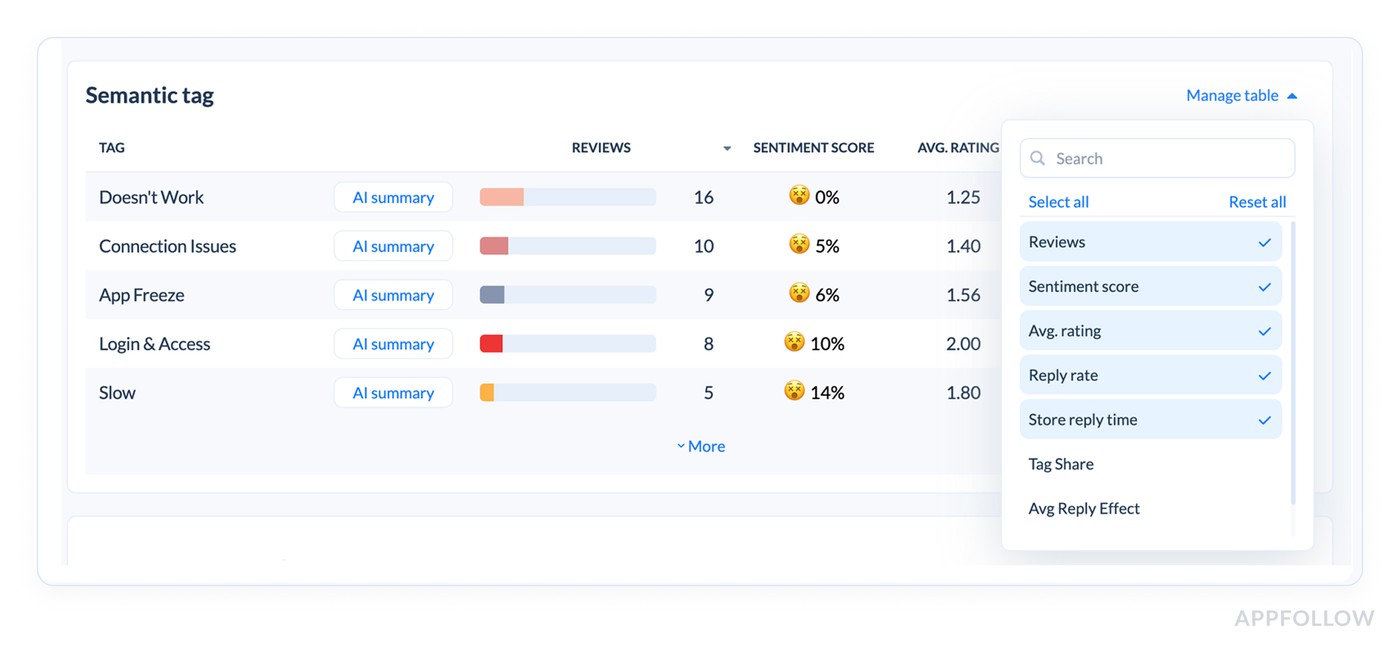
This table is where your sentiment score becomes a user experience backlog. Each tag is a cluster of reviews describing the same issue in human language. You’ve got the critical combo: Reviews (impact) + Sentiment score (emotion) + Avg rating (severity).
How to use it to improve UX:
- Sort by Reviews to find what’s hurting the most people.
- Use sentiment + avg rating to classify the work.
- Very low sentiment + ~1–2★ avg rating = broken experience. Ship a fix.
- Mid sentiment + ~2–3★ = friction. Redesign a step, simplify onboarding, reduce taps.
- Add “Tag share” (if you can) to see if the issue is spreading. Tag share rising means the experience is getting worse for more users, not staying contained.
Pro move: Create a “Top 3 tags” action board each week: one hotfix tag, one UX friction tag, one expectation/messaging tag.
Step 4: Click AI Overview for each tag → get the “why” fast, then write a plan
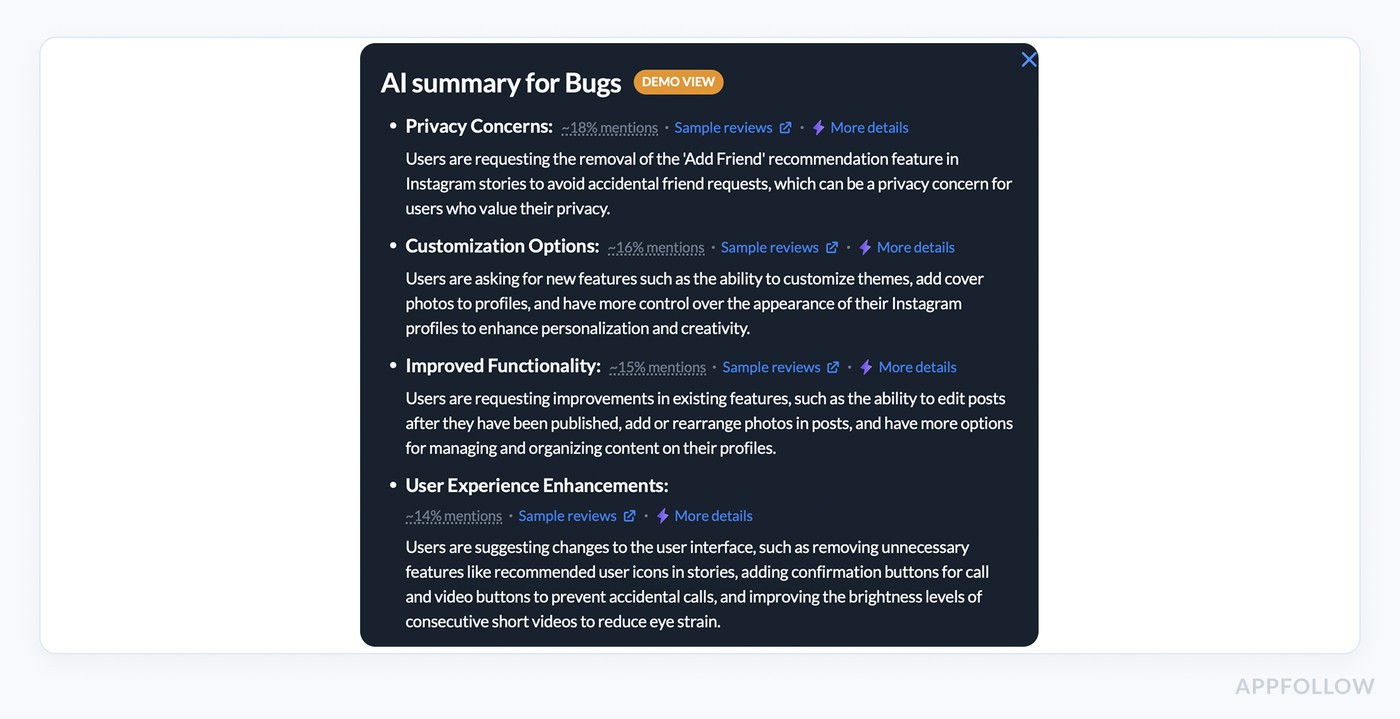
AI review analysis summary in AppFollow. Check how it works live.
If you want sentiment to change user experience, you need the story behind the number. AI Overview is how you get it without reading 200 reviews.
How to use AI Overview like a PM + support lead combo:
- Extract the common failure point: where users get stuck (OTP, paywall, loading, reset password).
- Pull reproduction clues: device/OS, region, specific flow steps mentioned.
- Name the fix type: bug fix, UX tweak, clarification, support guidance.
Then write two outputs that users feel immediately:
- A product action: “Fix login loop on Android 14 for SSO users.”
- A user action: “New in-app message + support macro explaining workaround.”
Based on this information, you can convert sentiment into a task that has a shipping plan and a communication plan. That’s how trust comes back.
Step 4: Geo analysis → improve the experience for the market that’s suffering
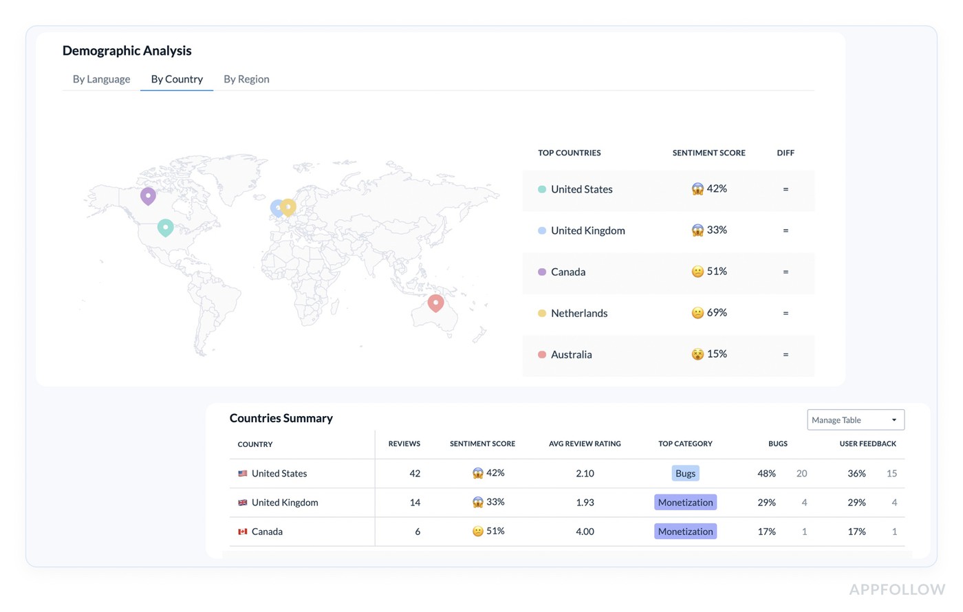
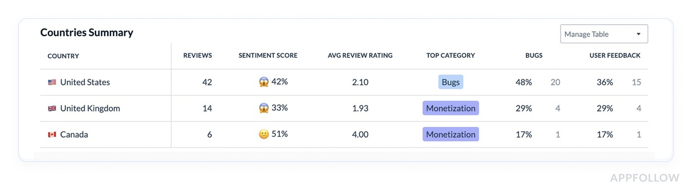
Global sentiment averages lie. One country can be melting down while everything else looks okay.
How to use Countries Summary + map to improve UX:
- Find markets with low sentiment + meaningful review volume. That’s not noise. It’s a localized experience issue.
- Check Top category per country. If the US is “Bugs” and the UK is “Monetization,” you need two separate fixes.
- Use this to prioritize localization and payment flows. Region-specific issues often come from translation, pricing display, or network behavior.
Based on this data, companies create a “market fix” checklist: localization review, payment provider test, onboarding copy audit, and device mix check.
Step 5: Sentiment analysis timeline → prove the UX got better
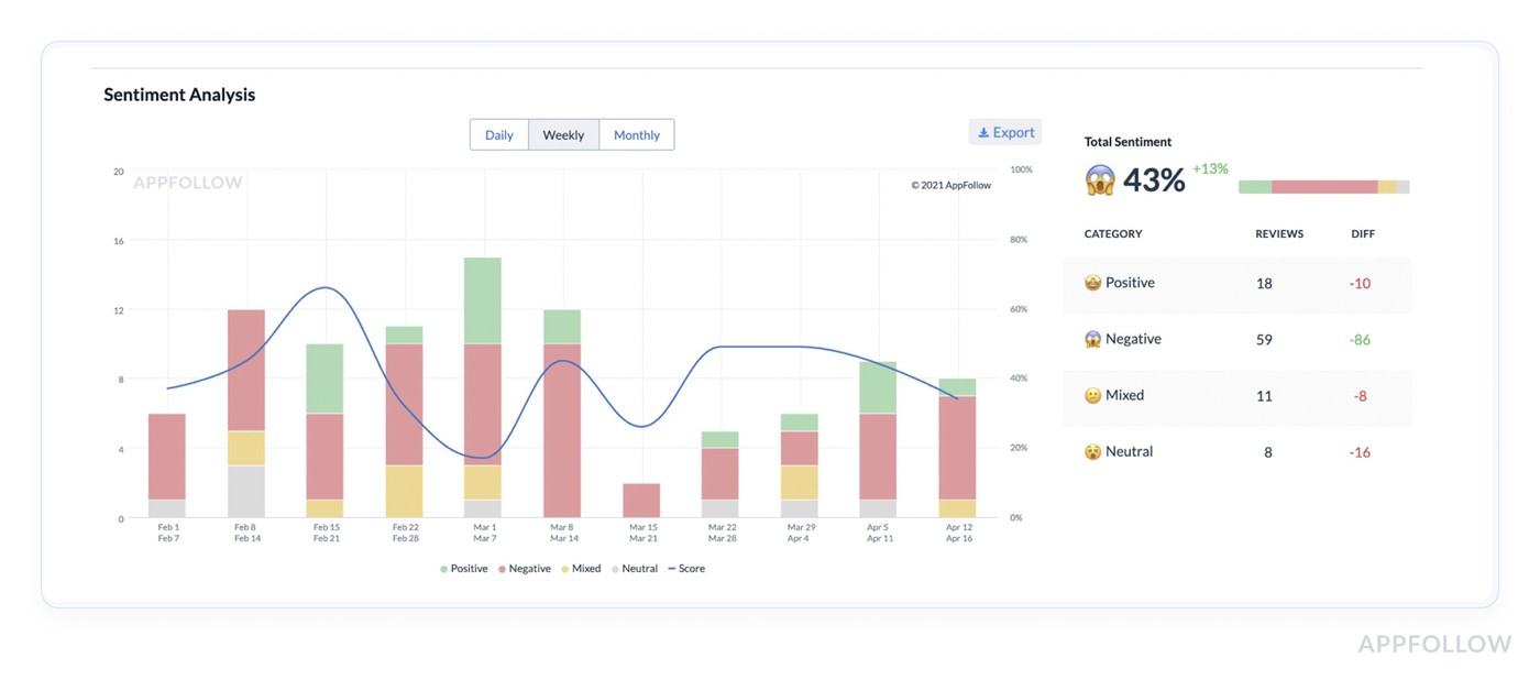
This chart is where you confirm you improved experience and didn’t just “respond to reviews.”
How to use Daily/Weekly/Monthly views:
- Daily after a release: catch regressions within 24–72 hours.
- Weekly: track whether fixes are working.
- Monthly: tie sentiment trends to roadmap and show leadership what changed.
What “UX improvement” looks like here:
- Negative volume falls in the tag you fixed
- The sentiment line rebounds after the patch
- Avg. rating rises inside the same cluster
Run a before/after check per fix. If the curve doesn’t move, the fix didn’t land or the communication wasn’t clear.
Analyze your sentiment score with AppFollow
Start a free AppFollow trial to track sentiment over time, auto-tag the themes behind the dips, and route critical feedback to the right owners with alerts and integrations.
cta_free_trial_purple
FAQs
What is a customer sentiment score?
A customer sentiment score is a single metric that summarizes how users feel based on the language in their feedback (reviews, surveys, tickets), usually grouped into positive, neutral, negative, and sometimes mixed. The sentiment score meaning is simple: it turns “users are angry about login” into a number you can trend, segment, and act on.
How do you calculate a sentiment score?
In AppFollow, Sentiment Score is a percentage calculated based on the correlation between positive and negative reviews. The score rises when positive reviews outweigh negative ones, and drops fast when negatives start winning.
How do you measure consumer sentiment?
You measure it by combining:
- Text sentiment (what people say)
- Context (topic, country, version, device)
- Trend (daily/weekly changes after releases)
In AppFollow, Semantic Analysis helps you do this from app store reviews by grouping feedback into semantic tags, showing sentiment per tag, and letting you drill into AI summaries to understand the “why” behind shifts.
What is an average sentiment score?
An average sentiment score is the overall number for a chosen time period and segment (for example, last 30 days in the US). It’s useful as a baseline, but it can hide spikes in specific themes like “login,” “crashes,” or “pricing,” so you always want the tag-level view too.
What is the most accurate sentiment analysis tool for enterprise CX teams?
“Most accurate” depends on what you call accuracy: correct polarity, correct topic, correct urgency, correct segmentation. Enterprise CX teams usually win with tools that combine strong NLP + governance controls + workflow. If your “source of truth” is app store reviews, AppFollow is built for that environment, with semantic clustering, sentiment trends, and AI summaries that make review volume usable.
What sentiment analysis software provides research-grade accuracy?
“Research-grade” usually means: validated on your domain, tested on multilingual data, monitored for drift, and benchmarked against human labels. In app reviews, domain language is messy (“crashes lol,” “won’t even open”), so the best tools are the ones tuned for that kind of short, emotional text and let you verify results with drill-down summaries and raw review access.
How does AI-powered sentiment analysis maintain accuracy at enterprise scale?
At scale, accuracy is less about one perfect model and more about guardrails:
- Confidence thresholds (don’t over-trust low-confidence classifications)
- Drift checks (language changes after feature launches)
- Segmentation (country/version/topic so you don’t average away problems)
- Human review for critical buckets (bugs, compliance, safety)
That’s how “AI” stays useful when you have 50 markets and weekly releases.
What's the difference between black-box and transparent sentiment scoring?
A black-box score gives you a number with no explanation. Transparent scoring shows:
- the formula or scoring logic
- counts behind the score (P/N/U)
- examples of reviews driving the change
- topic breakdown and filters
If you need to defend decisions, transparent wins. If you only need directional monitoring, black-box can be acceptable, but it’s risky during incidents or launches.
How do CX teams validate AI-generated sentiment scores?
Validation is simple if you treat it like QA:
- Pull a random sample from each sentiment bucket weekly
- Compare AI label vs human label
- Track mismatch rate over time
- Re-check after big feature changes or new markets
In AppFollow-style review workflows, validation also means clicking from sentiment shifts into semantic tags and reading the cluster that moved the needle.
What sentiment analysis tools offer human-in-the-loop controls?
Look for tools that let humans correct categorization through:
- editable tags or custom topics
- manual reclassification for priority queues
- review assignment and escalation flows
- saved filters that teams standardize on
Human-in-the-loop matters most for high-impact themes like payments, login, and policy complaints.
How does sentiment analysis integrate with enterprise feedback intelligence platforms?
Most enterprise setups route sentiment into the systems teams already live in:
- Slack/Teams for alerts
- Zendesk/Salesforce for case creation
- BI for executive dashboards
The integration goal is not “more dashboards.” It’s faster routing from negative feedback to an owner and a fix.
What benchmarks should enterprises use for sentiment scores?
Benchmarks should be internal first, external second:
- your baseline last stable period
- post-release windows (24–72h)
- your top markets and languages
- theme benchmarks (bugs vs monetization vs UX)
The sentiment score range depends on the tool. So compare within the same platform and definition, not across random vendors.
How do insights teams use sentiment scores for defensible executive reporting?
They don’t report “the score.” They report:
- what moved (which tag/topic)
- where it moved (country/version)
- what it cost or risked (support load, churn signals, rating pressure)
- what changed (fix shipped, response playbook updated)
That’s the difference between “insights theater” and reporting that leadership can act on.