How to measure customer sentiment for app reviews [7 metrics]

![How to measure customer sentiment for app reviews [7 metrics]](https://cdn.appfollow.io/blog/static/appfollow_1335e02d-b0b3-49f7-9eb6-94171dc7e379.jpg)
Table of Content:
- TL;DR
- Top 7 customer sentiment metrics that are worth tracking
- How to measure customer sentiment
- Measuring customer sentiment in common “oh no” scenarios
- Customer sentiment tracking dashboards, alerts, and reporting
- Common mistakes when measuring customer sentiment
- Level-up your reviews understanding & management with AppFollow
- FAQs
Updated July 9, 2026 | Reviewed by Karen Taborda, Customer Growth Team Lead
If you want to know how to measure customer sentiment, treat it as three signals working together: direction, intensity, and drivers. What shifted, how hard it hit, and what triggered it. That’s how you catch a rollout that’s quietly breaking checkout before the stars even move.
I pressure-tested this approach with ASO guru Yaroslav Rudnitskiy, Senior Professional Services Manager, and we landed on one rule: bring metrics and a repeatable workflow, not vibes.
- So what do you track when volume spikes but sentiment doesn’t?
- Where do you look when negativity concentrates in one feature, one locale, one app version?
- And how to perform customer sentiment analysis without spending your week tagging comments?
But first, let’s start with customer sentiment metrics that are worth tracking.
TL;DR
To measure customer sentiment from app reviews, track what changed recently, not only the lifetime rating. Use a fixed 7-, 14-, or 30-day window. Measure recent rating, negative share, review velocity, net sentiment, theme sentiment, and market-level sentiment. Then connect the change to app version, country, language, and owner.
The useful output is not “sentiment is down.” The useful output is “negative login reviews rose after version 6.3.1 in Brazil, and product needs to check OTP failures this week.”
Top 7 customer sentiment metrics that are worth tracking
These are the metrics AppFollow power users lean on because they’re practical.
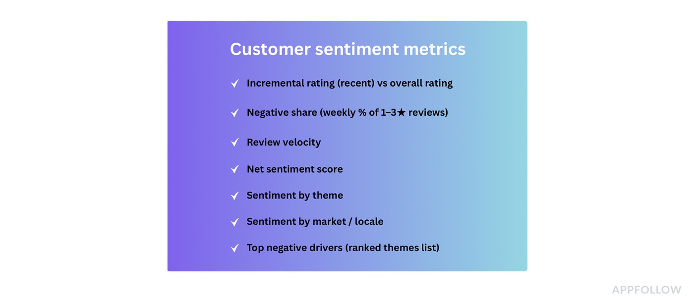
They move fast, they stay comparable, and they point to a fix. You don’t need all of them every day, but you do want the full set available when you’re measuring customer sentiment week over week.
Incremental rating (recent) vs overall rating
This is your “are we okay right now?” check. It tells you when the newest cohort is turning sour while the lifetime badge still looks proud. To calculate it, take the average rating from the last 7 or 14 days and compare it to the overall rating.
Use it after releases and big changes because it reacts earlier than the store badge. And when incremental starts drifting, the next thing you want is a faster damage detector than averages.
Negative share (weekly % of 1–3★ reviews)
It tells you what portion of current feedback is actively unhappy, even if the average rating hasn’t caught up.
Calculate it as: (number of 1–3★ reviews this week) ÷ (total reviews this week). Track it weekly, not monthly.
Use it when you need an early warning for paywalls, pricing changes, ad density tweaks, onboarding friction, anything that triggers immediate backlash.
Now, negative share tells you how bad. The next metric tells you how fast it’s spreading.
Review velocity (two lines: reviews/day and 1–3★ reviews/day)
This is the “fire spread” view. One line shows how noisy the week is. The other shows whether the noise is negative.
To calculate it, track daily counts for total reviews and daily counts for 1–3★ reviews, then compare both to your normal baseline.
Use it for bad releases and outages, or anytime someone says “reviews are suddenly exploding.”
Once you know something’s accelerating, you’ll want a single number that trends cleanly across weeks without staring at five charts.
Net sentiment score = (% positive − % negative)
This one is for trend clarity. It tells you whether the overall tone is improving or deteriorating, using one comparable line.
AppFollow calculates it inside a fixed window: percent positive minus percent negative. Your classifier can be star-based (4–5★ vs 1–3★) or text-based or %-based, as long as you keep it consistent.
Use it for weekly reporting, benchmarking across markets, and sanity-checking whether changes are trending the way you think they are.
A net score is useful, but it still doesn’t tell you why. That’s where themes come in.
Sentiment by theme (topic-level sentiment)
This is the “stop guessing” metric. It tells you which part of the experience is driving the shift. Login pain looks different from crash pain, and paywall backlash behaves differently again.
To calculate it, tag reviews into themes (crash, login, subscription, ads, performance) and track sentiment plus average rating per theme over time.
Use it when you need to prioritize work. Theme sentiment lets you walk into triage with a shortlist instead of a debate.
Even theme-level insight can mislead you if the problem is regional, so the next step is to split by where users are.
Sentiment by market / locale
This is your “global averages are lying” check. It tells you whether one country or language segment is melting down while the global view looks stable.
To calculate it, AppFollow segments reviews by country/locale (and language if needed), then track the same trends per segment: incremental rating, negative share, and theme sentiment.
Use it for localization issues, region-specific payment providers, phased rollouts, or any app with meaningful geo variation.
Once you’ve got themes and markets, you still need a clean output you can hand to a team and say “fix these first.”
Top negative drivers (ranked themes list)
It’s the weekly action list that tells you the top few things actively costing you goodwill right now, in words humans understand. To calculate it, rank themes by negative volume, negative share within the theme, and week-over-week growth. Keep the top 3–5 drivers.
Use it in your weekly cross-functional check-in. It also pairs perfectly with customer support conversation sentiment analysis because the same drivers often show up in tickets first and reviews second.
Next section, I’ll show you the weekly workflow that ties these metrics together ⬇
How to measure customer sentiment
Here’s where this guide comes from: patterns Yaroslav Rudnitskiy sees across AppFollow users who ask the same question every demo call, “how to measure customer sentiment fast enough to catch problems before the rating badge moves.”
The data source is consistent review tracking inside AppFollow, plus the habit of saving the same dashboard views so week-over-week trends stay comparable.
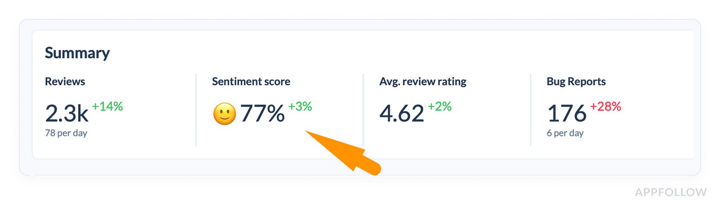
1. Start at the Summary and decide if you even need to dig
Open Summary and read it like a triage console, not a performance report.

If Reviews are up (+14%) and Sentiment score is up (+3%), you’re likely in “good noise” territory. If reviews jump but sentiment drops, that’s when you stop scrolling and start slicing. Avg review rating is helpful context, but it’s the slowest-moving number on that row, so don’t let it veto what the sentiment score is telling you.
The same logic applies to the “sub-stream” counters you have there, like Bug Reports and Reviews to Report. When Bug Reports are up (+28%) while rating stays fine, that’s often a release pain signal hiding inside an overall “okay” week.
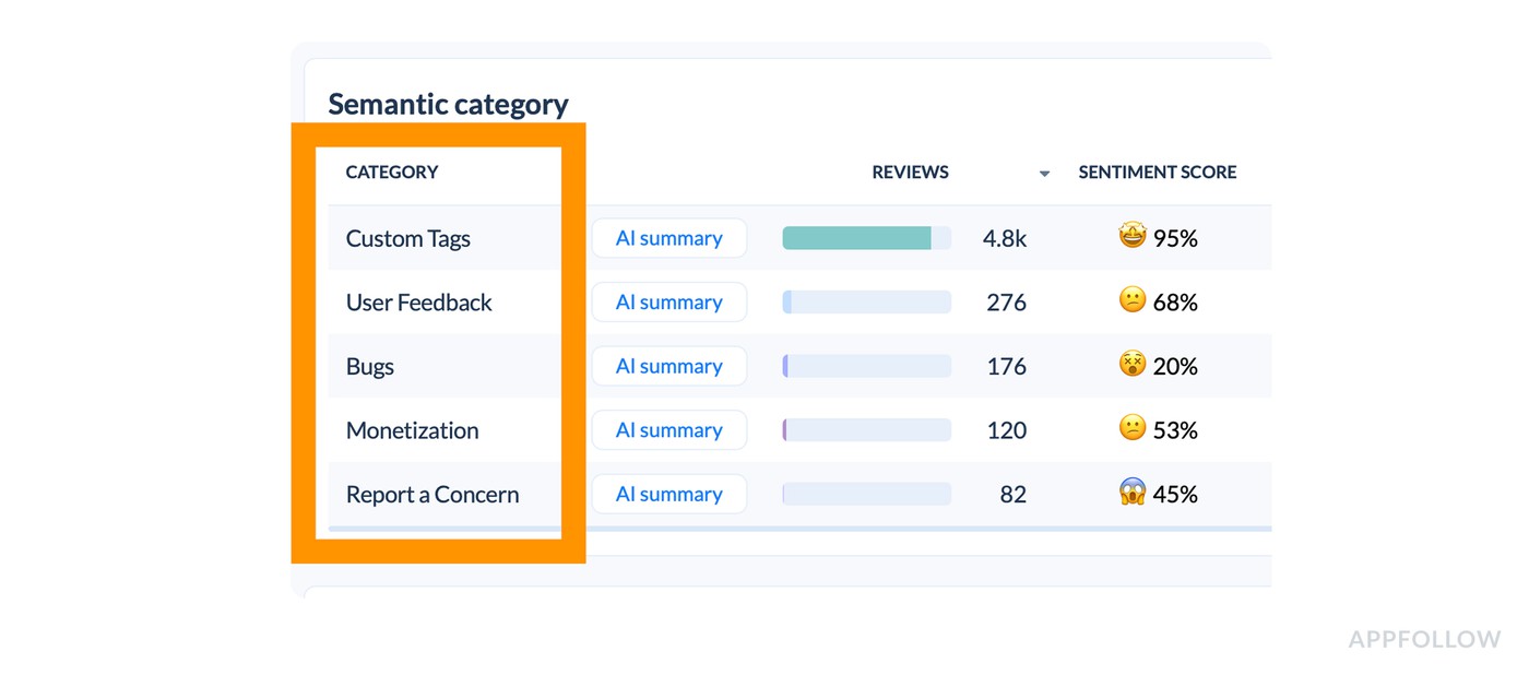
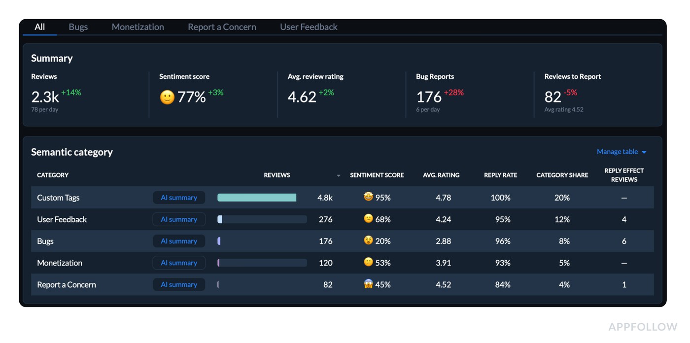
2. Use the Semantic category table to find the driver in under 60 seconds
Now move your eyes to the table where each CATEGORY has: reviews volume, sentiment score, avg rating, reply rate, category share, and reply effect reviews.
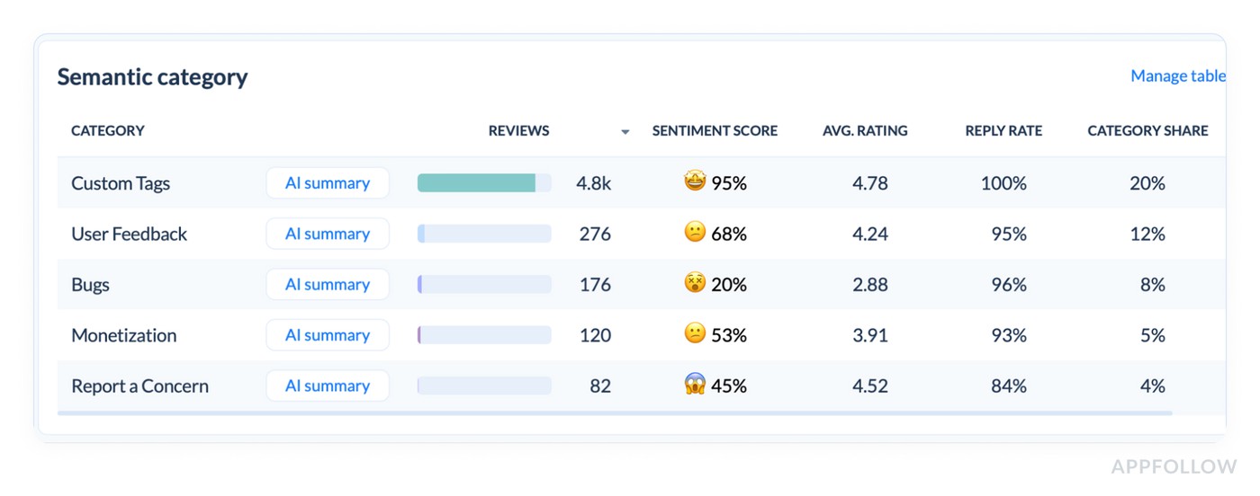
This table is your fastest “why.” You’re looking for mismatch patterns:
- A category with high share + weak sentiment (that’s where your reputation is getting taxed).
- A category with low average rating + rising volume (that’s where users are voting with stars).
- A category with sharp sentiment drop even if volume is small (that’s an emerging problem).
In the report example I provided, “User Feedback” sits at 68% sentiment with a 4.24 rating, “Bugs” is at 20% sentiment with a 2.88 rating, and Monetization is softer at 53% with 3.91. That instantly tells you what kind of week it was: the app is broadly doing fine (Custom Tags at 95%), but the pain is concentrated in Bugs and pockets of user feedback.
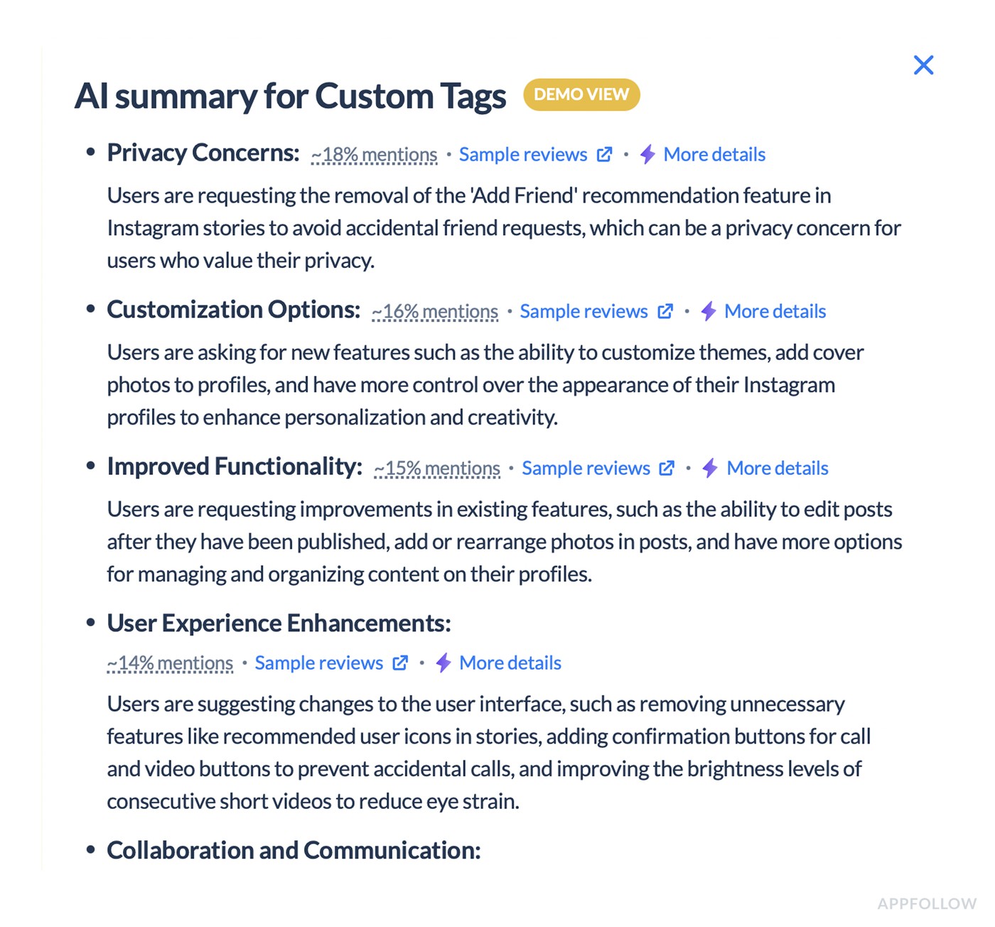
And the AI summary line per category is your shortcut to context.
You don’t need it to be “perfect.” You need it to be consistent enough to point your attention to the right bucket first.
3. Treat “Manage table” as a weekly decision, not a one-time setup
This sounds boring, but it’s what separates teams who get repeatable insight from teams who get random insight.
Pick the columns you will consistently use to make decisions. For most teams, that’s exactly the ones you already show:
- Sentiment score,
- Avg rating,
- Category share,
- Reply rate,
- and the row counts.
Once that’s stable, you can compare weeks without accidentally changing the lens mid-story.
4. Go geographic only after you know the category story
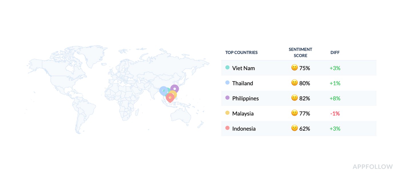
Now jump to Worldwide summary, and don’t start with “All.” Start with where the product reality differs.
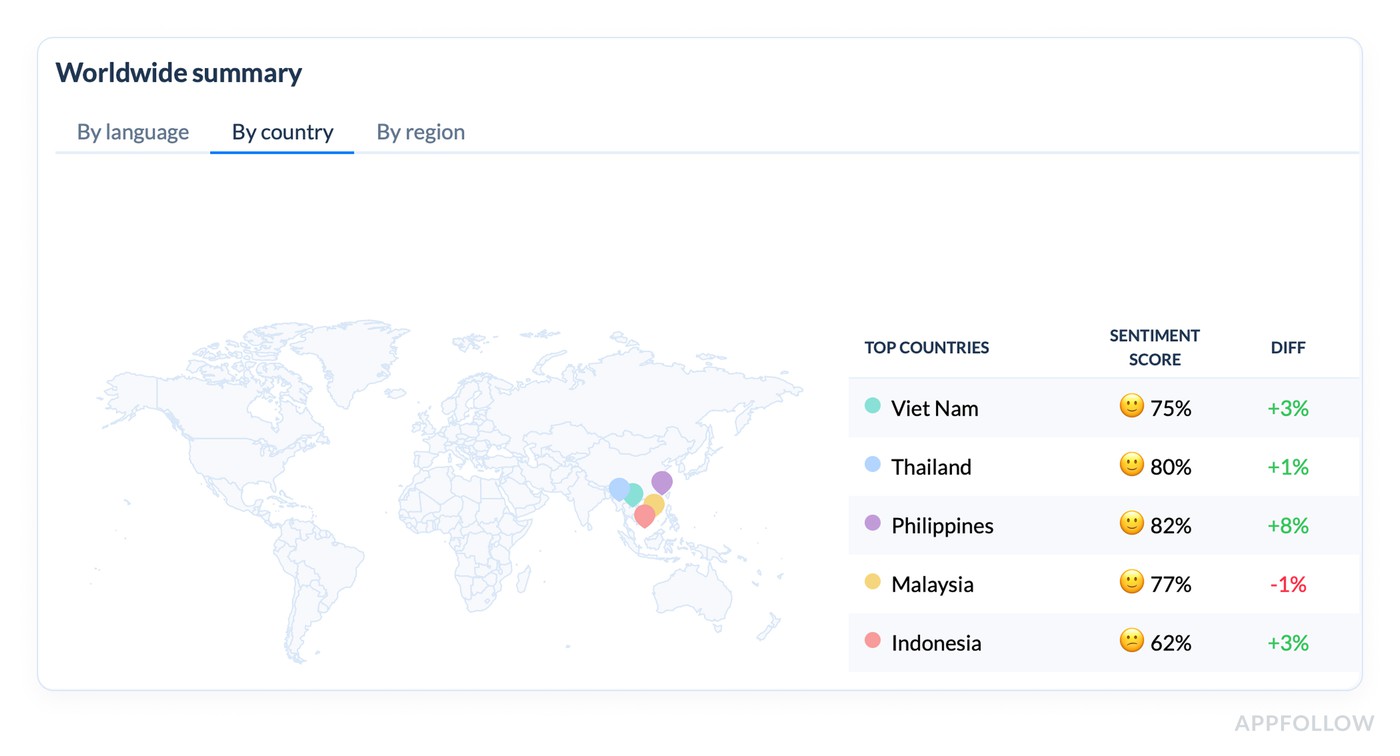
The “Top countries” list is the fastest sanity check because it shows Sentiment score plus diff. In your demo, you can immediately see that Philippines improved the most (+8%), while Malaysia dipped slightly (-1%), and Indonesia is sitting lower at 62% even though it’s up (+3%).
Then the Countries summary table gives you the real operating view: reviews count, sentiment, average rating, top category, plus country-level Bugs/User Feedback distribution. When a country’s top category is “User Feedback” and the Bugs slice is small, your fixes will look very different than a market where Bugs dominates.
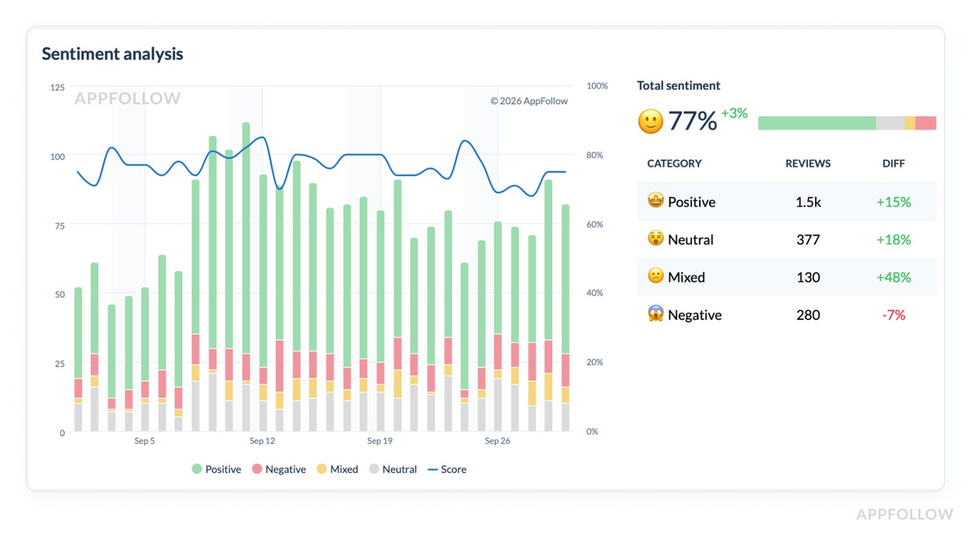
5. Confirm it’s a trend, not a one-day blip with the Sentiment Analysis chart
This is where the story becomes defensible.
The timeline shows Positive / Negative / Mixed / Neutral over the period, plus the Total sentiment score with the diff. That lets you answer “did we have one bad day, or did the baseline shift?”
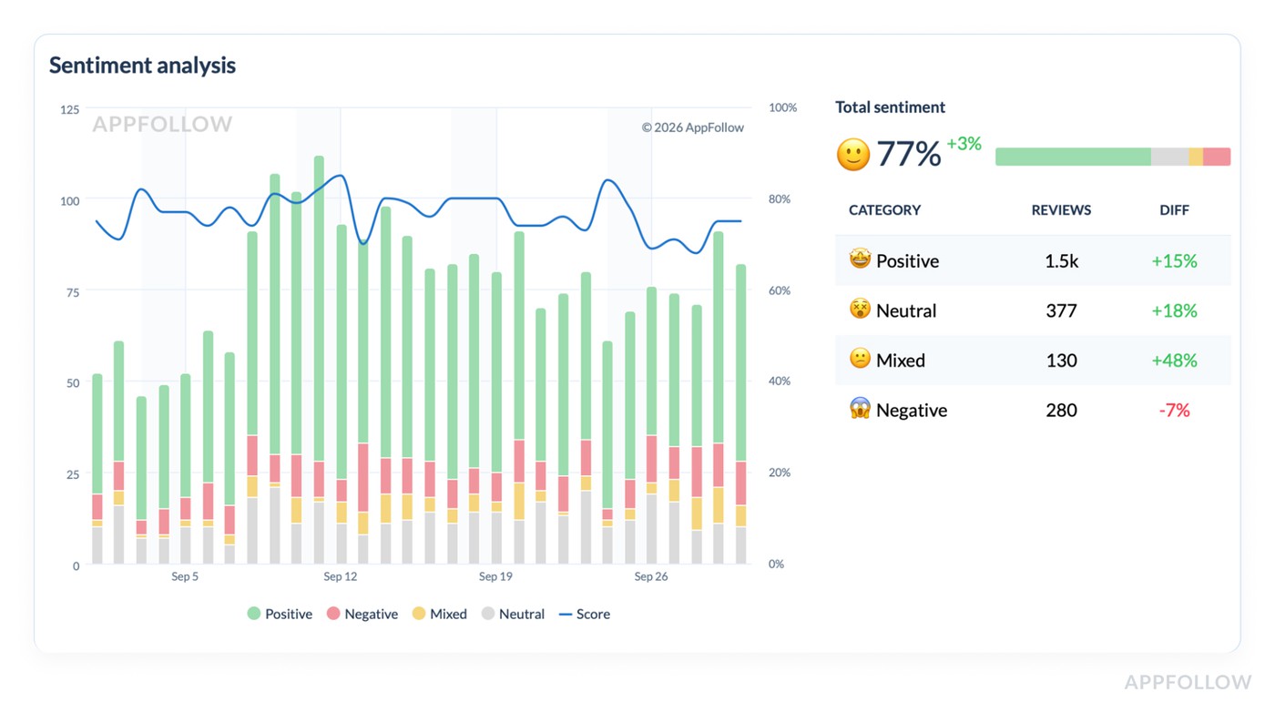
Then use the category breakdown below the chart to see what kind of sentiment moved. If “Mixed” is up +48%, that usually means ambiguity. Users aren’t screaming “hate,” but they’re not sold either. That’s often UX friction, pricing confusion, or features that almost work. If “Negative” is down -7% while Mixed rises, you’re not in crisis. You’re in “fix clarity and polish” territory.
6. End with a weekly output that’s easy to share
Your best “report” is a short narrative built from the dashboards you just used:
- What changed: Reviews +14%, sentiment 77% (+3%), bug reports +28%.
- Where it lives: Bugs category is low sentiment (20%) with low avg rating (2.88).
- Who feels it most: one or two markets with weaker sentiment or a different top category.
- What you do next: prioritize the category with the worst sentiment + meaningful share, and validate the top theme in that segment.
No extra tools required. No manual spreadsheet archaeology. Just a clean loop that matches the view AppFollow provides.
Start your AppFollow free trial and turn reviews into a short list your team can ship against: Bugs vs Monetization vs User Feedback, market splits, sentiment shifts, and those AI summaries that save you from reading 200 comments just to find the pattern.
cta_free_trial_purple
Measuring customer sentiment in common “oh no” scenarios
If you want the real answer to how to measure customer sentiment, it’s this: don’t start from “overall mood.” Start from failure patterns. AppFollow clients who run review ops like a monitoring system don’t wait for the average rating to move. They watch a small set of leading indicators, then slice fast by version, theme, and market to find the driver before it spreads.
This section is basically their playbook. The same five “oh no” situations show up across apps, genres, and geos, and the routine is repeatable: spot the spike, isolate the segment, read just enough excerpts to confirm the story, then hand product a ranked list of what broke and where.
You’ll see exactly which signals they pull first, what they ignore on purpose, and how they turn messy review text into actions, not debates.
Now let’s run the scenarios.
Bad release: “Clients notice the spike”
Ilia Kukharev, Product Manager:
“When AppFollow clients ship a bad release, they rarely come in saying ‘sentiment is down.’ They show up with a screenshot of 1–3★ reviews/day doubling, while the overall rating still looks fine.
The routine I see most: they pin 48 hours post-release, then watch 1–3★ velocity and theme sentiment for App Update and Crash. If velocity jumps 2× and ‘after update’ starts repeating in review text, they stop debating and roll back, hotfix, or pause rollout.
The smart move is version slicing first. Reading comes second, only to confirm the failure mode.”
Login/onboarding friction: “It’s usually regional. That’s why averages lie”
Dzianis Shalkou, Senior Professional Services Manager:
“With login and onboarding, AppFollow clients tend to miss it at first because the global line stays ‘fine.’ Then one market collapses.
The best teams start with theme sentiment on Login / OTP / Verification, then immediately split by locale. They’ll pull 10–15 review excerpts from the worst region and label the pattern in plain language: ‘code never arrives,’ ‘Google login loops,’ ‘can’t verify +34 numbers.’
Once they see it’s regional, they treat it like an integration or formatting issue, not a generic UX complaint.”
Subscription/paywall backlash: “Negative share moves before revenue dashboards do”
Veronika Bocharova, Customer Success Manager:
“After a paywall tweak, AppFollow clients who track the right signals catch backlash early. The first tripwire is weekly negative share. It jumps before the average rating drops, and often before revenue analytics show churn.
The routine that works: watch negative share, then watch the growth of the ‘Pricing / Subscription / Trial / Refund’ theme. If that theme accelerates week over week, they read a small sample to classify the complaint type: surprise charge, unclear cancellation, trial expectations mismatch.
The mistake I see is blaming ‘users hate paying.’ Clients who reword the offer and fix cancellation friction usually see the trend normalize fast.”
Localization issues: “One country can sink you quietly”
Yaroslav Rudnitskiy, Senior Professional Services Manager - ASO guru:
“Localization issues are the classic ‘oh no’ that hides in global averages. AppFollow clients often discover it when one region’s sentiment drops hard while the rest stays flat.
The more mature routine I’d advise is to run sentiment by market, then group by language clusters inside that market. It surfaces patterns like broken currency formatting, truncated UI strings, translations that change meaning, or region-specific payment flows failing.
Clients who fix the localized flow, not just copy, stop the bleed faster.”
Support backlog spilling into reviews: “Reviews become the escalation channel”
Karen Taborda, Customer Growth Team Lead:
“When support gets overwhelmed, AppFollow clients see it show up in reviews as a new theme: ‘no response,’ ‘still waiting,’ ‘support ignored.’ The best teams don’t treat that as a reputation problem first. They treat it as a queue problem.
Their routine is simple:
- track negative sentiment containing those phrases,
- tag the underlying driver (refunds, account access, billing),
- then match it to ticket backlog categories.
Replying helps, but the trend only improves when the root cause is resolved, and the support loop closes. Clients who publish one clear status update plus a fix often see review tone soften within a week or two.”
Next, I’ll show how AppFollow clients set up dashboards, alerts, and reporting so these “oh no” patterns surface automatically, before someone pings you with a one-star screenshot.
Customer sentiment tracking dashboards, alerts, and reporting
Once you’ve nailed the weekly workflow, the next problem is consistency. Not the “did we do it this week?” kind. The “are we measuring the same thing the same way, so trends mean something?” kind. That’s where AppFollow dashboards and alerts earn their keep: they turn review watching into customer sentiment tracking you can repeat without heroics.
The weekly dashboard that gets opened
Once you’ve nailed the weekly workflow, the next problem is consistency. Not the “did we do it this week?” kind. The “are we measuring the same thing the same way, so trends mean something?” kind. That’s where AppFollow dashboards earn their keep. They turn review watching into customer sentiment tracking you can repeat without heroics.
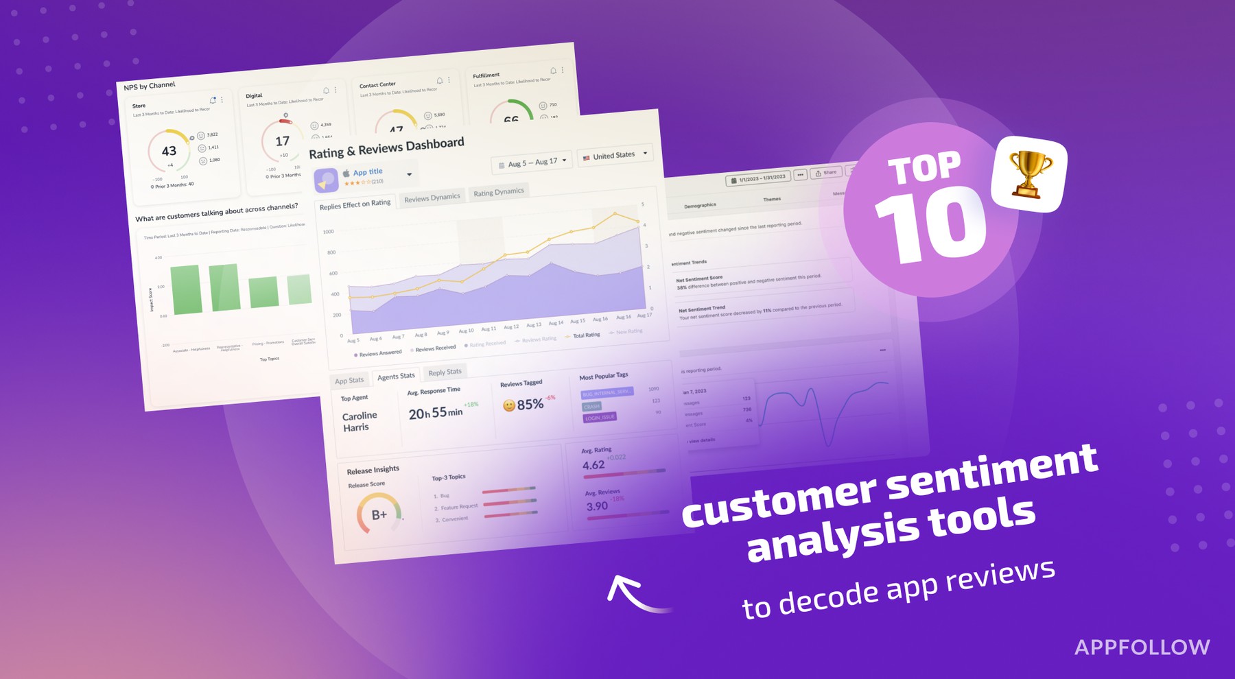
AppFollow teams who do this well live inside one view: Semantic Analysis. It answers three questions in the right order: did sentiment move, where did it move, what’s driving it. If your dashboard can’t do that fast, it becomes background noise.
In practice, the weekly “control panel” is already built into the page.
- You start at Summary and scan the core KPIs.
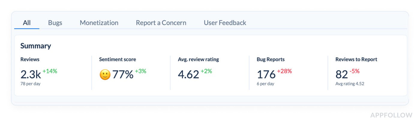
- Reviews (total and avg/day) tell you whether volume changed. Sentiment score tells you whether the balance of feedback shifted. Avg review rating is a useful context, but it moves slower, so it shouldn’t be your trigger. When reviews are up and sentiment is down, that’s a week you investigate.
- From there, you drop into the Semantic category table and let it point to the driver.
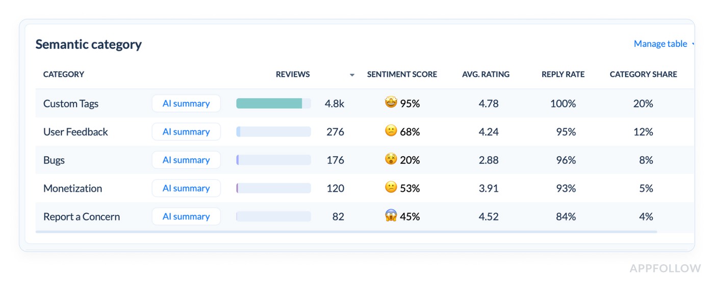
- This is the most underrated part of the dashboard because it gives you the “why” without manual reading: category volume, sentiment score, average rating, reply rate, category share, and an AI summary per category. You’re looking for concentrated pain. A category can be a small slice and still matter if its sentiment is collapsing, or it can be a big slice with mediocre sentiment and quietly tax your overall perception.
- Once you’ve found the category, you move to Worldwide summary to check if the story is global or local.
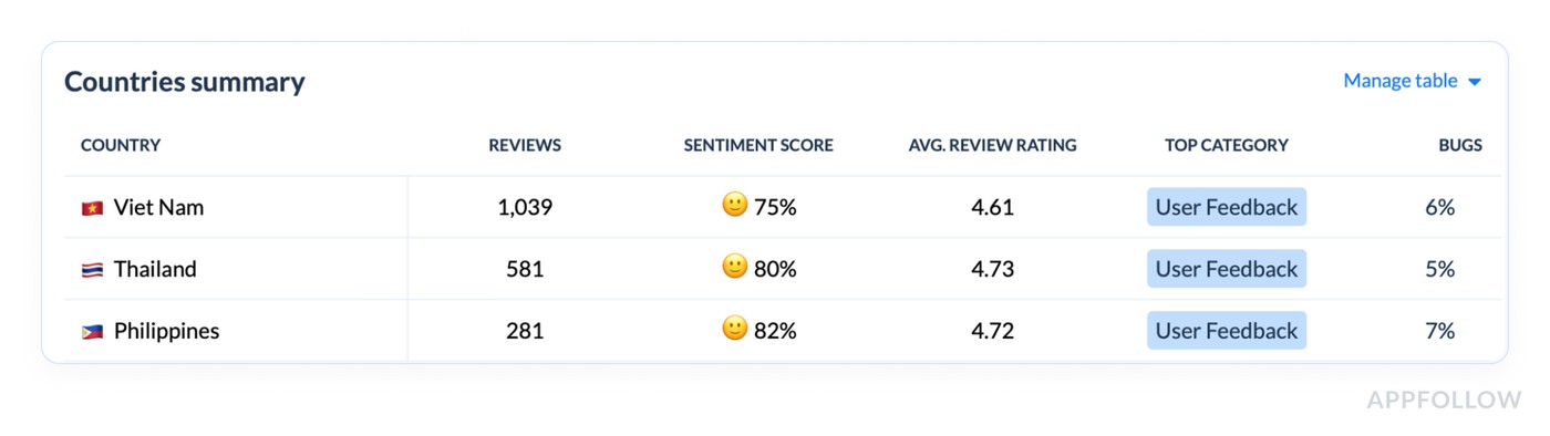
- The top-countries view makes this obvious because it shows sentiment per country and the week-over-week diff. Then the Countries table adds the operational detail: review volume, sentiment, average rating, and the top category per market. That’s how you avoid averaging away a regional fire.
- Finally, you validate the pattern in the Sentiment analysis timeline.
- The chart isn’t just pretty. It tells you whether this was a one-day wobble or a real shift, and it splits sentiment into positive, negative, mixed, and neutral so you can understand the type of change. If “Mixed” jumps, you’re often dealing with confusion or friction. If “Negative” climbs, you’re in damage control.
That’s the weekly dashboard that gets opened because it’s one place, one lens, and a clear path from signal to driver. It’s also the simplest way to explain how to do customer sentiment analysis to a non-analyst on your team.
Alerts that interrupt you for the right reasons
Dashboards are for patterns you check on schedule. Alerts are for surprises you don’t want to discover in a Monday retro. AppFollow clients usually set three kinds of alerts, because they map to the three fastest ways an app gets hurt.
- One is a rating-based spike alert. Sudden jump in 1★ reviews, or a surge in 1–3★ volume above a baseline. This is the alert that catches a release going sideways at 2pm, not next week.
- The second is a theme spike alert, using semantic tags. This is how you catch “subscription” backlash without reading every new review. When the “pricing” theme grows sharply, you want the ping even if the average rating looks fine.
- The third is a region-specific drop alert. This one saves teams from global averages. A localized payments issue can torch sentiment in one country while the global line shrugs. Good AppFollow setups treat market and language slices as first-class signals.
Reporting that reaches the people who can fix it
The last mile matters. If insights stay inside the ASO corner, they arrive late to product and support.
AppFollow clients typically solve this by pushing the same signals outward, using AppFollow’s custom reports/alerts and native integrations.

- Slack is the obvious one when you want a fast heads-up in a release channel (Slack).
- Support-heavy teams route review signals into their ticket world so “no response” complaints don’t get missed (Zendesk).
- Some orgs want reviews and sentiment context visible where customer conversations live (Salesforce).
- When leadership wants sentiment alongside retention or revenue, they pull it into BI (Tableau).
The point isn’t “more tools.” It’s making sure the same truth shows up where decisions happen, without someone copying charts into a slide at midnight.
And now that you’ve got a clean dashboard, sharp alerts, and sharing in place, it’s the perfect time to talk about what still goes wrong ⬇
Common mistakes when measuring customer sentiment
If you’re asking how to measure customer sentiment and still feel surprised by bad weeks, it usually comes down to these three mistakes. They’re common because they look “reasonable” on paper. In practice, they make you slow, vague, or stuck.
Treating the overall rating badge like an early-warning signal
“The badge is your reputation score. It’s supposed to be stable. So when teams use it as an alarm, they discover problems only after users have been angry for days.”
A bad release can spike 1★ reviews in hours and barely move the badge, especially if you have a long history of decent ratings. That’s why teams get caught off guard: they were watching the one number designed to resist change.
Fix: keep the badge for context, but trigger investigation off fast movers: incremental rating (7–14 days), 1–3★ share, and low-star velocity. When incremental diverges from overall, that’s your cue to go deeper.
Tracking “sentiment” without drivers, then calling it analysis
Saying ‘sentiment dropped’ is like telling a doctor ‘I feel weird.’ True, but not useful. You can’t assign ‘sentiment’ to a sprint. You can assign ‘login loop after 6.3.1’. When teams skip themes, the workflow collapses into opinions. People argue about whether users are “just complaining” instead of seeing a pattern. That’s not how to do customer sentiment analysis. That’s a meeting.
Fix: force the “why” into your tracking. Tag by themes you can act on: crash, login, subscription, ads, performance. Trend sentiment and volume per theme. The moment one driver accelerates, you have a clear owner and a clear fix path.
No operational loop, so insights don’t change next week’s line
The tell is always the same: someone posts a screenshot, everyone reacts, then nothing is owned to closure. Without ownership and a recovery check, the dashboard becomes entertainment.
Even strong analysis fails if nobody owns the signal.
The same pain keeps showing up, reviews get more sarcastic, and support becomes the unofficial escalation channel.
This is also where customer support conversation sentiment analysis matters. Tickets often flare before reviews do, so ignoring support sentiment is choosing to be late twice.
Fix: Set a tiny loop like assign theme owners, define a response SLA, and choose one recovery metric before you ship the fix. If the problem was a release, expect 1–3★ velocity to fall first. If it was pricing backlash, watch negative share normalize. Close the loop weekly, not “when we have time.”
You’ve now got the workflow, the metrics, and the traps. Next section: how AppFollow helps you level up review understanding and management so this becomes faster, more consistent, and less manual.
Level-up your reviews understanding & management with AppFollow
Once you’ve got the metrics and the weekly routine, the next bottleneck is always the same: humans can’t read thousands of reviews fast enough to spot what’s changing. That’s the gap AppFollow is built for, and why teams from global brands like Gameloft, Discord, Opera, and Flo use it at scale.
Think of it as a system that turns messy feedback into a clean map: what’s trending, what’s breaking, and what to fix first. Not once. Every week.
Here’s what that looks like inside the platform:
- You connect your app stores so reviews, ratings, and key store signals flow into one place.
-
From there, sentiment analysis customer reviews stops being “read and guess,” and becomes “filter, segment, confirm.” - AppFollow’s Semantic Analysis is the engine for this. It’s designed to surface issues that lead to dissatisfaction, lower ratings, and uninstalls, and it gives you a high-level view before problems become critical. The practical win is the tagging layer.
-
Semantic tags + auto-tags help you split feedback into themes so you can track sentiment shifts by topic instead of arguing about a global line. - Then you operationalize it with Alerts & Reports. Teams use custom notifications to stay on top of important changes without babysitting dashboards all day.
-
And when you want sharing to be automatic, AppFollow supports integrations that push those alerts and reports into tools teams already live in, including Slack and Tableau, plus helpdesk/CRM workflows through Zendesk and Salesforce. - One more detail AppFollow users love is the Zendesk app integration. Reviews can be automatically tagged so support teams can triage faster without re-classifying everything by hand.
If you’re serious about measuring customer sentiment, this is the upgrade: fewer “we should look into it” moments, more “here’s the theme, here’s the segment, here’s the trend, here’s what we ship.”
cta_free_trial_purple
FAQs
How to perform customer sentiment analysis?
Pick one time window (7 days is a good start), then track two layers: the trend and the driver.
- Trend = incremental rating, low-star share, review velocity, and a simple sentiment score.
- Driver = the themes behind the shift (crash, login, subscription).
Read a small sample only after you see movement, just to confirm the story and capture the exact wording users repeat. That’s how you analyze customer sentiment without drowning in comments.
How to do customer sentiment analysis for mobile apps without surveys?
Use your stores as the live feedback stream. Reviews already arrive tagged with version, rating, date, and locale. That means you can isolate “what changed after 6.3.1 in Spain” without asking a single question. Surveys are great for depth, but they’re slow. Reviews give you weekly signal, especially when you combine low-star velocity with theme-level shifts.
What are the best customer sentiment metrics to report weekly?
A tight weekly pack beats a fancy deck. Report:
- Incremental rating (7d) vs overall rating
- % of 1–3★ reviews (negative share)
- Reviews/day and 1–3★ reviews/day
- Net sentiment score trend (consistent classifier)
- Top negative drivers with week-over-week change
That set covers speed, severity, and “what to fix.” It’s the backbone of customer sentiment tracking.
How do you calculate a simple sentiment score from app reviews?
If you need something you can compute fast, use net sentiment: Net sentiment = (% positive reviews − % negative reviews) within a fixed window.
Define positive as 4–5★ and negative as 1–3★, or use a consistent text classifier. The key is consistency across weeks.
What’s the difference between overall rating and incremental (recent) rating — and which one reflects sentiment faster?
Overall rating is your long-term reputation score. It moves slowly because history cushions it. Incremental rating is the “what’s happening right now” line because it looks only at recent reviews.
When a release breaks login, incremental rating drops first, low-star velocity spikes even faster, and the overall badge reacts last. If you’re trying to catch issues early, incremental wins.
How to perform customer sentiment analysis using review text (not surveys)?
Treat review text as structured evidence.
- Cluster it by theme (login, crash, paywall, performance).
- Trend sentiment inside each cluster week to week.
- Pull a small sample of recent reviews from the worst cluster and extract the repeated phrases users use to describe the problem.
That’s the difference between “sentiment dropped” and “OTP codes don’t arrive for +34 numbers after 6.3.1.” This is what sentiment analysis customer reviews is for.
How do I measure sentiment by theme (login, crashes, paywall, performance) instead of one blended score?
Start with a controlled theme set so your tagging stays consistent. Keep 8–15 themes max, then tag every review into 1–2 themes. After that, trend two things per theme: sentiment and volume growth. A theme that’s only 5% of reviews can still be the real problem if it’s growing 3× week over week. This is how you get from blended noise to theme-level action.
How do I track customer sentiment by country and language without losing the signal in translation?
Don’t translate first. Segment first. Split by country/locale, then look at sentiment and incremental rating per segment. Inside each segment, group reviews by language clusters so mixed-language markets don’t blur the pattern. Only then read excerpts, and focus on repetition, not perfect translation. If Spain turns negative while Germany stays flat, treat them as separate stories, not one global average.