How to Create a Standout App Icon: Tips from ASO Experts


Table of Content:
What Is an App Icon?
So what's an app icon? The app icon is just a tiny square, but brands and ASO people, in particular, give obsessive attention to its design. The icon's strategic mission is both to show the essence of the app, and to help it stand out in search results on overcrowded app stores. That also means it should match app icon size and clarity stated in iOS and Google Play respective requirements.
So How to Make an App Icon?
How to make an app icon that will grab users' attention and encourage them to download your app? What are the best practices for conveying an app's functionalities into icon design? How to use an app icon for testing? Which colors and techniques are on-trend now in the App Store and Google Play?
There are so many things to look out for - trends, android, ios icon requirements (like app store icon size), testing, you name it.
We asked mobile marketing and app store optimization experts to share their favorite icon designs and explain why they work so well for brands’ App Store Optimization.
 |
Johannes von Cramon, App Marketer at Growfirst |
"Foodora. One of the biggest challenges for app icon designers is using symbolism that reflects the main benefits of the app while being unique and easy to understand. For example, almost every to-do app has a tick in its icon. This way users immediately 'get' what the app is about, but probably won't remember it visually, because all competitors look the same. Foodora though has this serving-lid on a hand that is not only unique in the food delivery space but also makes it clear that they offer high-quality food because serving-lids are only used in hotels or expensive restaurants. In addition, the icon is scalable to smaller sizes for push notifications and is consistent with other marketing creatives.
Streaks. Many of the things I said about Foodora, like scalability, consistency, and uniqueness can also be applied to Streaks, but with a little icing on the cake. Their icon is basically the core action of the app. All you do is close these rings for various activities. So using this as a mobile application icon is very clever because it works for potential new users by giving them an idea of what to expect from the app, and it's also good for existing users because they recognize the feeling of closing a ring which motivates them to return to the app."
 |
Peter Fodor, Founder & CEO at AppAgent |
"Onecast and R-Play is a family of two streaming apps we help to market at AppAgent. Both apps allow players to enjoy PlayStation or Xbox games on a mobile device. The app icon design solution is minimalistic and uses the significant button symbol on gamepads together with the typical color for each platform. Players are familiar with those “visual codes” and will simply join the dots when searching for such streaming services. Learning how to leverage well-known symbols to make it easy for customers to find the right product among a myriad of choices in the stores.

Glowing Gloves is a unique game where players box in augmented reality with their opponents. You move physically in the space and hit the boxer by tapping the phone screen. What I like about this icon from AppAgent’s design team is the POV perspective which essentially shows the gameplay 1:1. The label “AR” categorizes this experience, so people clearly understand what to expect. This is very important when you run paid UA and pay for each install! Otherwise, you waste money by failing to meet the players' vision when it comes to what the game is about.

The last mobile app icon I want to share is for Payday: Crime War which we soft-launched with Starbreeze before the title was acquired by NBCUniversal. It’s a multiplayer PvP game which I probably don’t have to explain as the visual tells the story. The iconic Payday heister mask is here to attract a large fan-base for this game, which was originally on desktop and console IP, while we use the cop to demonstrate that for the very first time in history, players can play by representing law enforcers too. Also, in this case, we were guided by the goal of distilling the gameplay into an icon format while making it visually catchy in the store."

 |
Oliver Hoss, Mobile Marketer & Author of a book on App Store Optimization |
"In my opinion, app icons should match three criteria:
- They should be relevant, so users get an idea about the purpose of the app.
- They should be unique, so users recognize them easily.
- Despite their uniqueness, they should be simple so they are legible, no matter where they appear.
Combining two simple pictograms does the job in most cases.
The app icon of Swiss Air is a great example. They combine the white cross from the Swiss ensign with a red quadrangle that is shaped like an aircraft’s tail. Both pictograms are highly relevant for an airline based in Switzerland, and the combination makes this app icon unique and recognizable.
 |
Anna Kochetkova, Head of ASO Consulting at AppFollow |
"It’s no secret that the ios app icon is one of the key parts of App Page performance. The most interesting aspect is that there is still no universal strategy on how to optimize your icon. A/B testing is necessary, as well as taking into account different regions, seasons, and even app stores’ specifics, like ios icon requirements. Getting your hands on an in-depth ios app icon design tutorial is always a good idea if that's the app store you publish on. The same goes for Google Play - even an android app icon template would be a good start.
Combining both branding and marketing on a 1024x1024 size format, while creating a storyline and keeping your brand safe is always a challenge.
That’s why I always follow Playrix’s app updates, their team does a great job, showing other competitors how a brand (their main character - Ostin) can be adapted. Every season Ostin changes - e.g., wearing the Christmas cap, pruning the shrubbery. Now Homescapes has a viral ad campaign with plumbing problems, electricity, etc. The current app icon is showing the main character holding a bucket. The app page performance is holistic and there is no misunderstanding after the user clicks the ad. The whole app page presence is very important, the brand in combination with dynamic customization is always a good tactic."

 |
Noga Szpiro, Senior ASO Consultant at StoreMaven |
"For the best icon, I choose Harry Potter: Hogwarts Mystery by Jam City. It has a unique element that conveys perfectly the new content available in the game (Quidditch) and shows the Harry Potter IP. The icon has an original composition and color scheme that makes it stand out in the top chart rankings and anywhere else it is shown."
 |
Peter Plachta, Founder at ARPU Brothers |
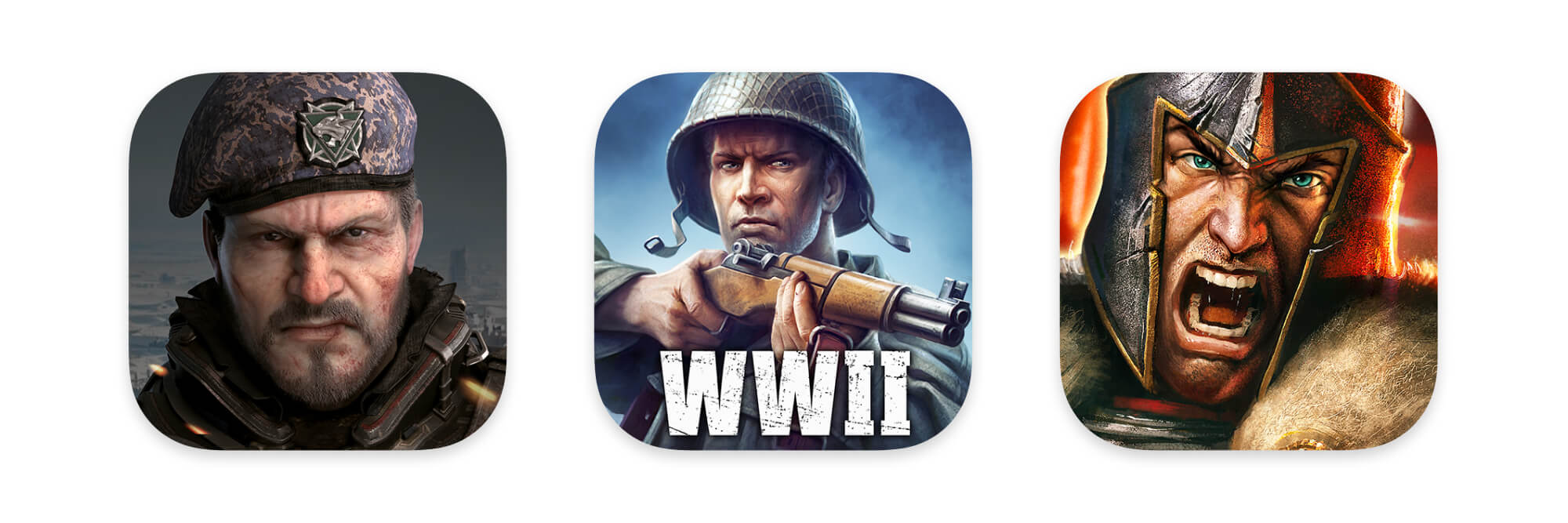
"I like mobile game icons with human, animated faces, for example, Last Shelter: Survival, World War Heroes, and Game of War.
An icon with a face (that shows certain emotions) is magnetic, eye-catching, powerful, and easy to remember."
______
For more tips on how to create great visual assets for your app page have a look at our detailed guidelines. Learn about android and ios icon size requirements, best practices and more.