App Store and Google Play Screenshot Guidelines
Table of Content:
Explore the nuances of working with Apple app store screenshots on iOS and iPad, as well as Android app store screenshots. Even when strictly following the app stores' screenshot guidelines, it's easy to miss details that negatively affect conversion rates. In this article, we'll show you how to work with things like the Apple App Store screenshot requirements and Google Play Store guidelines.
It often happens that even when an app has super cool functions, it stays under users' radars. A lack of installs prevents these apps from reaching the top of their categories and gaining popularity.
What keeps users from installing an app and how can developers change their minds?
The simplest thing for a developer to do is to change the graphics on the app page to garner more attention from users. Why is that important?
Users search for a solution to their problem by exploring all possible options. Screenshots and videos are what are most likely to hook them. The main thing is to sell happiness by showing the user what your app has to offer. This could be interesting puzzles in a game, safely transferring money or beautiful photos.
signup_boosting
How the Graphics are Displayed
1. Portrait screenshots and videos
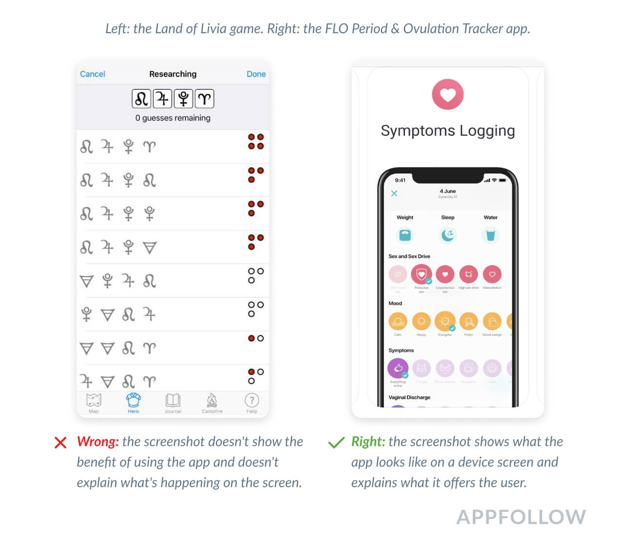
These show the product's features and give users an idea of what the app will look like on their devices' screens. This way, users know in advance what they can expect from the app.
2. Landscape screenshots and videos
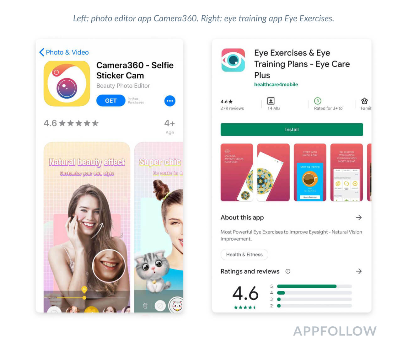
These are great for games and apps with a landscape screen orientation (widescreen). Landscape screenshots are also great for presenting a call to action in a large font that will be easy to read on the search results page.
3. Search results page
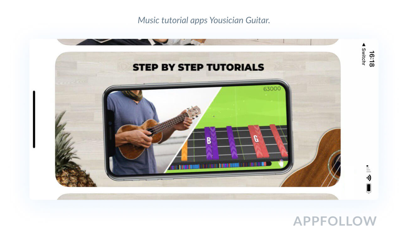
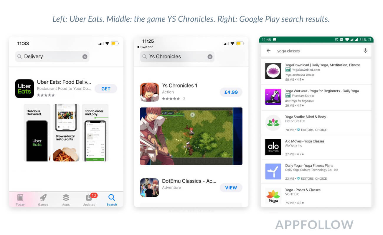
Apple app store screenshots on iOS are very small in the search results, but Apple increased them in 2020! If you add text to them, insert 2-3 words written in large font or merge screenshots. It's easier to show details on landscape screenshots, but the search results page displays only one screenshot. So you'll have to choose one main feature to showcase or use a video.
In Google Play, the search results don't feature any screenshots at all. You'll need to focus on the icon and title instead.
What Are the Apple App Store Screenshot Requirements?
How to Make Outstanding Screenshots for App Store
You can add up to 10 portrait and landscape Apple app store screenshots. You can also add an App Preview video that will be displayed both in search results and on the app page. If you don't have one, App Store required screenshots are the first three portrait screenshots or one landscape screenshot from the app page.
As per the app store screenshot requirements, the pictures must be in PNG (no alpha) or JPEG format. See the app store screenshot sizes below. You can find more details in the App Store Connect documentation.
Apple App Store Screenshot Sizes
Device | Portrait, pixels | Landscape, pixels |
iPhone 11 Pro Max iPhone 11 iPhone XS Max iPhone XR | 1242 x 2688 | 2688 x 1242 |
iPhone 11 Pro iPhone XS iPhone X | 1125 x 2436 | 2436 x 1125 |
iPhone 8 Plus iPhone 7 Plus iPhone 6s Plus | 1242 x 2208 | 2208 x 1242 |
iPhone 6 iPhone 6s iPhone 7 iPhone 8 | 750 x 1334 | 1334 x 750 |
iPhone SE | 640 x 1096 (without status bar) 640 x 1136 (with status bar) | 1136 x 600 (without status bar) 1136 x 640 (with status bar) |
iPhone 4s | 640 x 920 (without status bar) 640 x 960 (with status bar) | 960 x 600 (without status bar) 960 x 640 (with status bar) |
iPad Pro 3rd generation | 2048 x 2732 | 2732 x 2048 |
iPad Pro 2nd generation | 2048 x 2732 | 2732 x 2048 |
iPad Pro 11 inch | 1668 x 2388 | 2388 x 1668 |
iPad Pro 10.5 inch | 1668 x 2224 | 2224 x 1668 |
iPad iPad mini | High resolution: 1536 x 2008 (without status bar) 1536 x 2048 (with status bar) Standard resolution: 768 x 1004 (without status bar) 768 x 1024 (with status bar) | High resolution: 2048 x 1496 (without status bar) 2048 x 1536 (with status bar) Standard resolution: 1024 x 748 (without status bar) 1024 x 768 (with status bar) |
Apple Watch Series 3 | 312 x 390 | |
Apple Watch Series 4 | 368 x 448 |
If you're making iPad screenshots, keep in mind that the iPad Pro 2nd generation should have a Home button, while the iPad Pro 3rd generation does not. Keep good track of app store screenshot size whenever you are making new screenshots.
Apple App Store Video Requirements
Videos can be 15 to 30 seconds long in MOV, M4V, or MP4. Apple requires videos to show the app's UI/UX features or gameplay, not marketing materials like "Download now". Not doing so may result in the moderator rejecting the app.
Both portrait and landscape videos are permitted. You can upload up to three videos for iOS apps. This is important for games with challenging gameplay that can't be shown in one video.
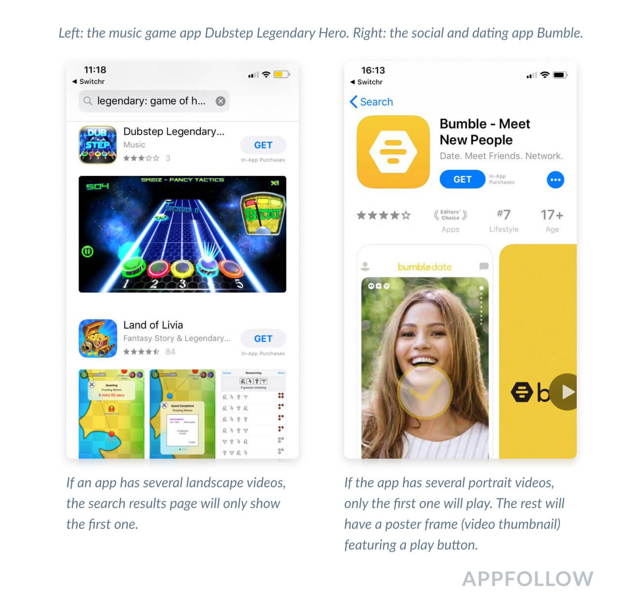
The video plays automatically without sound. You can opt to enable full screen and sound.
Note that the video will not play automatically if the user has low power mode enabled. That means you have to come up with a video thumbnail. See App Store Connect documentation for countries that support autoplay.
How to Make Killer Graphics for Google Play
You can upload 8 PNG or JPEG screenshots. Games need no less than 3 landscape screenshots to enter game lists. Google Play app screenshot size should not be less than 320 pixels or more than 3840 pixels. Learn more at Google Play Console.
Here you can upload screenshots for all devices, even if the app is only for phones. This is useful because Google Play displays all the screenshots and users can install the app via the web version.
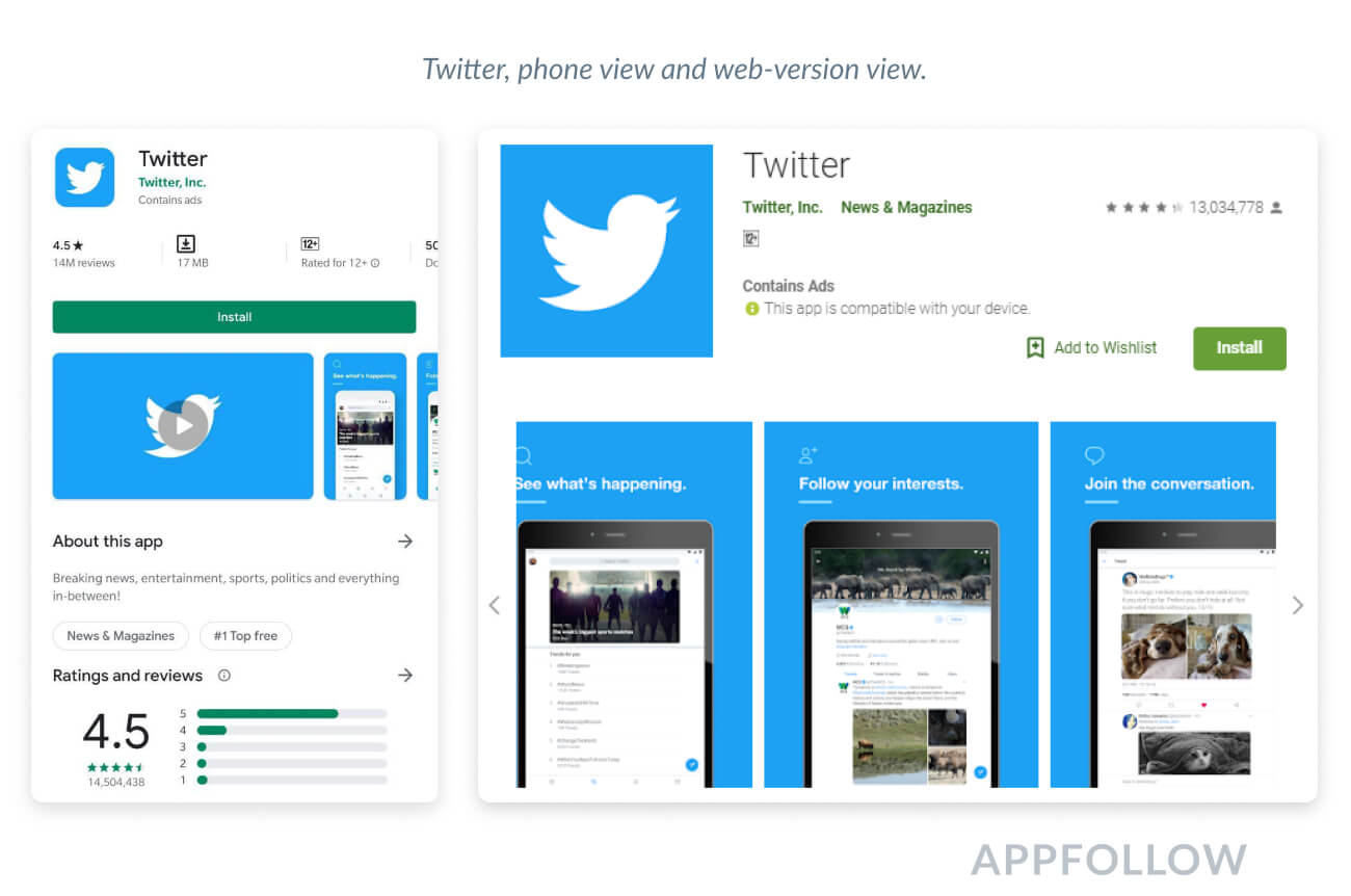
You can first display phone screenshots both in the web version and on the phone before moving to tablet screenshots. This makes it easier for users to select an app based on the device they have.
Google Play Screenshot Sizes
There are no hard specifications for each screen size. Instead, Google divides screenshots by device type and recommends a range of sizes. This simplifies the publishing process (there's no moderation) but makes it harder to track how screenshots will look on different screens.
Device type:
- Smartphone
- Tablet 7 inch
- Tablet 10 inch
- Wear OS
- Android TV
Screenshot sizes: 320 - 3840 pixels
We recommend the following sizes:
● 1080 х 1920
● 2000 х 1300
Aspect ratios:
● 2:1 portrait
● 16:9 landscape
Google Play Video Requirements
You can use only one video in Google Play, and it will be located before screenshots. It’s always in landscape view and, unlike the App Store, Google Play allows developers to add promo materials. Videos must be 15-30 seconds long.
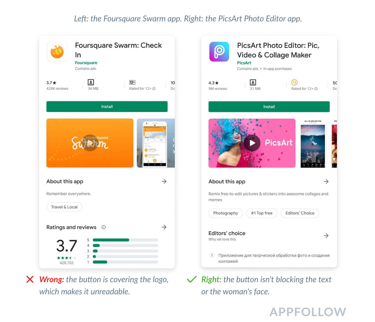
The key difference in the Play Store in 2020 is video autoplay. Similarly to the App Store, the video plays automatically without sound. If you open the full-screen mode, the video will open on YouTube leading you away from the app.
Also, it will take a few moments for the video to start playing. For this reason, it's critical to develop the thumbnail in such a way that the button doesn't cover up the logo and call to action.
4 Simple Ways to Improve Screenshots and Videos
1. Match up the image across two portrait screenshots.
This will help you to show the app interface in more detail and to add easy-to-read text.
It's important to not divide the text between two screenshots. Doing so will make it hard to read. You can also make sure that the phone mock-up doesn't shift across the two screenshots. This will be noticeable on the search results page, which can affect the app page's click-through rate.
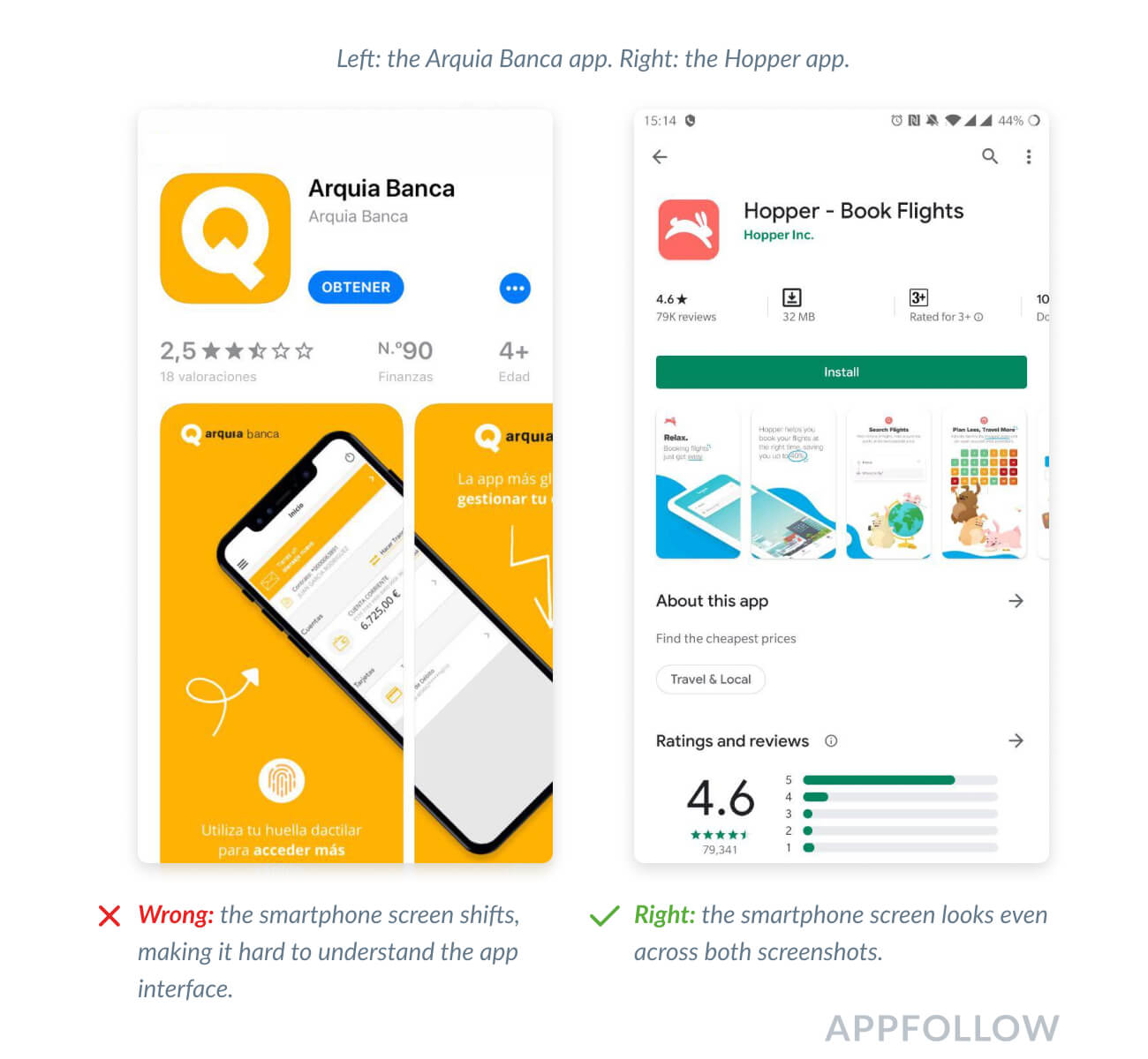
To avoid this, check what the screenshots will look like before publication using AppFollow App Preview.
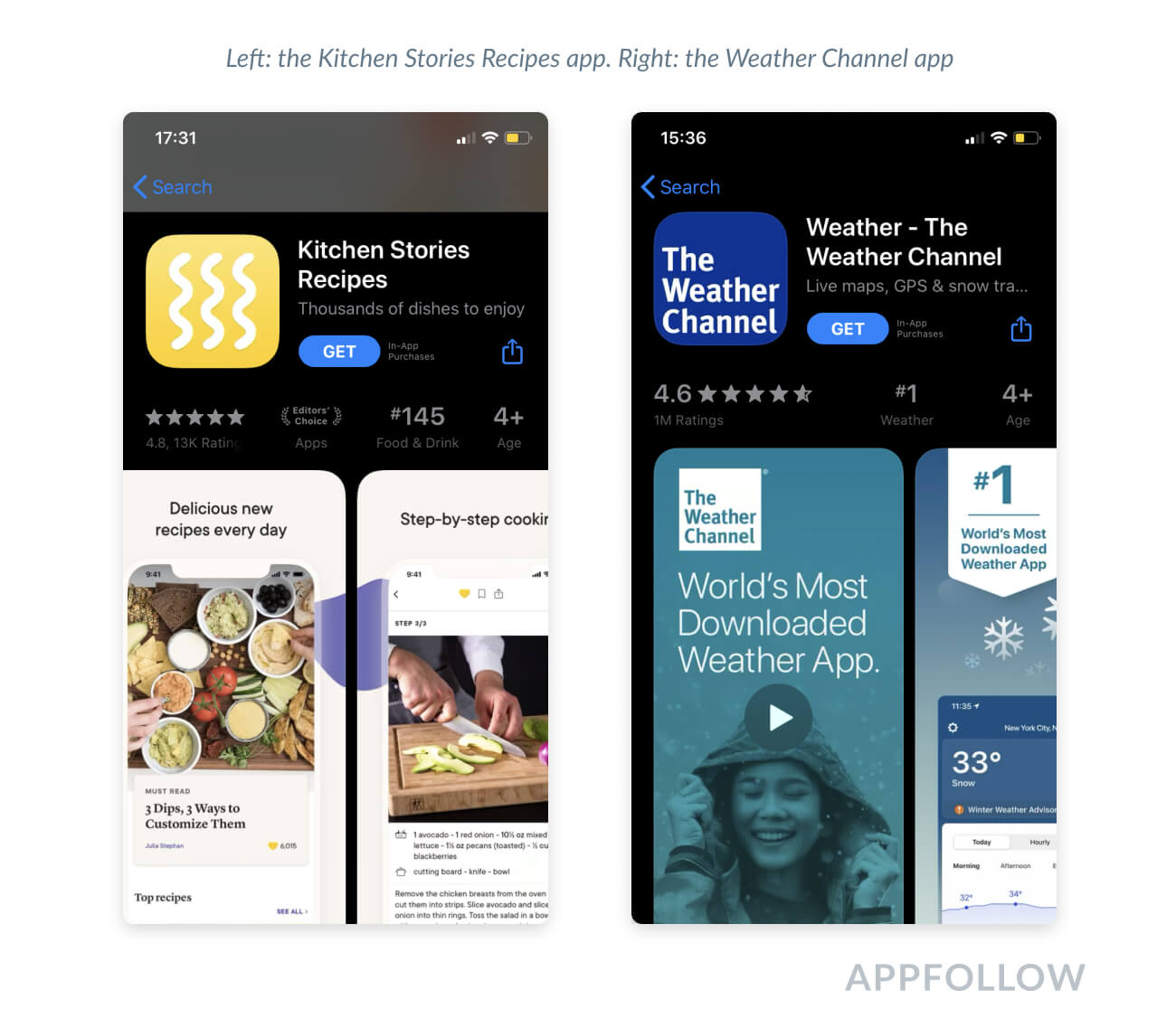
2. Test screenshots in both Light and Dark Modes
Since the App Store has released its Dark Mode feature, it’s become even more important for developers to test their screenshots. Imagine that your top-notch graphics don't look great in Dark Mode, and vice versa. Make sure you’ve checked both light and dark modes and adapted the background before the release.
3. Combine landscape and portrait layouts for screenshots and videos.
When combining portrait screenshots and a landscape video, the app page will display the video instead of three screenshots.
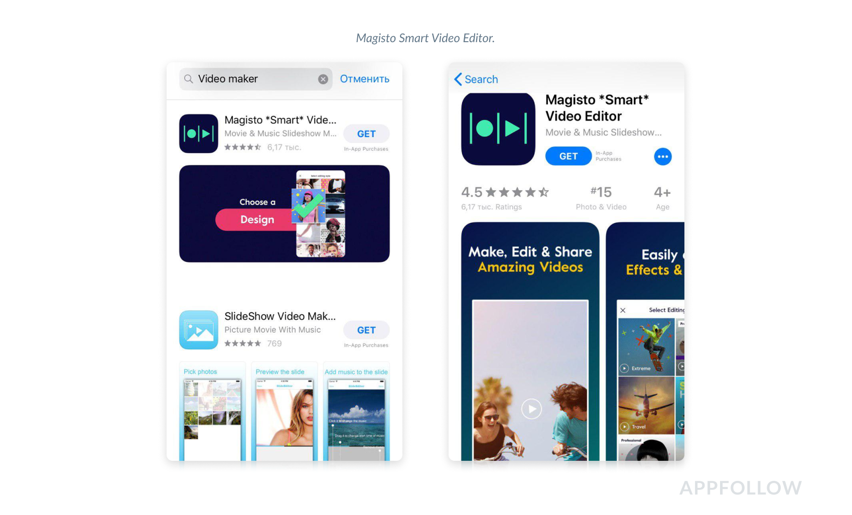
This combination looks different in Google Play. The video is always landscape and goes before screenshots. The portrait screenshots will always look smaller compared to the video, and the landscape ones will be as big as the video.
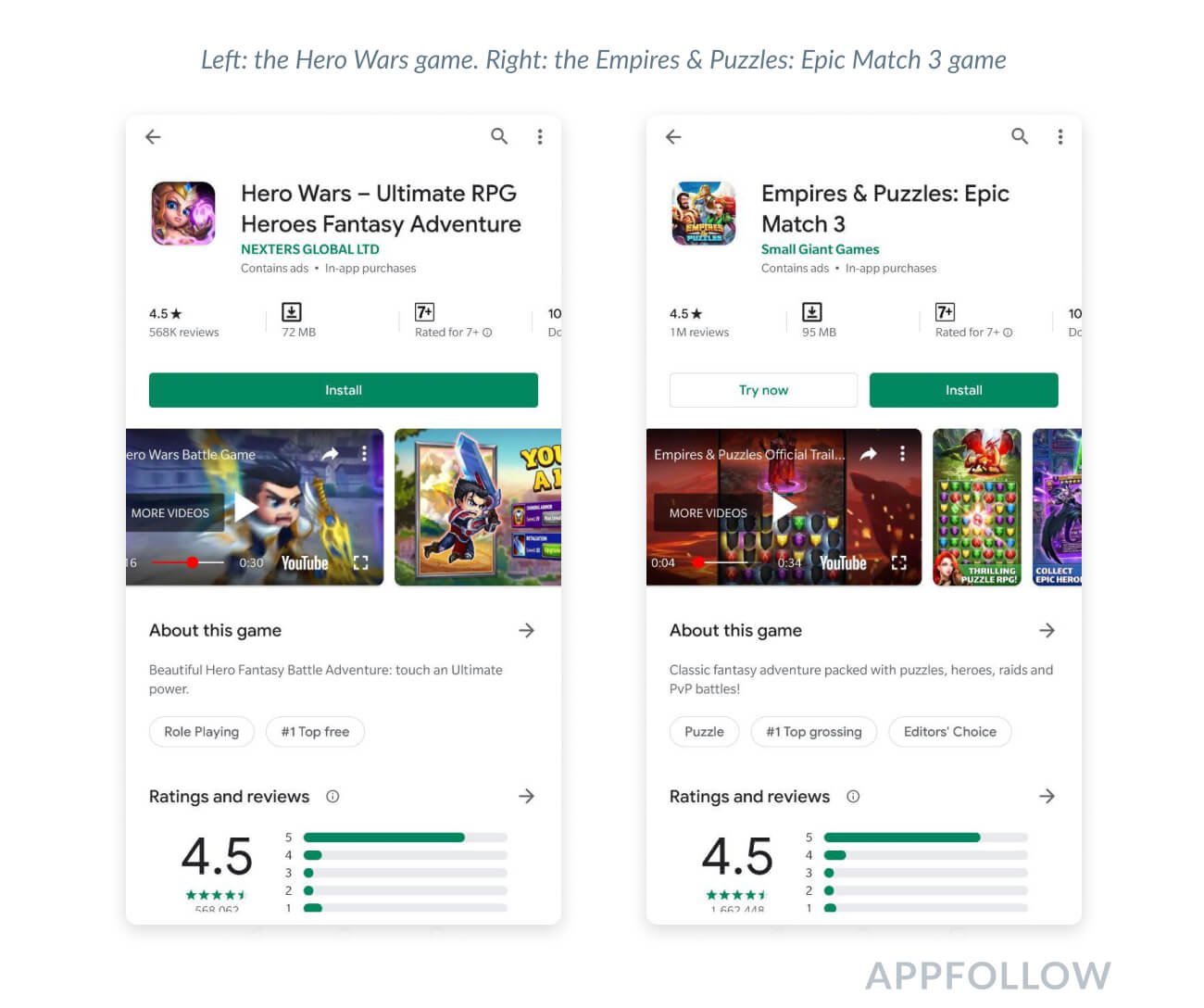
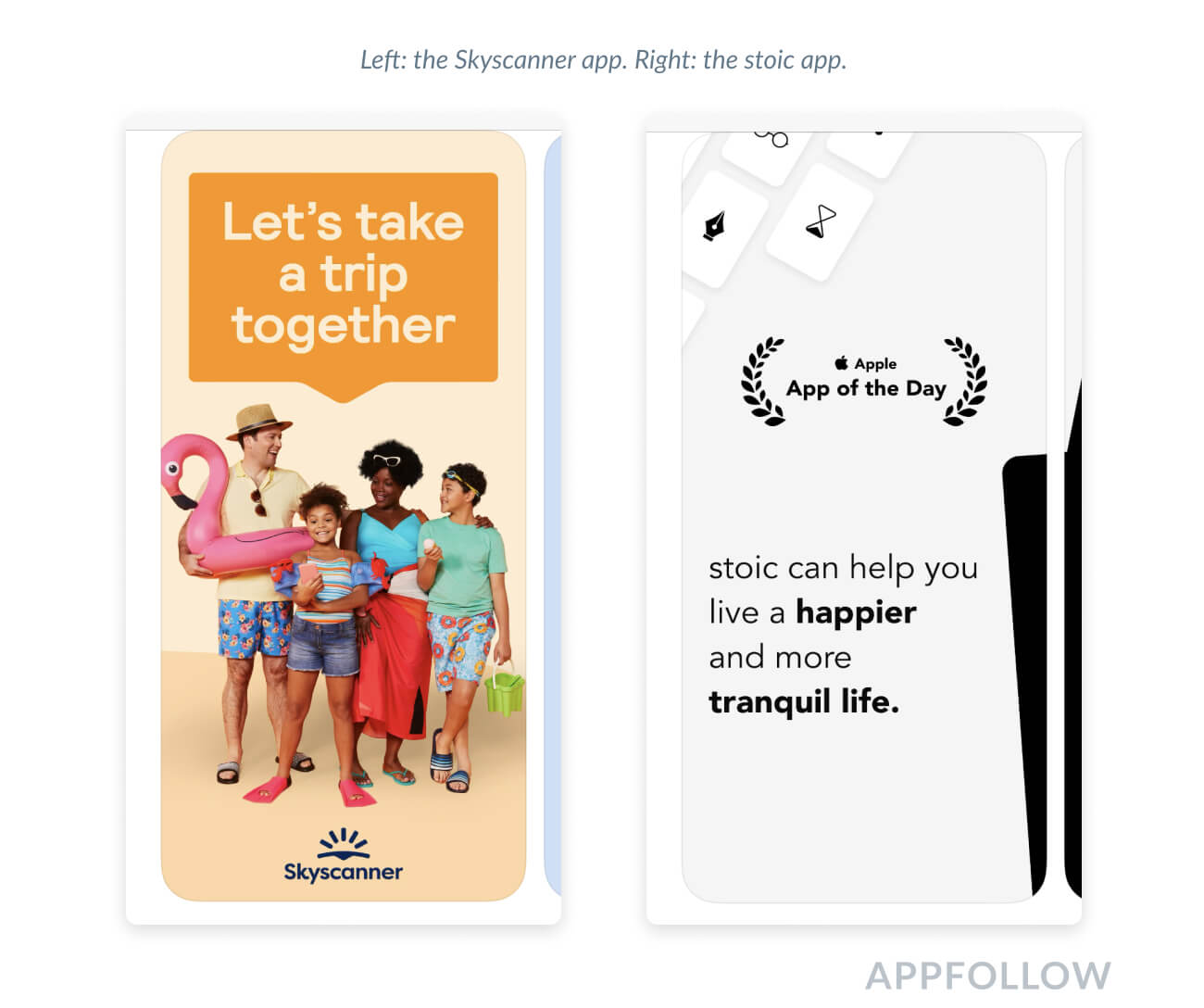
4. Sell happiness, not features.
You don't need all the screenshots to show only the app interface. You can create an atmosphere that inspires the user to install the app. AR and VR apps and games are especially useful in this case. In this case, you'll still need to add 2-3 app screenshots to have a better chance of getting approved by the moderator.
How to make your graphics work
The graphics you select don't always go off with a bang the first go-around. Test different versions of iOS screenshot size, android image sizes, and videos to maximize the effect your graphics have.
Google Play allows developers to change screenshots without releasing an update. This makes it possible to test how the graphics do and quickly change them if they don't look right. Testing the screenshots to fit the Apple app store screenshot guidelines is a little harder. There are no native tools for testing graphics.
There are two ways to test graphics in both app stores: native testing and A/B testing.
1. Native testing
You can test graphics using a pre/post-testing approach. With this method, the effectiveness of graphics is consistently measured before and after changes are made. It is complicated by the fact that it's hard to identify the specific role screenshots and videos play since many factors can impact installs.
2. A/B testing
Android apps have a special Google Experiments section for testing. You can upload up to 3 slots with screenshots for the current graphics. This section makes it possible to determine whether or not screenshots or a new video will impact installs.
Search Ads can be used to test graphics for iOS apps in countries where these ads are available. But this costs money.
There are also third-party services and tools that help with testing, such as StoreMaven, SplitMetrics, and others. Using AppFollow App Preview, for example, you can test what the app store screenshots on iOS will look like on different Apple devices before releasing an update.
Afterword
We've compiled the basic errors and shortcomings that prevent developers from getting coveted installs. We know from our frequent experience helping our users with ASO the harm these mistakes can bring. Sometimes it's enough to simply change the screenshot order to increase the conversion rate several times over. Maximize your app's potential with our Google Play Store rating guide.
Do you want to know how to improve your graphics to increase your installs? Contact our ASO team, we'll help you with screenshot testing and ASO optimization.
May the ASO and AppFollow be with you!
FAQ
Are app store screenshots important for user engagement?
Users are visually driven. They're on the hunt for apps that solve their problems, and screenshots are their first impression. It's all about showcasing the cool features your app offers, whether it's solving puzzles, transferring money safely, or sharing beautiful photos, using free ASO tools to optimize your presence. A picture sells your app better than a thousand words. ASO checker tools and integrating app store keywords will boost your app's visibility, too.
What are Apple App Store screenshot sizes and requirements?
Apple is picky about its screenshots. You're allowed up to 10 of them, either in portrait or landscape, plus an App Preview video. They've got to be in PNG or JPEG, no alpha. The sizes vary massively depending on the device, from the iPhone 4s all the way up to the iPad Pro and the Apple Watch. Mess this up, and your app's visibility takes a hit. Familiarize yourself with the App Store review guidelines and employ reputation management software like AppFollow to further boost top star ratings.
How do Google Play Store screenshot guidelines compare?
Google's a bit more laid back than Apple but still has rules. You can upload up to 8 PNG or JPEG screenshots, and if you've got a game, you better have at least 3 landscape shots. Sizes range from 320 to 3840 pixels. Google cares less about precise sizes and more about covering a range of devices, which can be a blessing and a curse since you've got to make sure your app looks good on all of them. Get the lowdown on app ratings from the experts: what is rating?


