The New Uber Rider App: Check Your ASO


Table of Content:

On November 2nd, 2016 Uber introduced an update to their app with new design in the App Store and Google Play. Learn more about it here or here.
My attention was drawn to ASO related changes of this new update. At first you can only notice new screenshots which is a logical move since the app design was updated. However, there are few flaws to notice…
New icon
The app icon has a new design:

Old and new icon of Uber
Major changes:
- bigger logo,
- higher colour contrast (new icon is black & white only),
- plain background without any pattern.
iPad-version and app size
New app is now available on iPad. It’s a great news for tablet users who can now easily get a cab via iPad if it’c more convenient for them. From now on if a tablet user searches “uber” in App Store, he or she will find official Uber app optimised for larger screens rather than competitors apps or clones.
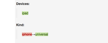
New universal app is almost 150 MB, yet iPhone and iPad apps are within the limit (<100 MB, according to Apple, apps of this size are easy to download even via mobile Internet).

Whoa, come on, how big can be the size of a taxi app? Is it the new designs that adds all these MBs?! :)
Not every user is ready to download or update an app of ~100 MB via mobile internet data. It is particularly true for smaller towns where mobile internet data is often expensive and can not provide high speeds. But may be Uber isn’t targeting them yet. Well, it turns out to be a major flaw for lots of taxi apps out there, no matter which audience they address.
My advice: no matter how popular app you develop, you should pay a proper attention to its size.
Smaller app size is more likely to serve for better conversion-to-install rate as users are eager to download or update an app with any connection at hand.

You can check app size analysis in App Size Calculator by Segment.com. They reviewed older version of Uber app, however basic finding are clear: https://segment.com/app-size-calculator/368677368-Uber
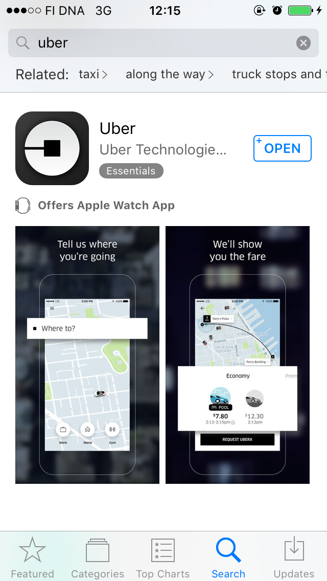
App Store Screenshots
New iPhone screenshots show team’s new approach: smartphone is slightly visible on the background whereas a particular interface element is zoomed in. Text phrases and large UI elements clearly deliver app value and its features.

It’s important to notice that app interface is only 60–65% of the screenshot. I believe, it’s not enough. Users can’t see much except the map. Background also draws too much attention which is arguable.
App interface can be zoomed to 70–75% on screenshots with no damage to design. Our practice shows that this can significantly increase conversion-to-install.
I suppose, new screenshots look worse than the previous ones:
I was even more surprised when I checked the screenshots for iPad. I didn’t believe there is only one app screenshot available.
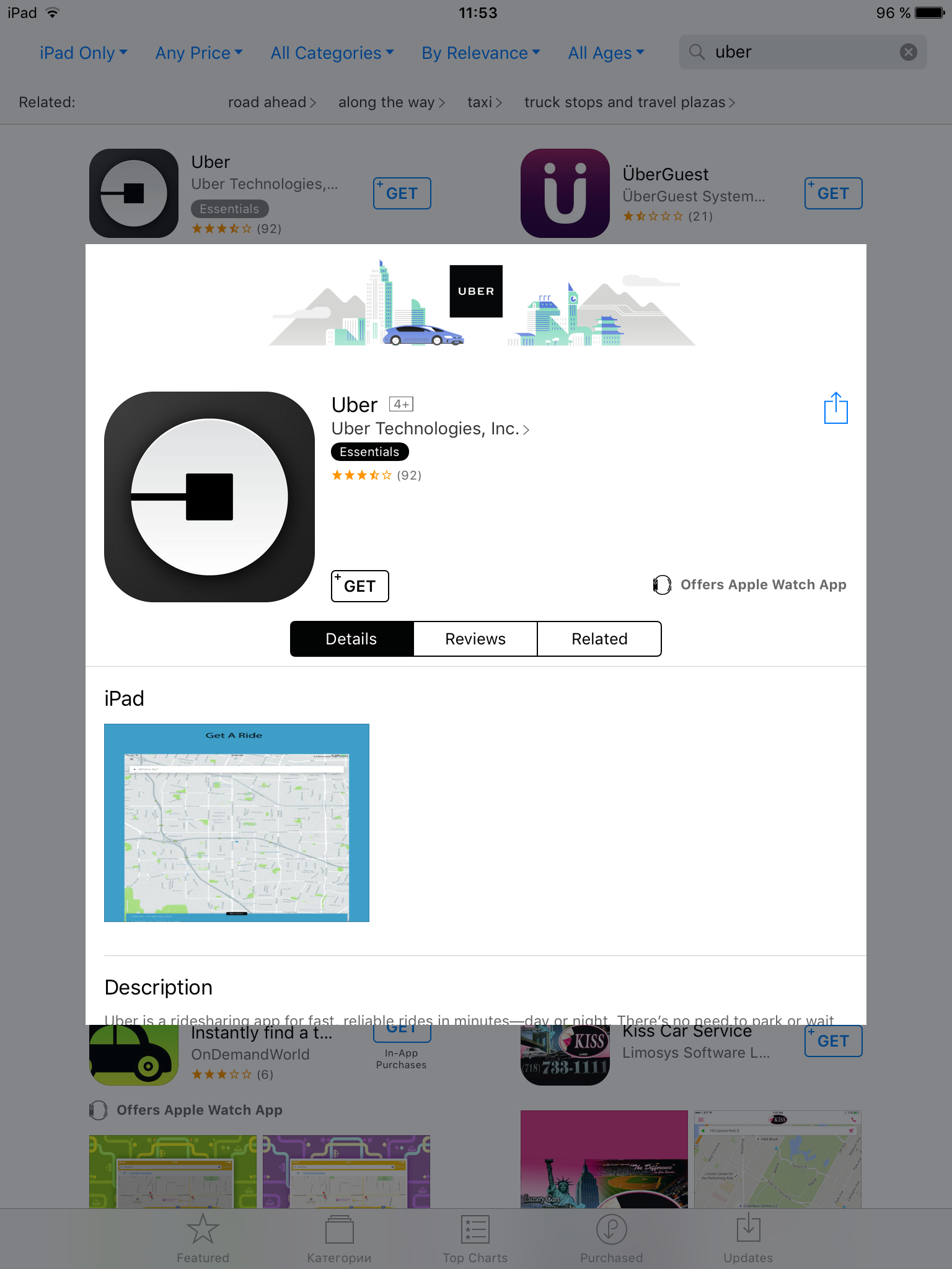
I examined app meta-data and realised that probably Uber’s team made a mistake while uploading new screenshots: they added them for iPad Pro only, other iPad models have only one screenshot which was, perhaps, added at last moment by one of the developer. Have a closer look here.

As a result, Uber app looks quite bad on all iPad models except iPad Pro. All competitors have much better screenshots and look more favourable.

Last thing to mention — currently all screenshots are in English. They are not localized for other geos where Uber is actively developing. The app description is translated to different languages though.

Changes in Google Play
I haven’t noticed any changes except a new app icon. Screenshots still remain the same as before.

As a conclusion, I can assume that:
- App launch preparations were done in a bit of a hurry, there are few elements that still need a revision.
- It seems that Uber’s team is not that much into ASO, otherwise they would pay much more attention to screenshot, for example.
- Company definitely relies on marketing budget that can ‘cover’ such pitfalls.
All meta-data on Uber’s app in the article was pulled from AppFollow.io.
Thanks to Jana Starostovich and Evgeny Kruglov for help with translating this post, original post in Russian is here.
