App Store and Google Play A/B Testing Strategies to Try in 2020


Table of Content:
Noga Szpiro from StoreMaven talks about App Store Optimization strategies, experiments, and ways to increase conversion rate in 2020. StoreMaven helps their users to get more app downloads by optimizing their app store creatives. AppFollow Mobile Growth Meetup, January 2018.
Based on the billions of data points StoreMaven has analyzed over the years, we understood what makes up a good ASO strategy. I’m going to share with you some of these insights.
What Drives Your Users
The main component of a good ASO strategy is understanding what drives your users, and as an example, I’m sharing with you a timeline of HBO NOW store updates.
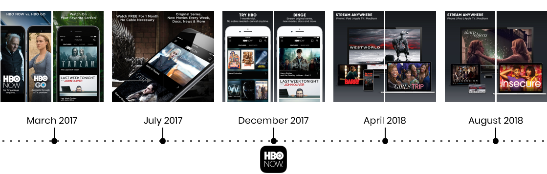
Here is an example of an app that understands how to constantly update their app store page based on the changing user’s interests. Back in March 2017, HBO NOW came to us with an issue of users not understanding the difference between HBO NOW and HBO GO. We helped them translate this issue into a hypothesis and this ended up being live in the store.
Later, in July 2017, users were mainly discovering HBO NOW through the new season of Game of Thrones. This was emphasized through their store assets. Later on in December during off-seasons it was important to show a variety of shows, a catalog, and messages of binge-watching, for example.
Then the message of cross-platform took cover while still showing the catalog of shows and the most relevant shows for that time period. It was a more subtle change and all of these changes might seem obvious now. But remember that all of them were parts of the hypothesis, of an experiment.
Users Behavior
Another layer of understanding your users means studying how they behave on the App Store. We understood that the users on the App Store and on Google Play can be categorized into two types of users: decisive and exploring ones.
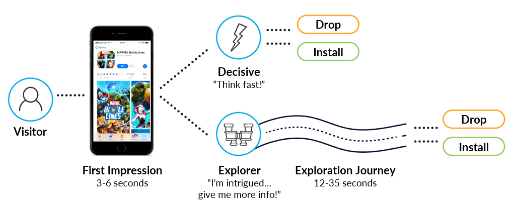
Decisives are lying on your app, they stare at the screen for a few seconds, they don’t make any active action and they make their decision whether to drop or install based on the first impression. The first impression is the screen that you see over here: the icon, the title and subtitle, the first two assets of the gallery, and that’s it.
Explorers take their time to explore the app a bit further. They scroll through the galleries, read reviews, the description, etc., and then they decide whether to install or drop.
We see that the more content users consume on the app store, the better quality users they become, they’re less likely to uninstall, more likely to open the app for the first time and they become higher payers. Top brands use the app store as more than just a way to get more users. It’s a part of their onboarding experience. Think of this as a way to inform users about what your app has to offer, different features and different kind of things they can do on the app.
Experiments
Brands that understand how users engage in their store can understand what type of messages must be part of the first impression. We developed the ability to see every live Google experiment, different variants, and assets that each variant includes. And we can derive which variant was the winner based on the variant that was implemented in the live story when the experiment was concluded.
I will show you the experiment by Deezer.
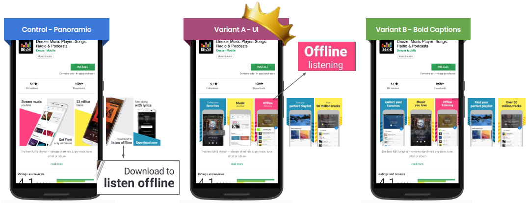
The control variant is a panoramic screenshot, which means that more than one of the screenshots have a creative that’s going through. This one is control. The difference between the variants A and B is the captions and the boldness of them. The variant A ended up winning.
The message of listen offline appears in this variant on the third screenshot, which is the part of the first impression. In the control, it appears on the fourth screenshot, and it’s not part of the first impression.
It’s hard to understand what caused variant A to be the winner, whether it was the design style that used individual screens in each screenshot, or whether it was that important message of listening offline. It’s also difficult to understand what was the traffic blend during the time of the experiment.
signup_boosting
Culturalization Instead of Localization
Developers who look into understanding their users may have already adopted a strategy of localizing the app store page. Here is an example that literally translates both creatives and the language. It is US and UK, so obviously they’re both in English, but the creatives are just suited to another geographical location.
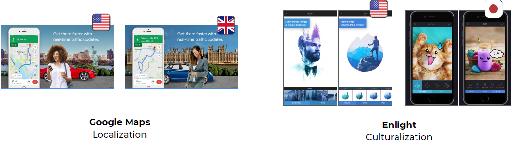
Culturalization, on the other hand, is taking this idea one step further with the understanding of what type of features suit the culture. On the right here is the Enlight app adopting the culturalization strategy and showing completely different features and creatives in Japanese store compared to the US store.
Traffic channels and creative assets
The future of ASO means not only understanding your users but the different types of users. Different users have different downloading intent. For example, users that come in from Search might have a very high intent, and they only need a confirmation that this is the app they were looking for. Browsing users are probably assessing your app to compare you to your competitors. They need more specific selling points that are relevant to your app specifically compared to other apps out there.
Let’s understand what each user journey actually looks like.
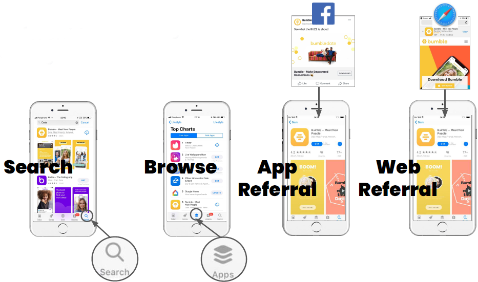
Users that go to Search and enter a specific keyword relevant to your app, could be something related to the app specifically, the brand, competitors, or the category. Among your creatives, they will see the first three assets.
Browsing users discover your app from anywhere on the App Store, besides search. Users came from Browse will just see a small business card of your app, mainly the icon.
App Referral users are redirected to your product page directly from another app. This could be all the EUA traffic. Web Referral traffic is redirected from a mobile web, e.g. your mobile website. Both categories will see the entire product page because they land directly there.
How should we address these different segments?
Traffic Channels Analysis
The first step is to understand the unique blend of your app. Where do impressions come from? Where is the app discovered? Where are installs coming from?
The app in the example is mainly discovered from Search (39%) and Browse (49%). However, when you look at installs, you can see that Search is bringing the smallest share of app units.
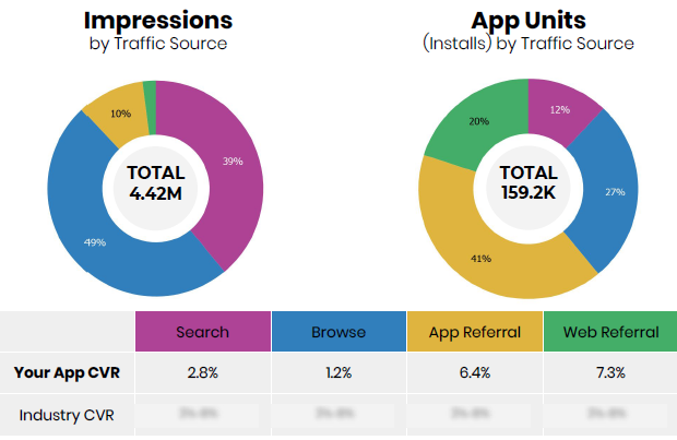
This means that there’s a large potential to optimize for search traffic.
The next step might be to analyze the keywords and to see what type of keywords bring in the largest share of traffic and where you fall behind in these creatives.
Target Audience Analysis
After you have understood your traffic, then the next step is to determine which audience you want to optimize for. Not every channel brings in the same quality traffic, and addressing them all at once might be impossible.
There are different factors to consider:
- the traffic segment that brings in the top payers,
- complimenting your general marketing strategy,
- the highest potential sources.
Let’s imagine Tinder wants to penetrate a new market in China. Here are real factors to consider:
- it might be easier to acquire female users compared to male,
- their main traffic source is App Referral,
- they might decide that the next channels they want to optimize are App Referrals or male users coming from App Referral while keeping in mind female users and not harming their experience.
Traffic Channels and Mistakes to Avoid
To understand what kind of messages can work for a different audience, let’s look at the different channels that users come from.
Search
In the example, a user entered the keyword cheap tickets.
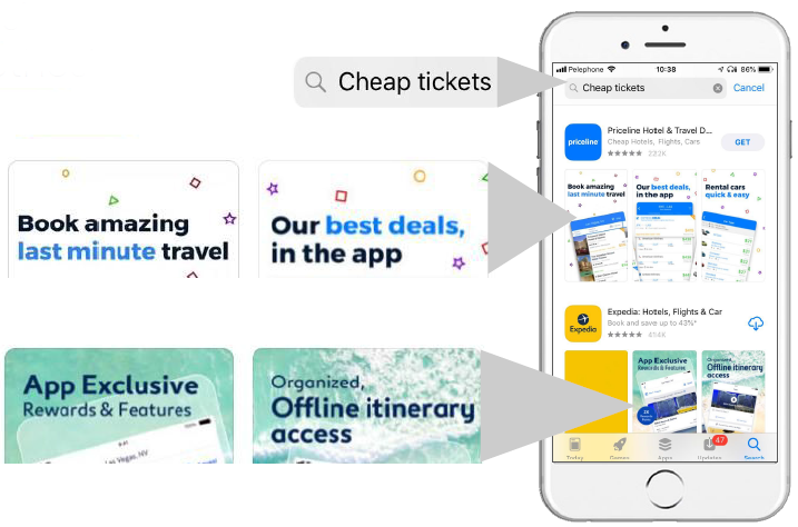
Two first search results are Expedia and Priceline. Expedia is not addressing the cheap tickets keyword directly, while Priceline is directly sending messages relevant to that keyword. This is not necessarily bad, Expedia might not consider this keyword an important and relevant source for their users. Maybe even their main traffic source is Web Referral and therefore these messages work better.
Web Referral
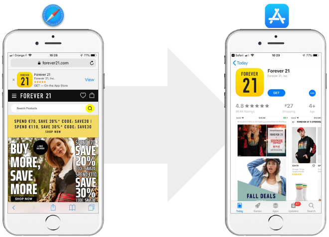
Forever 21 app sends users from their mobile website to their app using a smart ad banner. When users land on the App Store page they understand that they landed in the correct place. This is not always the case, sometimes users can land here and be very confused, for example, if the icon doesn’t fit with what they’ve seen before. But in this example, even though the users understood that they landed on the relevant app, they don’t see any value proposition for the app specifically compared to their mobile web page. Also, they don’t see the same promotions that were presented to them on the website. This can harm the user experience and can actually get users to drop off completely.
App Referral
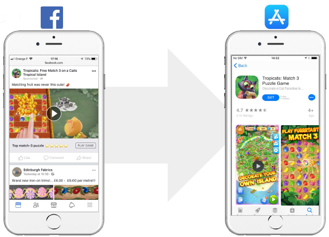
Tropicats app sends users from a Facebook ad to their product page. You can see a coherent transition between the add to the product page. All the important assets are demonstrated in both stops, but repetition is definitely avoided. Both, at the match three screen, the decorating aspect and the character. None of them repeats in the same way. It’s important for users to not see messages too repeatedly. Users get tired fast, and you want to constantly get more information. It’s important for each stop along the user funnel to build on top of the previous one.
Testing
After we decided which source we’re going to optimize and what kind of messages are going to derive, it’s time to test. I listed the four main AB testing solutions, and I’m going to talk about the pros and cons of each of them.
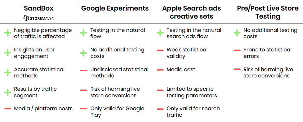
Sandbox
Sandbox is using a platform like StoreMaven to send a small share of the users into a test environment to see which variant they prefer.
The upsides: this is a test environment that live store traffic is likely to not be affected. You will be getting insights on user engagement like you’ve seen before. Accurate statistical methods that will tell you when it’s fine to close a test with confidence and when you can close variants along the way. You can also segment the traffic, so you can decide what traffic you’re going to send and what segments. For example, you can segment the traffic by gender or by age group or different interests, etc.
The main downside is the media and platform costs.
Google Experiments
The main upside — it’s free and it’s testing the natural flow, along with this is also the major downside that it risks harming live traffic. Also, the results you see on Google Experiments will probably only be valid for Google Play. I repeatedly see these things that work in Google Play don’t necessarily work on iOS. The main reasons are the different nature of users, different layout of the store, and the different competitive landscape.
Apple Search Ads
Apple Search ads creative testing or creative sets — the main upside here is that it’s testing the natural search ads flow. But you cannot control the sample size, and this will only be valid for search traffic. This is not used so much for App Store creative optimization.
Pre/Post Live Store Testing
The idea is to change the App Store and then see compared to the time period. This is free, but it’s extremely risky. You’re putting something on the live store and sending 100% of your users to that variance without an indication of whether that’s working or not. It’s likely that app developers that use this method are going to be a bit more conservatives with the variants that they’re testing and it’s going to lead to lower impacts.
Release
After we tested and we found an optimized version it’s time to update. When we update the live store there are few factors that need to be taken into account before analyzing which is the next step.
Here’s the example. The point shows what update was made, you can see the total app units by source.
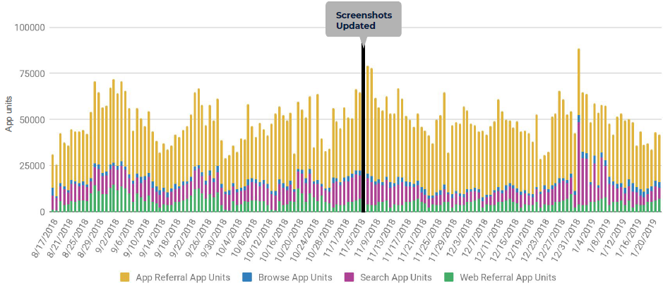
The factors to analyze here:
- seasonality,
- competitor landscape,
- OS release date,
- keywords ranking updates, etc.
But when you look at the overall it might be difficult to understand what the impact was. For that reason, we break it down by source.
Analyze
In this example, you can see app units for App Referral and for Search.
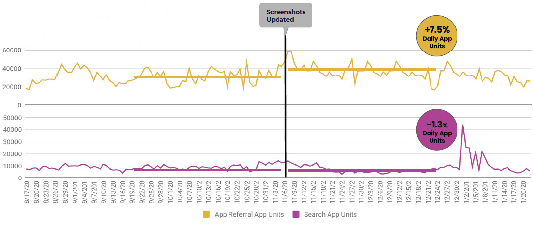
These two metrics can be broken down even further, App Referral can be broken down into App Referred and Search can be broken down into the organic update. But in this high-level analysis, you see that App Referral cause a positive impact, and Search face the negative impact. This could be either positive or negative depending on what was the goal of this update and based on the segment that we wanted to optimize.
--
ASO world has matured and things that worked in the past might not be enough in the future. We don’t have the ability to customize a store for different flows yet, so I recommend to follow these six steps. Developers that really take the time to develop a holistic approach are likely to win the App Store.