A Guide to Conversion Rate Optimization for Your App

Table of Content:
What is App Conversion Rate Optimization (CRO)?
The things about conversion rate optimization (CRO) is that it’s a complex task, involving composing app titles and subtitles (or short description), improving the long description, and changing the creative assets for the app product page.
Its purpose is to increase the amount of users that convert across points in the user journey. For most apps, the main overarching goal is to increase revenue. CRO is a crucial way to achieve revenue growth. When done well, it can get your users from having a mere interest in the app to becoming paying, loyal customers. This includes convincing them to go from a visit to the app store page into installing the app, being a free user to buying a subscription, or returning and buying additional purchases.
But what do you need to do to improve your conversion rate? Oliver Hoss, an expert in mobile marketing, shares three ways your can improve the metadata elements for your app product page you can implement as part of your CRO strategy.
How to improve your CRO — 3 strategies
1. Highlight relevant keywords in all your metadata
In your long description
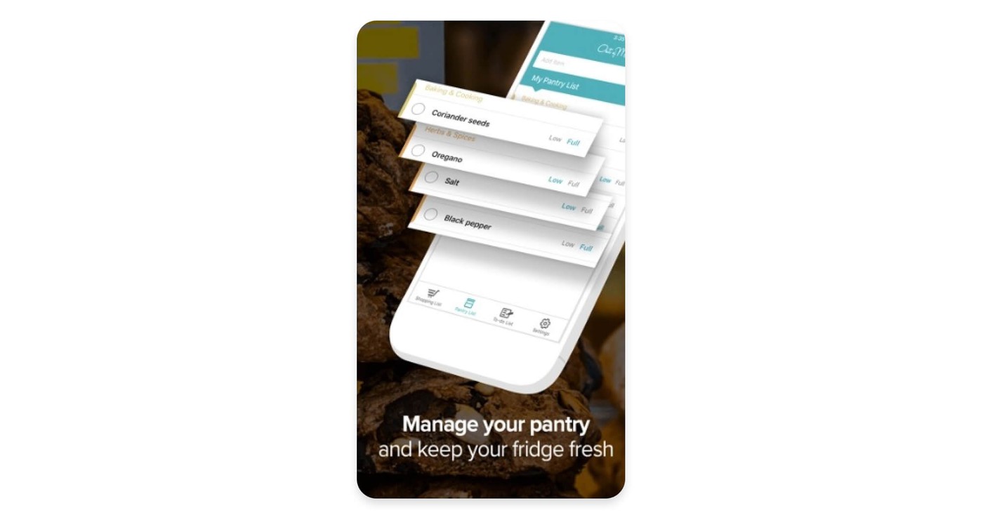
As you likely know, you only put keywords in your app title and short description that matches the relevant search intent. But did you know that it’s also important to highlight these keywords or phrases in your long description, too. You can do this by boldening them so that they are prominently displayed. This is because when visitors are going through your product page during their consideration, they’ll be looking for keywords or terms that link to their problem. If they can quickly spot them, they will be more likely to investigate your product page further and then download your app. Thus, you should invest some time to highlight keywords so they draw users’ attention towards them.
But how do you do this?
With HTML formatting, you can make keywords bold or italic, underline, or even color them. This is true for all text elements on Google Play: app title, short description, and long description.
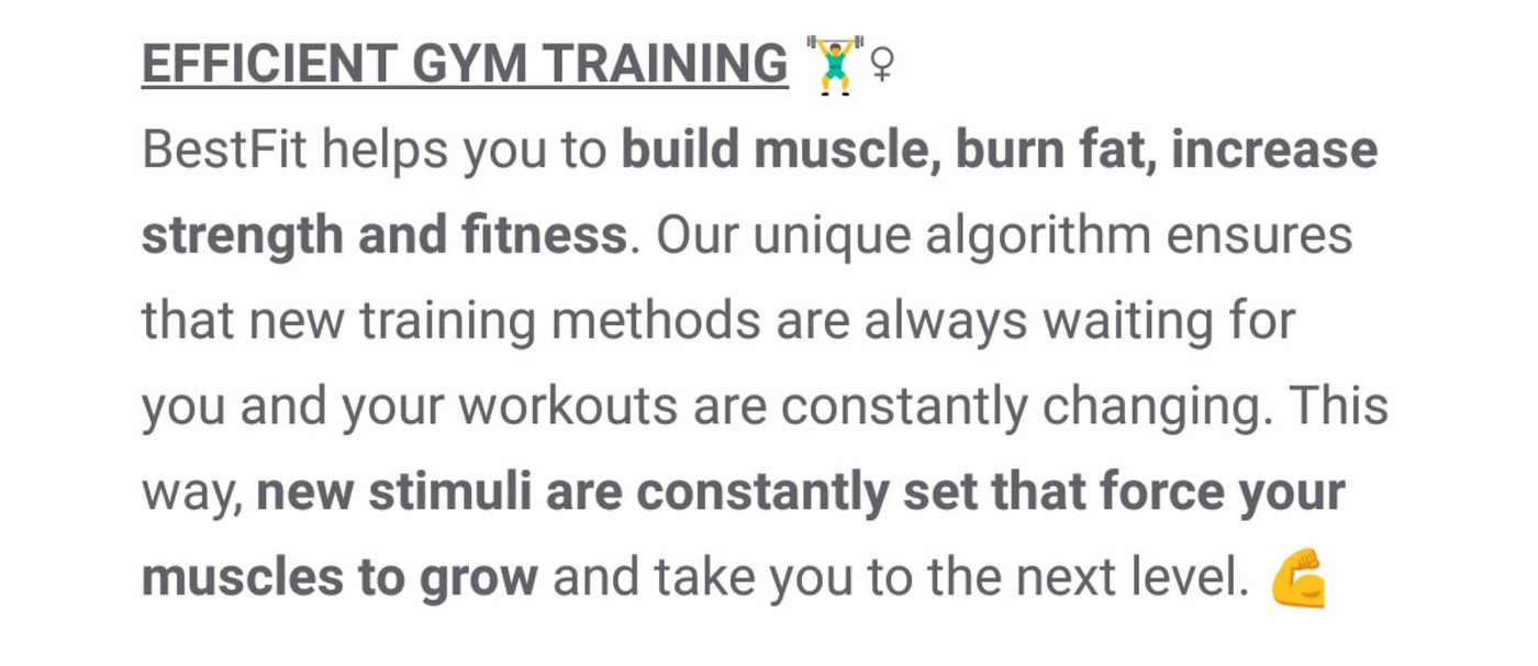
Let me illustrate how HTML tags work. To make the first sentence appear like in the picture above, you would have to write it like this:
BestFit helps you to <b>build muscle, burn fat, increase strength and fitness</b>.
The first tag <b> tells Google that the following text should be bold. The second tag </b> indicates the end of bold text. The same principle applies to italic, underlined, and colored text. These are the proper tags:
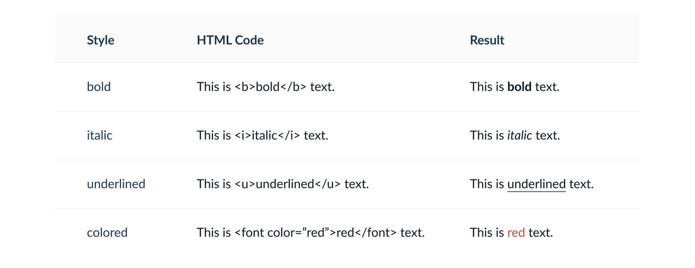
On iOS, your options for styling texts are limited, because Apple doesn’t allow HTML tags. To highlight keywords, you can only use all capitals. Additionally, think about using special characters like the plus (+), the asterisk (*), or the tilde (~) before and after a keyword to emphasize it.
However, it’s important to note here that you need to consider carefully whether highlighting or expressors are appropriate for your app.
In Screenshot and Video text
You should make your essential keywords visible in metadata elements that do not matter for the search algorithm, too
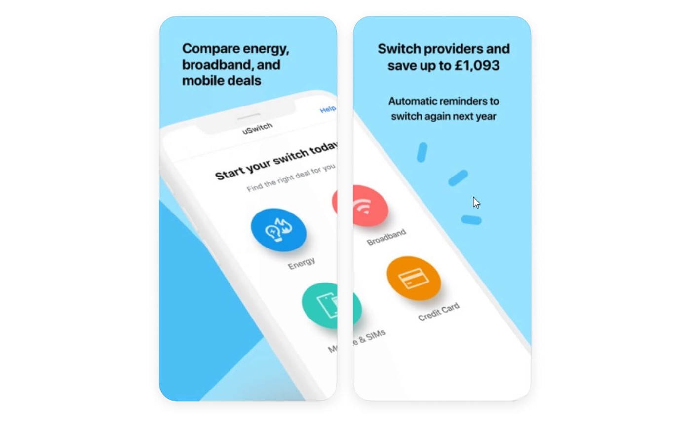
Add keywords to your screenshot and video text. They are the most appealing and eye-catching elements of your product page and need to get the message across immediately. Both should show your app’s most relevant features, and so adding relevant keywords to explain them is a logical consequence.
The screenshot by uSwitch is a good example. It contains a lot of relevant keywords for their business: compare, energy, broadband, mobile, switch, providers, save.
2. Show your app’s value proposition right away
If users don’t understand what they see or read, they will lose interest and leave your product page. So you need to take them by the hand and guide them through their experience by properly explaining your content.
A congruent story is a basis for explanatory guidance. Address the user’s problem and lead to the solution — your app. You can tell your story in your app description, but you can also visualize it in screenshots and videos. Here are three story types that sell the value proposition right away:
The transaction story
This story follows the in-app user journey. It is a great match for apps with a linear journey and a clear result at the end. For example, the transaction story in Lyft’s screenshots looks like this:
- choosing a destination
- checking the price
- tracking the driver and the ride
- Paying
The progression story
This emphasizes the long-term benefits of using an app. This is an excellent way to explain fitness or educational apps. They have a linear journey as well, but using them once will not create impressive results. Only long-term engagement will deliver the desired outcome. Here is an example of a progression story for a fitness app:
- selecting an exercise
- reading the instructions
- doing the workout
- starting over again
Finally, some apps offer multiple functions, but these functions are not connected to each other. Instead of linear journeys, users experience individual journeys based on their needs. If that’s the case, it makes sense to present features ordered by their complexity. These complexity stories make sense for many apps in the tools category. For a calculator app, it could look like this:
- basic calculating with addition and subtraction
- showing intermediate calculations with percentage or fractions
- introducing complex operations like integral calculus and vector analysis
Visualization is key to your app users getting it
In addition to explaining your content, you also need to guide people visually. Make them see what you want them to see.
I have already explained one way to do so for your app description: using HTML formatting. Single terms that are bold, underlined or colored stand out against the rest of the text and draw the reader’s attention towards them.
For screenshots, you need other techniques. In most cases, you want viewers to direct their attention to a specific part of a screenshot, for example a small navigation element or an icon. Here are some options for this purpose:
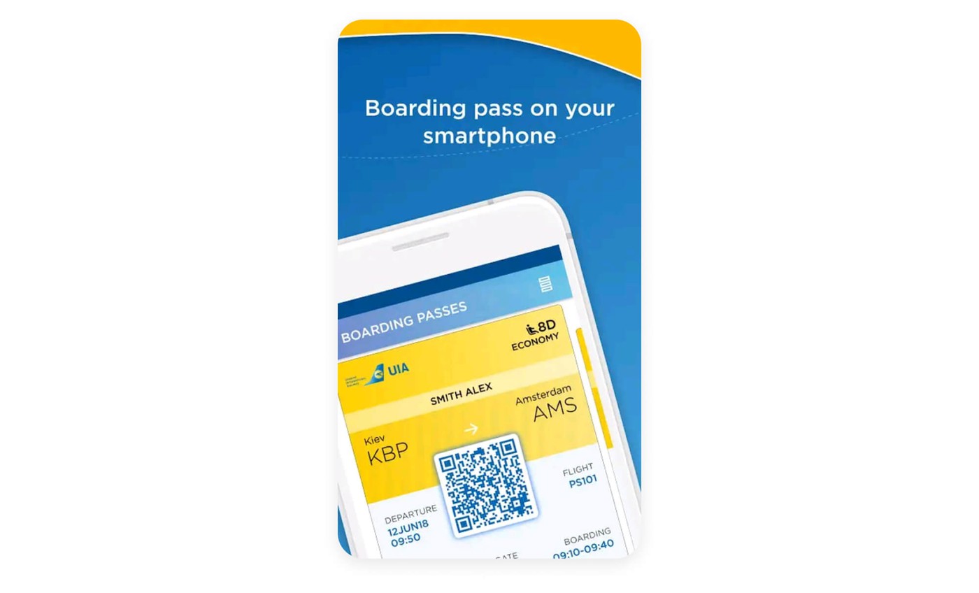
Show partial mobile devices in your screenshots
If a part of your raw screenshot is important and the rest is not, simply cut off the rest. When you show only half a device, you can enlarge it and make the relevant content more legible for users. Have a look at the example screenshot from FlyUIA below. They cut off the lower half of the raw material and focus on the upper part to show the mobile boarding pass in more detail.
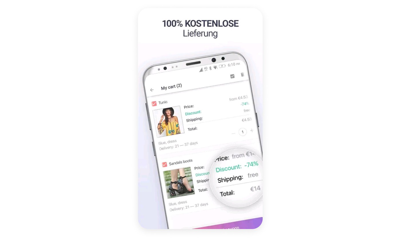
Use a magnifying effect in your screenshots to zoom in on crucial information
In the German screenshot of the shopping app Joom, you can see a magnifying glass that enlarges a small section of a price table. Without understanding the German captions, can you guess which feature the screenshot shall emphasize? It is free shipping.
Use augmentation effect to emphasize details in your UI
A technique that works similar to magnifiers is augmentation. It is about cutting out a specific component and popping it up to the foreground. When combined with a rotated device, augmentation not only emphasizes the details you want to push into the user’s focus, it also creates spectacular 3D effects. Check the screenshot from Out of Milk below:
No matter which technique you choose, don’t overdo it. Too many highlights will confuse viewers rather than guiding them.
3. Product page assets should be unique and appealing to the eye
The third criterion of a good product page is beauty. Your visual creatives should simply look great and stand out against your competitors’ product pages.
A crucial aspect of beauty is accessibility. To optimize users’ experience when browsing your product page, you should take care of several things:
- Give your app description a proper structure. Nobody wants to read a blue-streak-style wall of text. Create paragraphs with bold headlines to tell users what each paragraph is about. Use blank lines to separate them from each other. Replace running text by bullet-point lists if possible.
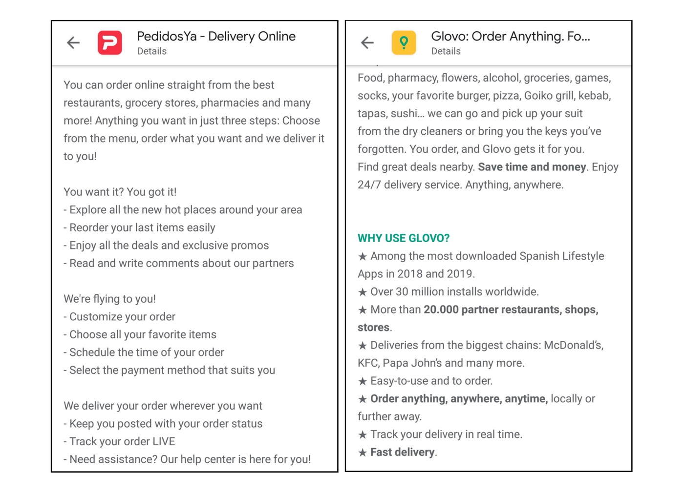
- The techniques you use to make your keywords stand out (see above) are suitable to make your description more beautiful, too. Compare the two app descriptions by PedidosYa (left) and Glovo (right) below. Both have a proper structure with headlines and bullet-point lists. But Glovo’s description is much more appealing because it uses HTML-formatting and unique star-bullets.
- Keep app icons clean. Use two or three simple pictograms and only a few colors. Less is more, and especially for the app icon, you should keep it simple. Check out the Adobe portfolio. Their icons are all very simple, yet recognizable: black background, colored border, and simple pictograms using the border color.

- Use simple vocabulary and short phrases. Make your texts understandable for people from all walks of life.
- Make sure that text in screenshots is big enough to be readable in SERPs. Try to keep caption length to 4 to 5 words per screenshot. In videos, also take care about reading time. Make sure the text is visible long enough, so people can read it before it disappears. Give them at least one second per three words.
All of the three criteria are similarly important. But as relevance depends on your keyword research, you should start drafting your metadata from there. Decide which keywords you want to emphasize. Then draft a story around these terms. Finally, apply the techniques for beautification. Learn more about ASO optimization from AppFollow's ASO guide.